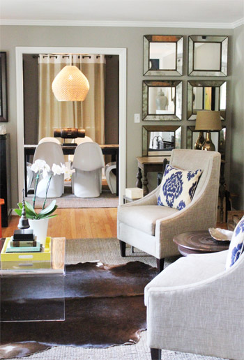
Some homes whisper. Some homes politely clear their throat. And then there are homes like House Crashing: Swanky Panky, which stroll into the room wearing a textured pendant light, a perfectly moody wall color, a few spicy orange accents, and the confidence of someone who knows exactly where the good throw pillows are hidden.
Inspired by the beloved house-tour style of peeking inside real homes for design ideas, this article explores what makes the “Swanky Panky” look feel so memorable: it is polished but not stiff, elegant but not untouchable, collected but not cluttered. In other words, it is the kind of interior that makes guests say, “Your house is amazing,” while secretly wondering whether they can rearrange their entire living room before dinner.
The charm of this style lies in contrast. Sleek furniture meets natural texture. Neutral walls get a jolt of color. Affordable finds sit beside meaningful travel pieces. A polished dining area flows into a cozy den. The result is a home that feels designed, yes, but also lived in by actual humans who probably own a snack drawer.
What “Swanky Panky” Really Means in Home Design
The phrase may sound playful, but the design idea is surprisingly practical. “Swanky” suggests polish: thoughtful lighting, refined color, elegant shapes, and a sense of adult sophistication. “Panky,” on the other hand, keeps the whole thing from taking itself too seriously. It is the wink in the roomthe orange accent table, the bold pillow, the sculptural object, the dramatic wallpaper, the outdoor lanterns that make a patio feel like a boutique hotel decided to loosen its tie.
A Swanky Panky home does not rely on one expensive sofa or one perfect paint color. It works because every room has layers. You notice the broad strokes first: neutral walls, balanced furniture, and calm flow. Then the details start tapping you on the shoulder: woven rugs, warm metals, graphic pillows, glassy surfaces, art with a story, and accessories that look like they were chosen because someone loved them, not because a catalog said so.
The Living Room Lesson: Texture Is the Secret Sauce
If a room feels flat, the problem is often not colorit is texture. A neutral living room can look rich when it includes several tactile surfaces: a nubby rug, linen-like upholstery, smooth acrylic, reflective mirrors, woven shades, warm wood, ceramics, and soft pillows. Texture gives the eye something to do without making the space feel visually loud.
In a Swanky Panky-inspired living room, start with a calm base. Think warm gray, greige, ivory, taupe, or soft white. Then add contrast through materials instead of piling on random colors. Pair a sleek coffee table with a natural fiber rug. Put a glossy lamp beside a rough ceramic vase. Mix tailored chairs with a relaxed sofa. Suddenly, the room looks layered instead of “I bought the whole furniture set on a Saturday and emotionally recovered on Sunday.”
Use Reflective Pieces Without Turning the Room Into a Funhouse
Mirrors are a signature move in sophisticated home design because they bounce light, add sparkle, and visually open a room. A grid of mirrors, one oversized mirror, or a pair of slim mirrors can help a living room feel brighter and more dimensional. The trick is placement. Hang mirrors where they reflect something worth seeing: a window, a chandelier, art, greenery, or a beautiful architectural detail.
Acrylic and glass furniture can do something similar. A clear coffee table, for example, offers function without visual heaviness. It is especially useful when a room already includes strong textures, colorful pillows, or bold rugs. The piece practically says, “I am here to hold your books and coffee, not steal the whole show.”
The Power of High-Low Decorating
One of the most approachable parts of the Swanky Panky look is the mix of high and low. A room does not need to be filled with luxury pieces to feel expensive. In fact, a home often feels more interesting when it blends investment items, budget finds, vintage accents, family hand-me-downs, and travel treasures.
For example, you might splurge on a sofa because people actually sit there, nap there, and occasionally eat popcorn there while pretending crumbs do not exist. Then you can save on accent tables, trays, mirrors, baskets, and decorative accessories. A budget-friendly orange side table can look fabulous if it is placed confidently beside more restrained pieces. Confidence is free, which is convenient because lamps are not.
Meaningful Pieces Beat Generic Decor
The best rooms contain at least a few objects with stories. A sculpture brought home from a trip, a framed textile, a painting from a small artist, a rug inherited from family, or handmade pottery from a local market can give a space soul. These details keep a polished room from feeling like a showroom where nobody is allowed to sit down.
When using meaningful decor, avoid spreading tiny objects across every surface like confetti. Group pieces intentionally. A trio of vases on a console, one sculptural object beside a lamp, or one large piece of art above a sofa usually feels stronger than ten small items all competing for attention like they are auditioning for a reality show.
Dining Room Drama: Statement Lighting Does the Heavy Lifting
A dining room does not need endless furniture to feel complete. Often, the winning formula is simple: a grounded table, comfortable chairs, a rug that defines the zone, and one statement light fixture that announces, “Yes, this is where the pasta deserves respect.”
Textured chandeliers and pendant lights are especially effective because they create a focal point without crowding the room. A woven, beaded, or sculptural fixture adds warmth and movement overhead. It also helps bridge different styles. A modern table can feel less cold under a natural-fiber pendant. White chairs can look more inviting when paired with a rug that has texture and depth.
How to Mix Sleek and Rustic Pieces
The Swanky Panky approach often pairs sleek furniture with earthy elements. This balance is important. Too much sleekness can feel cold. Too much rustic texture can feel heavy. Together, they create tension in the best possible way.
Try combining sculptural dining chairs with a woven chandelier, a smooth tabletop with a natural rug, or polished metal with aged wood. The goal is not to match everything. The goal is to make everything feel like it belongs at the same dinner party, even if one guest is wearing linen and another arrived in patent leather shoes.
The Moody Den: Cozy, Dramatic, and Not Afraid of Wallpaper
Every home deserves at least one room that feels like a retreat. In the Swanky Panky design universe, that room is the moody den. It is darker, cozier, and richer than the main living area. Grasscloth wallpaper, deep upholstery, warm art, iron accents, and spicy red-orange details can turn a den into a cocoon.
Grasscloth and textured wallcoverings are powerful because they add depth without needing loud pattern. They also make walls feel warmer and more architectural. If full wallpaper feels too ambitious, use a similar idea on one accent wall, inside built-ins, behind a console, or even through framed grasscloth panels.
Make Dark Colors Feel Inviting, Not Gloomy
Dark walls can be beautiful when paired with the right lighting and texture. The mistake is painting a room dark and then relying on one lonely ceiling light to save the day. That poor bulb cannot carry the emotional weight of an entire design scheme.
Layer your lighting instead. Use table lamps, floor lamps, sconces, picture lights, candles, or dimmable fixtures. Choose warm bulbs rather than harsh, icy light. Then add reflective or lighter accents: a pale lampshade, a framed artwork, a metallic tray, or a few warm-toned pillows. Dark rooms need glow, not interrogation-room brightness.
The Kitchen: Where Sleek Meets Practical
A Swanky Panky kitchen proves that practical rooms can still have personality. Stainless steel pulls, simple cabinetry, and clean appliances provide structure. Then texture softens the space: a woven shade over the sink, a patterned runner, handmade-looking tile, or warm wood accessories.
The smartest kitchen decorating often happens in small moments. A vintage rug can make a galley kitchen feel warmer. A Roman shade can soften a window. A ceramic bowl on the counter can hold fruit and look intentional. Cutting boards, plants, pendant lighting, and interesting hardware can all work harder than expected.
Do Not Underestimate the Runner Rug
A runner rug in the kitchen is one of those details that can look decorative while secretly doing useful work. It protects floors, cushions feet, introduces color, and helps connect the kitchen to nearby living spaces. Choose a flat-weave or low-pile option that is easier to clean, because tomato sauce has never respected anyone’s design plan.
The Bedroom: Moody Walls and a Headboard That Deserves Applause
The bedroom in this style leans dramatic but comfortable. Deep gray walls, a tall upholstered headboard, patterned pillows, and a graphic rug can make the room feel tailored and restful. A darker bedroom palette works especially well when the space is meant to feel like an evening retreat rather than a morning conference room.
The headboard is often the star. A curved, winged, tufted, or oversized upholstered headboard adds softness and height. It also creates the feeling of a room within a room, which is exactly what a bedroom should do. Your bed should not look like it was pushed against the wall as an afterthought. It should look like it has a reservation at a very nice hotel.
Use Pattern in Controlled Doses
Pattern works best when it has a plan. In a Swanky Panky bedroom, that might mean striped pillows, a graphic rug, and a restrained color palette that keeps everything connected. The patterns do not have to match, but they should share something: color, scale, mood, or geometry.
If you are nervous about pattern, start small. Try two patterned pillows with one solid pillow. Add a rug with a soft geometric design. Use tone-on-tone bedding. Pattern does not need to shout. Sometimes it can simply raise one elegant eyebrow.
The Outdoor Room: A Patio That Feels Like a Vacation
The outdoor area is where Swanky Panky design becomes pure joy. A large sectional, outdoor pillows, lanterns, side tables, and a few playful accessories can turn a patio into a second living room. The best outdoor spaces do not feel like leftover corners. They feel furnished, layered, and ready for iced tea, late-night conversations, and pretending you are the type of person who always remembers to water plants.
To create the look, treat the patio as an actual room. Start with seating. Add a surface for drinks. Bring in pillows for color. Use lanterns, string lights, or portable lamps for evening glow. Include planters for height and softness. If the area is exposed, choose durable outdoor fabrics and weather-friendly materials.
Color Belongs Outside
Outdoor spaces can handle bolder color than indoor rooms because sunlight naturally softens strong hues. Blue pillows, white lanterns, orange accents, striped cushions, or patterned poufs can feel cheerful without overwhelming the house. If your interior palette is neutral, the patio is a great place to loosen up. Think of it as your home’s vacation shirt.
How to Recreate the Swanky Panky Look in Your Own Home
You do not need a designer budget or an Atlanta address to borrow this style. Start by choosing one room and editing it before buying anything new. Remove the pieces that feel tired, too small, or out of place. Then identify what the room is missing: texture, contrast, lighting, art, color, or comfort.
Step 1: Build a Calm Base
Use neutrals for the largest surfaces: walls, major upholstery, large rugs, and curtains. Warm gray, taupe, ivory, sand, mushroom, and soft charcoal all work beautifully. A calm base allows your accent pieces to feel intentional instead of chaotic.
Step 2: Add Two or Three Textures
Layer materials such as jute, linen, wood, ceramic, metal, glass, velvet, leather, grasscloth, or woven fibers. Do not add everything at once. A natural rug, a glossy table, and linen curtains may be enough to change the whole mood.
Step 3: Bring in One Confident Color
Orange, rust, yellow, blue, oxblood, olive, or teal can wake up a neutral room. Repeat the accent color at least twice so it feels deliberate. For example, an orange side table might connect with warm artwork, a pillow, or a tray.
Step 4: Upgrade Lighting
Lighting can make an affordable room look expensive. Add lamps at different heights, use warm bulbs, and choose at least one fixture with personality. A sculptural pendant, woven chandelier, or brass sconce can shift the entire room from basic to boutique.
Step 5: Mix New, Old, Cheap, and Special
A room full of brand-new pieces can feel strangely flat. Add something vintage, something handmade, something budget-friendly, and something personal. This mix gives your home the collected-over-time feeling that defines the Swanky Panky look.
Common Mistakes to Avoid
The first mistake is overdecorating. Layered does not mean crowded. Leave breathing room around your favorite pieces so they can actually be noticed. The second mistake is using only small accessories. Tiny decor can make a room feel busy. Mix in larger pieces: oversized art, a substantial lamp, a tall plant, or a strong mirror.
The third mistake is ignoring scale. A rug that is too small can make furniture look disconnected. Curtains hung too low can make windows feel squat. A coffee table that is too tiny can make a seating area feel awkward. Good design is not just about pretty things; it is about proportion, spacing, and flow.
The final mistake is chasing perfection. A home with personality should have a little looseness. It should evolve. It should include the weird vase you love, the hand-me-down rug that somehow works, and the patio pillow you bought because it made you smile in aisle seven.
Experience Notes: Living With the Swanky Panky Mindset
The most useful experience related to the Swanky Panky style is learning that a home rarely becomes beautiful in one heroic shopping trip. In fact, the best rooms often improve slowly. You move a chair, hate it, move it again, then suddenly discover the layout was hiding behind your stubbornness the whole time. You buy one lamp and realize the room did not need more decor; it needed better light. You try a bold pillow and discover your beige sofa has been quietly begging for personality.
One practical experience is starting with what you already own. Before buying new pieces, shop your house. Move a mirror from the hallway to the living room. Put a bedroom lamp on a dining console. Try a tray from the kitchen on the coffee table. Bring an outdoor garden stool inside as a side table. This experiment costs nothing and often reveals which colors, shapes, and textures you naturally love. It also prevents the classic mistake of buying something just because it looked cute online next to a plant that was clearly raised by professionals.
Another experience is testing bold color in small doses. A warm orange table, a yellow tray, blue outdoor pillows, or rust-colored cushions can change a room without locking you into a huge commitment. Paint and upholstery are bigger decisions, but accessories are friendly little design auditions. If they work, wonderful. If they do not, they can move to another room and start a new life under less pressure.
Lighting is where many people experience the biggest transformation. A room can have attractive furniture and still feel wrong if the lighting is flat. Adding a floor lamp near a reading chair, a table lamp beside the sofa, and a dimmable overhead fixture can make the same room feel warmer, deeper, and more expensive. Evening lighting especially matters. Your home should not look like a dentist’s office after sunset unless your design goal is “root canal chic.”
Outdoor decorating also teaches a valuable lesson: comfort creates use. A patio with two stiff chairs may look fine, but nobody lingers there. Add cushions, a small table, shade, lanterns, and a few plants, and suddenly the space becomes part of daily life. Morning coffee tastes better there. Conversations last longer. Even a small balcony can feel special when it has texture, lighting, and a reason to sit down.
The deepest lesson from House Crashing: Swanky Panky is that style works best when it feels personal. A beautiful room should not erase the people who live there. It should reveal them. Travel art, inherited rugs, budget finds, favorite colors, books, ceramics, and imperfect treasures all make a home more interesting. The trick is editing, not sterilizing. Keep what you love, arrange it with care, and let the room have a little charm, a little polish, and just enough mischief to keep things fun.
Conclusion
House Crashing: Swanky Panky is more than a catchy title. It is a design attitude: refined but relaxed, layered but livable, stylish but not allergic to fun. Its strongest ideas are easy to apply in real homes. Build a neutral base, add texture, mix sleek and rustic materials, layer your lighting, use mirrors strategically, include meaningful objects, and let one or two bold accents bring the room to life.
The magic is not in copying a room exactly. The magic is understanding why it works. When a home balances polish with personality, it becomes memorable. When it mixes high and low pieces, it becomes approachable. When it includes texture, warmth, and stories, it becomes the place everyone wants to visitand the place you are happiest to come home to.
Note: This publication-ready article is written in original language and synthesizes real home design principles related to texture, lighting, mirrors, high-low decorating, pattern mixing, moody rooms, and outdoor living. No source links are embedded in the article body so it can be copied cleanly for web publishing.