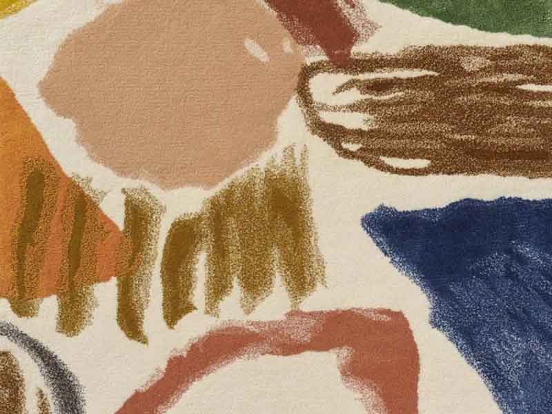
Some rugs politely sit under a coffee table and behave. La Toile Du Peintre FT244001 – Bleu does not do that. This Pierre Frey carpet walks into a room like an artist arriving late to dinner, wearing paint on the cuffs and somehow making everyone else look underdressed. It is bold, graphic, expressive, and unmistakably decorative in the best possible way.
Designed as part of Pierre Frey’s artistic universe, La Toile Du Peintre translates the energy of painter and sculptor Heather Chontos into a hand-tufted rug. The Bleu colorway is especially interesting because it balances bright movement with a cooler foundation. It has personality without becoming visual chaos, which is a rare little miracle in the world of statement rugs. Many rugs say, “I match the sofa.” This one says, “The sofa can apply for membership.”
In this in-depth guide, we will explore what makes La Toile Du Peintre FT244001 – Bleu distinctive, how it fits into modern interiors, what to know about its materials, and how to style it without making your living room look like an art supply store exploded. We will also cover care tips, placement ideas, and real-life experiences related to using a painterly blue rug as the anchor of a room.
What Is La Toile Du Peintre FT244001 – Bleu?
La Toile Du Peintre means “the painter’s canvas” in French, and that name is not decorative fluff. The design is inspired by the expressive work of Heather Chontos, whose compositions often combine saturated color, dynamic lines, organic forms, and an instinctive sense of movement. Pierre Frey’s interpretation preserves that handmade, painterly spirit and turns it into a luxury carpet suitable for high-design interiors.
The code FT244001 refers to the Bleu rug colorway. In the Pierre Frey family, this design also appears across fabric and wallpaper, which makes it part of a broader decorative story rather than a standalone floor covering. That matters because the pattern was not developed as a generic “blue rug.” It was conceived as an artwork translated across surfaces.
Product descriptions for the rug identify it as a wide contemporary graphic pattern with bright colors, reinterpreting a Heather Chontos creation. It is hand-tufted and worked in semi-worsted wool and bamboo, giving it both tactile depth and a subtle play between matte and shiny surfaces. The result feels more like a soft artwork than a simple household object.
Why the Bleu Colorway Works So Well
Blue is one of the most flexible colors in interior design. It can feel coastal, modern, traditional, moody, playful, or serene depending on tone and context. In La Toile Du Peintre FT244001 – Bleu, blue becomes a stage for energy rather than a quiet background. It gives structure to the composition while allowing the brighter colors and painterly gestures to move freely across the surface.
This is important because highly graphic rugs can overwhelm a room when they lack a strong organizing color. Bleu helps prevent that. It gives the eye a place to rest. Think of it as the calm friend at karaoke night who somehow keeps the group from performing three songs by Journey in a row.
A Statement Rug That Still Feels Livable
Statement rugs often fail for one of two reasons: they are too timid to make an impact, or they are so loud they appear to be auditioning for their own reality show. La Toile Du Peintre FT244001 – Bleu lands in the much more useful middle zone. It has scale, color, and artistic motion, but the blue foundation makes it easier to pair with natural woods, white walls, cream upholstery, black accents, and even warm metals.
In a minimalist room, the rug can become the central artwork. In a layered maximalist room, it can join the party without needing to shout over every pillow, vase, and suspiciously expensive candle. The key is to let the rug lead while giving surrounding pieces supporting roles.
The Artistic Background: Heather Chontos and Painterly Design
Heather Chontos is known for working with force, spontaneity, and unconventional tools. Her practice includes painting and sculpture, and her compositions often feel physical, not just visual. Instead of neat decorative repetition, her work carries the energy of gesture: scraping, dragging, layering, and marking surfaces with confidence.
That matters because La Toile Du Peintre does not look like a pattern created by clicking “randomize” in a design program. It has human irregularity. The lines feel drawn. The forms feel pushed into place. The colors feel chosen by instinct as much as by theory. In a home, that quality can soften architectural spaces that are otherwise too polished.
The appeal of painterly textiles and rugs has grown because people increasingly want homes that feel personal, collected, and expressive. A rug like La Toile Du Peintre FT244001 – Bleu gives a room visual evidence of creativity. It says someone in the house enjoys art, risk, and possibly buying coffee-table books that are too heavy to lift comfortably.
Material and Construction: Why Hand-Tufted Matters
La Toile Du Peintre FT244001 – Bleu is described as a hand-tufted carpet made with semi-worsted wool and bamboo. Hand-tufting allows designers to translate complex shapes and color fields with a high level of control. Unlike flat printed rugs, tufted construction gives the design dimension. You do not just see the pattern; you feel it underfoot.
Semi-Worsted Wool
Wool remains one of the most respected rug fibers because it is resilient, naturally warm, and pleasingly tactile. Semi-worsted wool typically offers a smoother, more refined look than rougher wool textures while still preserving the durability that makes wool so desirable in interiors. For a rug with a complex artistic design, wool helps color appear rich without feeling synthetic.
Bamboo and Subtle Sheen
Bamboo fibers used in luxury rugs are often appreciated for their silk-like sheen. In a design like La Toile Du Peintre, that reflective quality helps certain areas catch light differently throughout the day. Morning sun, evening lamps, and cloudy afternoon light can all change the mood of the rug. It is basically interior design’s version of a mood ring, except far more elegant and less likely to be found in a mall kiosk.
Cut Pile and Visual Depth
Product information for the rug notes a cut pile construction and a shiny-matte aspect. Cut pile feels soft and finished, making it suitable for living rooms, bedrooms, lounges, studies, and other spaces where comfort is part of the design brief. The contrast between matte wool and shinier bamboo helps the pattern feel alive rather than flat.
Where to Use La Toile Du Peintre FT244001 – Bleu
This is not the rug you buy to disappear. It should be placed where it can breathe. The best rooms for La Toile Du Peintre FT244001 – Bleu are spaces that benefit from energy, color, and an artistic focal point.
Living Room
In a living room, this rug can anchor the seating area. Pair it with a low-profile sofa in cream, oatmeal, navy, charcoal, or warm beige. Add one or two accent pillows that borrow colors from the rug, but resist the urge to match every shade exactly. Overmatching is how good rooms start looking like catalog hostages.
A glass, wood, or sculptural coffee table works well because it allows the rug to remain visible. If the table is too heavy visually, it may hide the movement of the design. Since the rug itself already has expressive lines, simple furniture silhouettes often work best.
Bedroom
In a bedroom, La Toile Du Peintre FT244001 – Bleu can bring energy without sacrificing calm if the bedding is restrained. White linen, pale gray, soft blue, or warm ivory bedding gives the rug space to perform. The contrast between painterly floor and relaxed bedding creates a collected, gallery-like mood.
For larger bedrooms, placing the rug under the bed with generous exposure on three sides allows the pattern to frame the sleeping area. For smaller rooms, consider using it partially under the lower two-thirds of the bed to preserve both function and visual impact.
Creative Studio or Home Office
The name “the painter’s canvas” makes this rug especially appealing in creative spaces. A home office with white walls, open shelving, and a clean-lined desk can become far more inspiring with this rug underneath. It introduces movement without requiring wall art on every available surface.
That said, if you use a rolling desk chair, protect the rug. Chair wheels and luxury pile are not best friends. A stationary chair or a discreet chair mat can help preserve the surface.
Entry or Gallery-Like Hall
For a dramatic entry, this rug can make an unforgettable first impression. However, because of its luxury materials and artistic surface, it is better suited to a controlled entry or gallery-style hallway than a muddy front door where sneakers, umbrellas, and one emotionally unstable houseplant all compete for floor space.
How to Style a Bold Blue Artistic Rug
Styling La Toile Du Peintre FT244001 – Bleu is about balance. You want the room to feel intentional, not like every object was selected during a sugar rush. The easiest strategy is to build around three layers: calm base pieces, selective color echoes, and strong texture.
Start With a Calm Foundation
Neutral upholstery is the safest partner for this rug. Cream, stone, taupe, soft gray, charcoal, walnut, and black all work beautifully. These tones allow the rug’s colors to stand out while keeping the room grounded.
If your sofa is already colorful, choose accessories carefully. A green velvet sofa, for example, could work if the rest of the room is edited. A bright patterned sofa plus this rug plus busy curtains may create the kind of visual conversation where everyone talks at once and nobody hears the punchline.
Repeat Colors Lightly
Pull one or two colors from the rug into the room through pillows, ceramics, lampshades, art, or books. The trick is subtle repetition. Do not create a scavenger hunt where every color must be represented. Let the rug be the original painting and the accessories be polite footnotes.
Use Natural Materials
Wood, stone, linen, leather, plaster, rattan, and ceramic all pair well with a painterly rug. They keep the room from feeling too slick. A walnut coffee table, a linen sofa, and a ceramic lamp can bring warmth and texture while respecting the rug’s artistic force.
Give the Rug Enough Space
Rug sizing can make or break the look. A rug that is too small makes a seating area feel disconnected. A larger rug helps unify furniture and gives the design room to unfold. In living rooms, aim for at least the front legs of major seating pieces to sit on the rug. In dining areas, the rug should extend far enough beyond the table so chairs remain on it when pulled out.
Design Mistakes to Avoid
Even a gorgeous rug can be bullied by poor styling. Here are the biggest mistakes to avoid with La Toile Du Peintre FT244001 – Bleu.
Choosing Competing Patterns Everywhere
Pattern mixing can be beautiful, but it requires restraint. If the rug is large and expressive, avoid pairing it with equally large geometric drapes, busy wallpaper, and twelve pillows that look like they are arguing. Smaller-scale patterns or textured solids are easier companions.
Ignoring Lighting
Because the rug has shiny-matte variation, lighting matters. Layered lighting from floor lamps, table lamps, sconces, and natural daylight can bring out its depth. A single harsh ceiling fixture may flatten the room and make even luxury materials look less exciting.
Using It in the Wrong Traffic Zone
This rug is artistic and tactile, not a utility mat. It belongs in spaces where it can be appreciated and cared for. Very wet, muddy, or food-heavy zones may not be ideal. If you have toddlers with grape juice, dogs with muddy paws, or guests who treat red wine like a floor seasoning, plan accordingly.
Care and Maintenance Tips
A rug made with wool and bamboo deserves thoughtful care. The goal is not to panic every time someone walks on it. The goal is to maintain it with the same calm confidence you pretend to have when assembling furniture without reading the instructions.
Vacuum Gently
Use a suction-only vacuum or a vacuum with the beater bar turned off, especially on delicate or lustrous fibers. Regular vacuuming removes grit before it works into the pile. Dirt particles can act like tiny sandpaper, and tiny sandpaper is not the interior design assistant anyone asked for.
Blot Spills Immediately
If a spill happens, blot it right away with a clean, absorbent white cloth. Do not rub. Rubbing can push liquid deeper into the fibers and distort the pile. For bamboo or silk-like fibers, moisture can be tricky, so use minimal liquid and seek professional advice for serious stains.
Rotate the Rug
Rotate the rug periodically to even out sunlight exposure and foot traffic. This is especially helpful in rooms with strong windows or furniture arrangements that funnel people through the same path every day.
Use a Quality Rug Pad
A rug pad helps prevent slipping, reduces friction, adds cushioning, and protects both rug and floor. It also makes the rug feel more luxurious underfoot. This is one of those invisible upgrades that quietly does the work while receiving none of the applause.
Consider Professional Cleaning
For a luxury hand-tufted rug, professional cleaning is the safest route for deep maintenance. Always tell the cleaner about the materials, especially bamboo or silk-like fibers, so they can choose the right process.
Who Should Choose La Toile Du Peintre FT244001 – Bleu?
This rug is ideal for homeowners, designers, collectors, and style-focused decorators who want a room to feel expressive, layered, and artful. It is not for someone seeking a silent beige rectangle. Beige rectangles have their place, of course. Sometimes a room needs one. But this is not that story.
Choose La Toile Du Peintre FT244001 – Bleu if you enjoy contemporary interiors, painterly design, French decorative arts, artist collaborations, and high-impact textiles. It is especially strong for spaces that need personality but already have good bones: clean architecture, quality furniture, and enough breathing room for a large-scale pattern.
Real-Life Experience: Living With a Rug Like La Toile Du Peintre FT244001 – Bleu
Living with a rug like La Toile Du Peintre FT244001 – Bleu changes the way a room behaves. The first thing you notice is that the floor stops being background. In many homes, floors are treated like the quiet supporting actor: practical, neutral, and usually ignored unless something spills. But when you introduce a painterly blue rug with large-scale movement, the floor becomes part of the conversation.
In a living room, the effect is immediate. A simple sofa suddenly looks more intentional. A plain coffee table feels curated. Even a stack of books appears more stylish, as if it has been reading design magazines after everyone goes to sleep. Guests tend to notice the rug quickly, not because it screams, but because it feels alive. The pattern invites curiosity. People ask what it is, where it came from, and whether they are allowed to step on it. The answer should be yes, though preferably not while holding nachos.
One practical experience with bold rugs is that they make decorating easier and harder at the same time. Easier because the rug gives you a palette. Instead of wondering what colors to use, you can borrow from the design: blue, cream, warm accents, dark lines, and bright artistic notes. Harder because you must resist overdecorating. Once the rug is in place, fewer accessories are needed. The room already has energy. Adding too many extra patterns can dilute the impact.
Another experience is how much lighting changes the mood. During the day, the blue may feel fresh and open. In the evening, under warm lamps, the rug can look richer and more intimate. If the bamboo fibers catch light, certain areas may appear slightly brighter depending on where you stand. This makes the rug feel dynamic rather than static.
Maintenance becomes part of the lifestyle, but not in a terrifying way. You become more aware of shoes, spills, and traffic paths. A rug pad becomes non-negotiable. Vacuuming becomes gentler. You may find yourself developing strong opinions about coasters, which is how adulthood quietly wins.
The best part of living with a rug like this is the sense of individuality it brings. Many interiors today look polished but predictable. La Toile Du Peintre FT244001 – Bleu breaks that pattern. It introduces the feeling of a hand, an artist, and a story. It makes a room feel less like a showroom and more like a place where creative people actually live, laugh, read, spill one tiny drop of coffee, panic, blot immediately, and move on.
Conclusion
La Toile Du Peintre FT244001 – Bleu is more than a blue rug. It is a translation of painterly energy into a luxurious floor covering, combining Pierre Frey’s decorative heritage with Heather Chontos’ expressive artistic language. Its bold graphic movement, rich color, hand-tufted construction, and wool-bamboo texture make it a powerful choice for interiors that need personality, warmth, and visual rhythm.
This rug works best when treated as a major design element. Give it space, pair it with calm furniture, repeat its colors lightly, and care for it with respect. Do that, and it can become the piece that turns a nice room into a memorable one. In other words, it is not just something you walk on. It is something that makes the whole room stand taller, smile wider, and maybe consider taking up painting.
Note: This article is written in original American English for web publishing and is based on verified product details, interior design best practices, rug material knowledge, and practical styling experience related to La Toile Du Peintre FT244001 – Bleu.