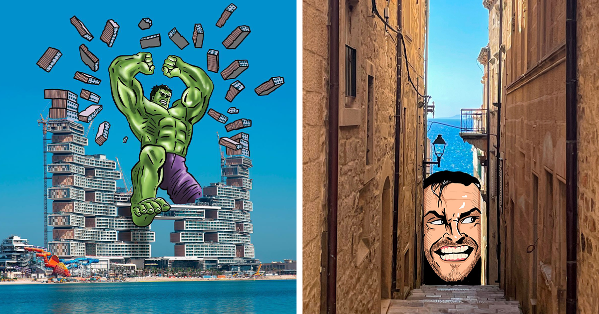
Most travel photos ask us to admire a place exactly as it appears. Robin Yayla’s work politely ignores that rule, borrows the skyline, and hands reality a cartoon mustache. In his series of 65 creative illustrations drawn on scenic photos, bridges become limbs, towers turn into household objects, city blocks resemble snacks, and famous monuments suddenly discover second careers they never listed on LinkedIn.
The appeal is immediate, but the craft is more sophisticated than a quick visual gag. Yayla combines photography, digital illustration, architectural observation, and playful visual storytelling. Each image begins with something recognizablea landmark, waterfront, street, building, mountain, or public spacethen adds a drawn element that changes how the entire scene is understood. The photograph remains believable. The illustration supplies the surprise.
That collision between the ordinary and the impossible is what makes the collection so memorable. It is travel photography viewed through the imagination of someone who refuses to let a tower remain merely a tower.
Who Is Robin Yayla?
Robin Yayla is an Istanbul-born illustrator and visual artist whose creative path has included art and design study in Milan. His broader portfolio includes illustration, poster work, product concepts, and image-based visual experiments, but he is especially recognized online for drawing directly over scenic photographs. His artistic method reflects two long-running interests: exploring places and sketching ideas.
Instead of treating a landmark as a finished subject, Yayla treats it as raw material. A building’s outline might suggest a face. A bridge cable may resemble a string, a zipper, a stretched limb, or the edge of a costume. A circular plaza can become a plate, an eye, or a sports arena. This habit of looking twice is central to his style.
Across his wider body of work, well-known examples include the Galata Tower imagined as a rocket, the Eiffel Tower transformed into part of a zipper, and Rome’s Colosseum incorporated into a Vespa-inspired scene. The joke is rarely pasted on randomly. It grows from the architecture itself, as though the landmark had been waiting years for someone to notice its secret identity.
Why the 65 Scenic Photo Illustrations Work So Well
The Real Photograph Creates an Instant Anchor
A scenic photograph gives the viewer a stable world before the drawing disrupts it. We recognize sky, water, stone, roads, windows, trees, and familiar proportions. Because the background feels real, even a simple illustrated addition can produce a strong surreal effect.
This is important. If every part of the image were invented, viewers would accept the scene as fantasy. By keeping most of the photograph untouched, Yayla creates a productive little disagreement in the brain: “I know what this place is, but now I cannot stop seeing it as something else.” That second interpretation becomes the fun.
Each Image Usually Has One Clear Visual Idea
The strongest pieces do not require a paragraph of explanation. A giant hand interacts with a skyline. A character appears to leap across a bridge. A landmark becomes the stem of a flower. Barcelona’s geometric city blocks can be reimagined as pieces in an enormous bento box, with illustrated chopsticks hovering above. The viewer recognizes the concept in seconds.
That clarity is not the same as simplicity. A successful visual metaphor requires careful selection. The artist must notice the correct angle, outline, gap, texture, or repeated shape. He then has to design an illustration that fits the photograph without burying the original scene. The final joke may look effortless, but “effortless” is often what careful editing wears to a party.
Scale Becomes a Creative Playground
Yayla frequently exaggerates scale. A human figure may tower over a city, a hand may manipulate a monument, or a bridge may function as part of a gigantic body. These scale shifts are effective because photographs naturally give us reference points. We know roughly how large a building, ferry, or bridge should be, so an illustrated figure interacting with it feels delightfully impossible.
Forced perspective has always been useful in photography, but Yayla pushes the principle into illustrated storytelling. He does not merely make something appear larger or smaller. He gives the altered scale a purpose. The giant is walking, kicking, holding, pulling, eating, playing, or transforming the landscape.
Landmarks Become Characters, Props, and Punchlines
Architecture is ideal material for Yayla because buildings are full of suggestive geometry. Towers are long and narrow. Domes resemble heads, helmets, bowls, or buttons. Bridges carry strong horizontal lines. Windows repeat like teeth, pixels, piano keys, or patterns on clothing. Once the artist chooses a new interpretation, the physical structure starts doing part of the drawing for him.
Consider a suspension bridge reimagined as the extended leg of a martial artist. The bridge already supplies the length, tension, and dramatic direction. The illustrated body simply completes an action hidden inside the photograph. In another type of composition, a pair of drawn hands can frame a bridge as a heart, turning a massive piece of infrastructure into an unexpectedly tender symbol.
Other pieces use famous monuments as visual props. The Arc de Triomphe may support an animal or become part of an athletic scene. The Sagrada Família can be folded into a character-based composition without losing its distinctive silhouette. Modern skyscrapers become costumes, robots, musical objects, or exaggerated body parts. Ancient ruins may serve as chessboards, instruments, or stages for tiny illustrated conflicts.
The humor comes from recognition. We know these landmarks are culturally important, heavily photographed, and generally expected to behave with dignity. Yayla gives them a day off.
The Visual Techniques Behind the Whimsy
Matching Lines and Silhouettes
Many compositions begin with contour matching. The artist studies the dominant line in a photographa roof edge, shoreline, tower, railing, or cableand asks what else it could represent. A strong match allows the drawing and photograph to connect cleanly, which makes the illusion readable even when the two media remain visibly different.
Silhouette matters just as much. A landmark must remain identifiable while also supporting the new idea. If the illustrated addition covers too much, the visual joke becomes muddy. If it touches too little of the scene, the drawing appears unrelated. The balance is delicate: enough overlap to create transformation, enough photographic detail to preserve recognition.
Using Negative Space as Part of the Drawing
Empty sky is not empty in Yayla’s work. It is a drawing surface. Open water offers room for oversized characters, motion lines, floating objects, and exaggerated gestures. Gaps between buildings can define a face or body. Clear areas around monuments make the illustrated intervention easier to read.
This is one reason scenic photos are so useful. They often contain broad regions of sky, water, pavement, or landscape that can hold new visual information without becoming chaotic. The background provides atmosphere; the open space provides opportunity.
Keeping the Color Relationship Friendly
Yayla’s illustrated elements are usually bold enough to stand apart from the photograph, yet they still respond to the scene’s palette and lighting. Warm lines work naturally with terracotta roofs and sunsets. Crisp blacks and whites can cut through colorful urban backgrounds. Bright cartoon tones create contrast against stone architecture or blue skies.
The goal is not photorealistic blending. Viewers should know that a drawing has been added. The pleasure comes from seeing two visual languages cooperate: detailed photography and clean, graphic illustration. One says, “This place exists.” The other replies, “Yes, but let us improve it with a giant sneaker.”
More Than a Visual Joke
Humor is the doorway into these images, but curiosity is what keeps them interesting. Yayla’s work encourages a habit that artists, travelers, and everyday observers can use: look at familiar surroundings as shapes before labeling them as objects.
A bridge is not only a bridge. It is a line under tension. A tower is not only a tower. It is a vertical form with a distinctive top. A road is a ribbon. A row of windows is a rhythm. A harbor full of boats may become a board game, a meal, or a crowd of miniature characters. This way of seeing temporarily loosens the practical meaning of a place and replaces it with possibility.
The collection also communicates affection for cities. The illustrations do not mock architecture by destroying its identity. They depend on that identity. A landmark must be loved, remembered, or visually understood before it can be transformed effectively. The joke works because the original place still matters.
Why This Style Is Perfect for the Social Media Era
Yayla’s scenic photo illustrations are highly shareable because they reward both fast viewing and closer inspection. At thumbnail size, the concept is usually clear enough to stop a scrolling thumb. At full size, viewers can study the alignment, small details, perspective, and relationship between the drawn figure and the real environment.
The images also cross language barriers. A visual metaphor does not require translation, subtitles, or a fifteen-part explanation beginning with “Here is the backstory.” A tower shaped like a flower stem communicates instantly. A giant figure walking through a marina is understandable anywhere. That accessibility helps the work travel far beyond the locations shown in the photographs.
There is also a satisfying before-and-after quality, even when the original photo is not displayed. Viewers mentally reconstruct it. We can imagine the untouched bridge, skyline, or monument, then compare that invisible version with Yayla’s interpretation. The artwork turns observation into a small interactive game.
What Photographers, Illustrators, and Content Creators Can Learn
The series offers practical lessons for anyone interested in mixed-media art, photo manipulation, travel content, or conceptual illustration.
- Begin with shape, not software. The core idea should come from the photograph’s lines, proportions, and negative space. No editing tool can rescue a concept that has no visual connection to the scene.
- Choose one dominant transformation. A single strong metaphor is usually more memorable than five unrelated clever details fighting for attention.
- Preserve the identity of the place. The audience needs enough architecture and atmosphere to recognize what has been transformed.
- Make interaction believable. Hands should appear to grip, feet should appear to land, and characters should follow the photograph’s perspective.
- Use contrast intentionally. The drawing must be visible, but it should not flatten or overwhelm the scenic photo.
- Let humor come from observation. The most satisfying jokes feel discovered rather than imposed.
Creators can practice the technique without traveling to world-famous landmarks. A local water tower, parking garage, lamp post, stairway, stadium, or unusual tree can be just as useful. In fact, ordinary places may create more surprising results because viewers are not already carrying a suitcase full of visual clichés.
An Experiential Way to Explore the 65 Illustrations
Viewing all 65 images in one sitting feels less like flipping through a conventional travel album and more like walking through a city with a friend who keeps pointing at buildings and saying, “Wait, does that not look like a robot wearing formal pants?” At first, the brain focuses on the illustrated addition. After several images, however, the viewing process changes. You begin scanning the photograph before accepting the joke, trying to guess what architectural clue triggered the idea.
That shift is one of the best experiences the collection offers. The viewer stops behaving like a passive spectator and starts acting like a visual detective. A curved roof becomes suspicious. A narrow tower clearly has plans. A bridge cable can no longer be trusted to remain a bridge cable. The world begins to look temporarily unfinished, as though every structure is waiting for its missing cartoon component.
A good way to explore the series is to pause for a few seconds before focusing on the drawing. Notice the original photograph first: the horizon, weather, dominant color, architectural style, and direction of the lines. Then look at the illustrated overlay and identify the exact point where reality changes meaning. Sometimes the transformation depends on one clean connection. In other works, several details cooperatea building becomes a torso, windows become clothing patterns, and the surrounding skyline completes the scale.
The emotional rhythm also varies. Some illustrations deliver an immediate joke. Others feel nostalgic, romantic, or cinematic. A pair of hands around a landmark can make an enormous structure feel personal. A giant character stepping across a harbor creates a sense of childhood play. A flower emerging from a tower can turn a dense cityscape into something gentle. These tonal shifts keep a long collection from feeling repetitive.
Another rewarding experience is comparing locations. Historic European monuments invite transformations based on ornate silhouettes, domes, arches, and cultural associations. Modern skylines offer glassy surfaces, sharp geometry, and vertical repetition. Coastal scenes provide open space and reflections. Bridges naturally suggest movement and connection. Each environment gives the illustrator a different set of visual ingredients.
After spending time with the images, many viewers may notice a curious aftereffect: ordinary surroundings become more interesting. A crane might resemble a fishing rod. A round window could be an eye. A traffic barrier may look like the shoe of an invisible giant. This does not require artistic training; it requires permission to interpret first and label second.
For families, teachers, or creative teams, the collection can become a useful prompt. Show a scenic image without the illustration and ask what it could become. Encourage several answers rather than searching for one “correct” concept. The exercise builds visual association, flexible thinking, and awareness of composition. It is also considerably more enjoyable than another meeting where everyone says “synergy” and nobody draws a rocket on a tower.
The most lasting experience, then, is not simply amusement. It is renewed attention. Yayla’s work reminds us that creativity often begins before the pen touches the screen. It begins when someone looks at a familiar object long enough to see an alternative hiding inside it.
Conclusion: A Fresh Perspective Hiding in Plain Sight
“65 Creative Illustrations Drawn On Scenic Photos By Robin Yayla” celebrates a simple but powerful artistic idea: reality does not have to be replaced to become imaginative. It can be nudged, extended, and reinterpreted. A few drawn lines can transform a landmark while leaving its history, atmosphere, and photographic beauty intact.
Yayla’s strongest images succeed because they combine observation with restraint. The scenic photo remains important. The illustration adds one clear, witty possibility. Together, they create mixed-media artwork that is accessible, memorable, and surprisingly thoughtful.
The collection may begin with recognizable places, but it ends by changing how we look at our own surroundings. After seeing bridges kick, towers bloom, and city blocks become lunch, even the most ordinary street starts to look a little less ordinaryand considerably more suspicious.
Note: This article is an editorial appreciation of Robin Yayla’s creative approach. The 65-image collection is discussed thematically rather than reproduced or ranked, and all referenced artworks remain the property of their respective creator and rights holders.