Note: This article is an original editorial guide based on publicly available design, retailer, and brand information. Product availability, pricing, and collections can change, so readers should verify current details before purchasing.
Some wallpaper whispers. Marimekko wallpaper walks into the room wearing oversized sunglasses, carrying a bouquet the size of a lampshade, and politely asks why your walls are still beige. That is the magic behind Walls, Windows & Floors: New Marimekko Line at the Wallpaper Collective: it is not just a decorating update, but a reminder that walls, windows, and floors can do more than quietly behave. They can lead the conversation.
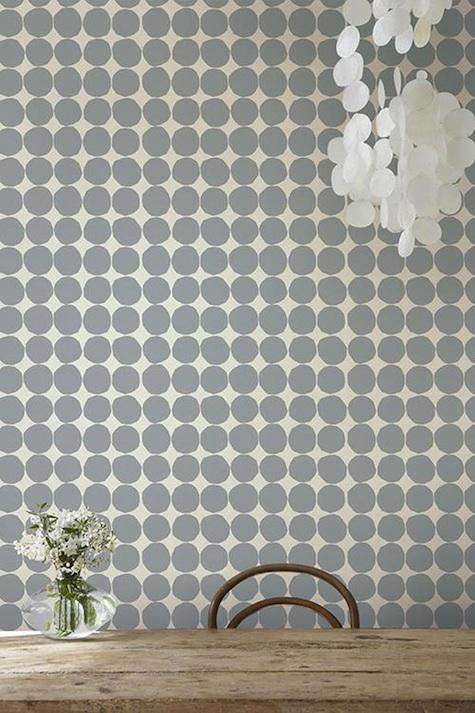
The original design-world buzz around the Marimekko line at the Wallpaper Collective centered on the appeal of bringing the Finnish brand’s iconic patterns into everyday interiors. One standout was Pienet Kivet, a joyful pebble-like pattern with a graphic rhythm that feels both playful and sophisticated. It is the kind of print that can make a dining nook look intentional, a hallway feel collected, or a tiny powder room suddenly act like the best-dressed guest at the party.
Today, the topic feels newly relevant because wallpaper has fully returned from its “grandma’s guest room” exile. Designers, homeowners, renters, and DIY decorators are embracing bold wallpaper, Scandinavian prints, botanical motifs, stripes, block patterns, and personality-forward interiors. Marimekko fits neatly into this movement because the brand has always treated pattern as a way of living, not merely a surface treatment.
Why Marimekko Wallpaper Still Feels Fresh
Marimekko was founded in Finland in 1951 and became famous for bold prints, joyful color, and a design language that feels confident without being fussy. Unlike delicate wallpaper patterns that disappear unless you squint at them over coffee, Marimekko wallpaper has presence. It is graphic, friendly, and built around shapes that can feel modern even decades after their debut.
The brand’s best-known patterns, including the famous Unikko poppy, show why Marimekko continues to matter in home decor. Unikko was created by Maija Isola in 1964 and became one of the most recognizable floral prints in modern design. Its success is not just about flowers. It is about scale, movement, and courage. Marimekko understands that a flower does not have to be shy. Sometimes it can take up the whole wall and still look chic.
That confidence makes Marimekko a natural match for modern interiors. In an era where people are tired of rooms that look like rental listing stock photos, these wallpapers offer instant identity. A Marimekko wall can say “creative,” “Scandinavian,” “collected,” “optimistic,” or “yes, I do own more than one interesting mug.”
What Makes the Wallpaper Collective Connection Interesting?
The Wallpaper Collective angle matters because it frames Marimekko wallpaper as part of a curated design shopping experience. Instead of hunting through endless generic wallcoverings, the idea is to find designer wallpapers with a clear point of view. Marimekko’s patterns are especially suited to that kind of curation because they are recognizable but not one-note.
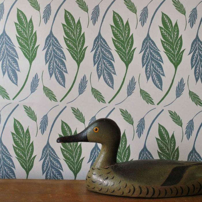
For example, Pienet Kivet has a repeating stone-like motif that can read as playful dots from a distance and organic geometry up close. It works in spaces where a traditional floral might feel too sweet, but a plain geometric might feel too cold. The pattern has that Nordic trick of being simple and expressive at the same time, like a very stylish person who claims they “just threw this on.”
Meanwhile, striped Marimekko patterns such as Korsi show another side of the brand. Stripes are among the most practical wallpaper choices because they can visually stretch a wall, sharpen a room, and pair well with furniture styles from midcentury to farmhouse to contemporary minimalism. But in Marimekko’s hands, stripes are not stiff. They feel hand-drawn, human, and lively.
Walls: How to Use Marimekko Wallpaper Without Overwhelming a Room
Start With One Hero Wall
If you are new to bold wallpaper, the easiest entry point is one feature wall. Use Marimekko wallpaper behind a bed, along a dining banquette, in a home office, or behind open shelving. This allows the print to become a focal point without turning the room into a full-time pattern festival.
A large floral like Unikko can make a bedroom feel energetic and artistic, while a small-scale graphic like Pienet Kivet can add texture without shouting. The secret is balance. If the wall is loud, let the surrounding furniture speak at a normal indoor volume. Natural wood, white oak, black metal, linen upholstery, and simple ceramics all work beautifully with Marimekko’s expressive prints.
Use Wallpaper in Small Rooms for Big Personality
Powder rooms, mudrooms, laundry rooms, and entryways are ideal spaces for dramatic wallpaper. These rooms are small enough that the cost is more manageable, yet visible enough to create a strong design moment. A Marimekko wallpaper in a powder room can make guests forget they only came in to wash their hands.
Small spaces also tolerate more pattern because people pass through them quickly. A print that might feel intense across four living room walls can feel charming and memorable in a compact entry. Think of it as design espresso: concentrated, bold, and surprisingly uplifting.
Let Scale Do the Heavy Lifting
Pattern scale matters. Large-scale prints are best when they have room to breathe, while smaller repeats can work well in narrow spaces or rooms with many interruptions like doors, windows, and built-ins. Before choosing a Marimekko wallpaper, consider how much of the repeat will actually be visible. A giant flower chopped awkwardly by three windows and a thermostat may not deliver the poetic Finnish drama you were hoping for.
Windows: Bringing the Marimekko Mood Into Light and Fabric
The phrase “Walls, Windows & Floors” is useful because Marimekko is not limited to walls. The brand’s textile heritage means its patterns naturally translate to curtains, shades, and soft window treatments. If wallpaper feels too permanent, Marimekko-inspired window decor can give you the same color and pattern story with more flexibility.
Roman shades in a bold graphic print can turn an ordinary kitchen window into a design feature. Floor-length curtains in a Marimekko floral can soften a modern room that has too many hard lines. Even a simple fabric panel can create continuity when paired with wallpaper in a nearby room.
For a polished look, avoid matching everything too perfectly. A room does not need Marimekko wallpaper, Marimekko curtains, Marimekko pillows, and a Marimekko mug positioned for emotional support. Instead, repeat one color or shape across surfaces. For example, pair a black-and-white pebble wallpaper with linen curtains edged in black trim, or use a floral wallpaper with solid drapes that pick up one quiet color from the pattern.
Floors: How Rugs and Flooring Support Bold Wallpaper
Floors are the grounding element in a room with expressive wallpaper. When your walls are wearing a statement print, your floors need to act like the calm friend who knows where the car keys are. Natural wood flooring is a classic partner for Marimekko wallpaper because it supports the Scandinavian mood without competing.
For rugs, consider simple textures such as jute, wool, flatweave cotton, or low-pile neutrals. If you want to mix patterns, choose a rug with a different scale from the wallpaper. A large floral wall can work with a tiny check rug. A small geometric wallpaper can pair with a broad stripe. The goal is conversation, not argument.
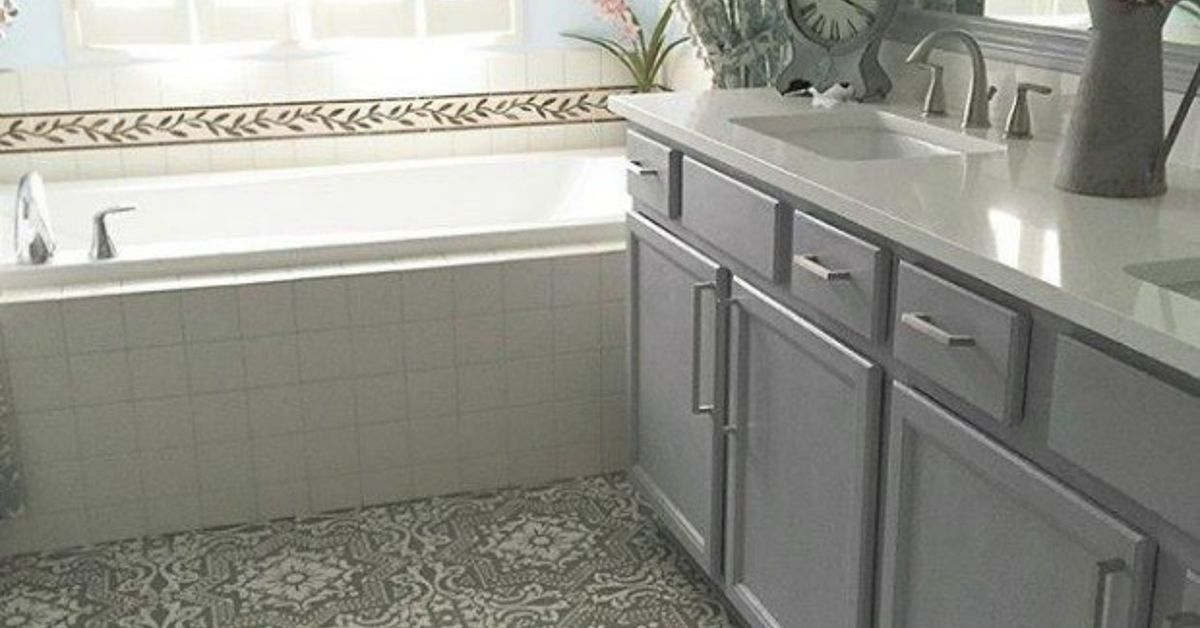
In kitchens and bathrooms, tile can also play well with Marimekko prints. White square tile, terrazzo, black hex tile, or warm stone flooring can give the wallpaper a clean architectural base. Avoid overly busy floor patterns unless you are deliberately going for maximalism. Even then, maximalism works best when someone in the room is still doing the dishes visually.
Marimekko and the Return of Joyful Decorating
One reason Marimekko wallpaper feels current again is that homeowners are moving away from safe, anonymous interiors. For years, the internet rewarded rooms that looked calm, pale, and almost suspiciously untouched by human life. Now, people want homes with personality, memory, and a little wink.
This does not mean every room needs to look like a boutique hotel lobby after three espressos. It means design can be personal again. A Marimekko wallpaper line is appealing because it offers that personality with design credibility. These are not random trendy prints; they come from a deep archive of textile design, modernism, Finnish nature, and artistic experimentation.
Wallpaper trends for recent years have favored botanicals, stripes, block prints, murals, and expressive surfaces. Marimekko intersects with all of these ideas. It has flowers, but they are graphic. It has geometry, but it is warm. It has Scandinavian roots, but it does not feel cold. That balance gives the brand unusual staying power.
Best Rooms for Marimekko Wallpaper
Dining Rooms
A dining room is one of the strongest places to use Marimekko wallpaper. Pattern makes meals feel more festive, even when dinner is just pasta and the last respectable vegetable in the refrigerator. Choose a print with enough contrast to glow in evening light, then keep the table, chairs, and lighting simple.
Home Offices
Marimekko wallpaper can make a home office feel creative and energized. A graphic wall behind a desk creates a strong video-call background without requiring you to arrange books by color. For productivity, consider patterns with rhythm rather than chaos. Repeating stones, stripes, or abstract botanicals can be stimulating without becoming distracting.
Nurseries and Kids’ Rooms
Because Marimekko patterns often feel playful without being babyish, they can grow with a child. A bold floral, animal-inspired print, or cheerful geometric can work from nursery years into elementary school with only small changes in bedding and accessories.
Entryways
An entryway is your home’s handshake. Marimekko wallpaper gives it confidence. Add a bench, a mirror, a simple runner, and hooks that do not collapse under the weight of real life. The result is practical, welcoming, and memorable.
How to Style Marimekko Wallpaper Like a Designer
Pick a Palette Before You Pick Accessories
Start by pulling three colors from the wallpaper: one dominant color, one supporting color, and one accent. Use the dominant color for larger items, the supporting color for textiles, and the accent for small decor. This keeps the room from looking like a craft drawer exploded.
Mix Modern and Vintage
Marimekko patterns look especially good with a blend of modern furniture and vintage finds. A clean-lined sofa, a vintage wood cabinet, and a bold wallpaper can create the kind of room that feels collected rather than purchased in one nervous afternoon.
Respect Negative Space
Bold wallpaper needs breathing room. If every surface is filled with art, shelves, plants, baskets, candles, and mysterious decorative beads, the wallpaper will lose impact. Let some areas remain quiet. Negative space is not boring; it is the design equivalent of punctuation.
Use Lighting to Warm the Pattern
Wallpaper changes throughout the day. Morning light may make colors feel crisp, while evening lamps can soften them. Before committing, test a sample in the room and observe it in natural light, overhead light, and lamplight. This is especially important for large-scale prints and high-contrast colors.
Buying and Installation Tips
Before ordering Marimekko wallpaper, measure carefully. Multiply wall height by wall width, subtract major openings if appropriate, and account for pattern repeat. Large repeats often require extra wallpaper because each strip must align correctly. Ordering too little is a classic wallpaper mistake, right up there with starting without a plumb line and believing “I can eyeball it” five minutes before regret enters the room.
Always order samples first. Tape them to the wall and live with them for several days. Check how the color looks near your trim, flooring, and furniture. A pattern that looks perfect online may feel too bright, too cool, or too large in person. Samples are cheap compared with the emotional cost of wallpapering an entire room and then whispering, “Oh no.”
For renters, removable wallpaper or framed fabric panels can capture the Marimekko look without risking a security deposit. For homeowners, professional installation may be worth it for expensive papers, complicated repeats, or older walls. Wallpaper is forgiving in theory; walls, unfortunately, are often dramatic little surfaces with bumps, waves, and opinions.
The Design Lesson Behind Marimekko’s Appeal
What makes the Marimekko line at the Wallpaper Collective worth revisiting is not only the product itself. It is the design philosophy behind it. Marimekko reminds us that pattern can be optimistic. It can be functional. It can be artful without becoming precious. It can make an ordinary wall feel like a decision.
That is why Marimekko wallpaper continues to work across so many interiors. It can brighten a traditional room, loosen up a modern one, or bring structure to an eclectic space. It does not ask your home to become a museum. It asks your home to wake up a little.
Experience Notes: Living With the Marimekko Look
There is a particular moment that happens after you install a bold wallpaper. At first, you stare at it like you have adopted a very large tropical bird. You wonder whether you have made a brilliant design decision or accidentally turned your breakfast nook into a boutique stationery store. Then the room settles. The furniture comes back in. The lamp turns on. The art finds its place. Suddenly, the wallpaper stops feeling loud and starts feeling inevitable.
That is the best way to understand Marimekko in real life. These patterns have energy, but they are not random. A print like Pienet Kivet can make a room feel more relaxed because its organic circles break up straight architectural lines. In a small apartment, that kind of movement can make the space feel less boxed in. In a larger home, it can make a transitional area like a hallway or stair landing feel designed rather than forgotten.
One practical experience with Marimekko-style decorating is that the rest of the room becomes easier, not harder, once the wallpaper is chosen. The print gives you a roadmap. If the wallpaper includes black, cream, olive, and coral, your accessory decisions are already halfway made. Add a cream sofa, black picture frames, a wood table, and one coral pillow. Congratulations, you now look like someone who has “a design vision,” even if yesterday you were eating cereal over the sink.
The second lesson is that bold wallpaper improves ordinary objects. A simple white vase looks more sculptural against a graphic print. A plain wood chair gains warmth. Even a basic mirror feels intentional. This is why wallpaper can be more powerful than buying more decor. Instead of adding clutter, it changes the atmosphere.
Another experience worth noting is emotional. Pattern affects mood. Marimekko’s joyful shapes can make daily routines feel less mechanical. Walking into a laundry room with cheerful wallpaper does not make laundry thrilling, let us not lie to the internet, but it does make the task feel less grim. A patterned entryway can make coming home feel like crossing into your own little world. A wallpapered home office can make work feel more creative, even if the spreadsheet remains spiritually beige.
The most successful Marimekko-inspired spaces usually have one thing in common: restraint around the bold choice. They do not try to make every object compete. They let the wallpaper lead, then support it with texture, light, and breathing room. That approach keeps the look grown-up rather than chaotic.
In the end, living with Marimekko wallpaper is less about chasing a trend and more about choosing a point of view. It says your home does not have to apologize for color. It says pattern can be intelligent and fun at the same time. And it proves that walls, windows, and floors are not background characters. With the right print, they can become the plot.
Conclusion
Walls, Windows & Floors: New Marimekko Line at the Wallpaper Collective is more than a design headline. It is a reminder that bold wallpaper can transform a room from plain to personal with one confident decision. Marimekko’s graphic florals, playful stones, lively stripes, and Scandinavian spirit continue to feel relevant because they combine joy with structure. Whether used on a single feature wall, a powder room, a window treatment, or as inspiration for a whole-home palette, Marimekko brings color, movement, and optimism into everyday spaces.
For anyone considering a wallpaper refresh, the lesson is simple: choose a pattern with personality, balance it with quieter materials, test samples in real light, and let the room grow around it. Beige will survive somewhere. Your walls, however, may be ready for something much more interesting.