Some kitchen rules are helpful. Keep sharp things away from toddlers. Do not put a toaster in the sink. Never trust a junk drawer that claims it is “organized.” But design rules? Those are more like polite suggestions wearing a blazer. A great kitchen before and after often happens when homeowners stop treating every old guideline like a law carved into a granite countertop.
The best kitchen remodels are not about copying a showroom. They are about taking a space that feels cramped, dim, dated, or oddly bossy and turning it into a room that actually works for real life. That might mean breaking the “everything must match” rule, skipping the traditional work triangle, painting cabinets a moody color, mixing metals, using open shelving sparingly, or choosing a bold backsplash that says, “Yes, I have a personality, and yes, I also own measuring cups.”
This kitchen before and after guide explores how smart rule-breaking can create a kitchen that is more functional, more personal, and much more fun to live with. We will look at layout, lighting, storage, materials, color, budget decisions, and the small design choices that make a dramatic difference.
The “Before”: When a Kitchen Follows the Rules but Still Fails
Many outdated kitchens technically follow old-school design advice. The sink, stove, and refrigerator may form a triangle. The cabinets may match perfectly. The counters may be neutral. The appliances may sit in predictable places. And somehow, the room still feels like it was designed by a committee of beige socks.
A common “before” kitchen has upper cabinets closing in on every wall, one lonely ceiling light, a tiny prep zone, and a layout that sends the cook walking laps like they are training for a grocery-store marathon. The island may be too big for the room, or there may be no island at all because someone once declared, “Small kitchens can’t have one.” The backsplash may be safe. The floor may be practical but sad. The result is a kitchen that obeys rules while ignoring people.
Common before problems
Before the makeover, a kitchen often suffers from poor flow, cluttered counters, weak task lighting, limited storage, or a design that looks finished but not loved. Maybe the cabinet hardware is too small. Maybe the range hood does not vent well. Maybe the breakfast nook is a dumping zone for backpacks, mail, and one mysterious charger no one recognizes.
The real problem is not always square footage. It is how the kitchen uses that square footage. A compact kitchen can feel generous when zones are clear, lighting is layered, and storage is intentional. A large kitchen can feel awkward when appliances are placed without thought or when every design choice is made to please resale value instead of daily life.
The “After”: A Kitchen That Breaks Rules With Purpose
The after version of this kitchen is not rebellious just for drama. It breaks rules the way a good chef adjusts a recipe: thoughtfully, confidently, and with enough butter to make everyone relax. The remodel keeps what matterssafety, durability, ventilation, clearances, and comfortwhile challenging outdated ideas about matching finishes, white cabinets, symmetrical layouts, and the sacred work triangle.
Instead of asking, “What is the correct kitchen?” the better question is, “What should this kitchen do for the people who use it?” A family that cooks together needs different zones than someone who mostly reheats leftovers and hosts wine-and-cheese nights. A baker needs landing space and storage for pans. A busy parent may need an appliance garage, snack drawer, durable flooring, and a sink that can handle the aftermath of spaghetti night.
Rule to Break #1: The Kitchen Work Triangle Is Not Always King
The classic work triangle connects the refrigerator, sink, and stove. It is useful, especially in smaller kitchens, but it is not magic. Modern kitchens often do more than support one person cooking dinner. They serve as homework stations, coffee bars, meal-prep zones, entertaining hubs, and occasionally emergency craft-supply hospitals.
Instead of forcing every layout into a triangle, consider work zones. A prep zone might include counter space, knives, cutting boards, compost, and the sink. A cooking zone should keep pans, spices, oils, and utensils near the range. A coffee zone can live away from the main cooking path so one person can make espresso while another scrambles eggs without performing kitchen ballet.
Example: a better zone-based after
In a narrow kitchen, moving the refrigerator to the end of a cabinet run may technically stretch the triangle, but it can open up the prep counter and reduce traffic near the stove. In an open kitchen, a sink in the island may create a stronger prep zone than a sink trapped under a window just because “that is where sinks go.” The best layout is not the one that wins a geometry contest. It is the one that keeps dinner from feeling like an obstacle course.
Rule to Break #2: Everything Does Not Have to Match
Matching every finish used to feel safe: brushed nickel faucet, brushed nickel pulls, brushed nickel lights, brushed nickel everything. The result could look tidy, but also a little like the kitchen was purchased in one giant shrink-wrapped kit. Today, mixing metals, woods, stones, and cabinet colors can make a kitchen feel layered and custom.
The trick is to mix with intention. Choose one dominant finish, then add one or two supporting accents. For example, matte black cabinet pulls can pair beautifully with a brass pendant and a stainless steel range. White oak lower cabinets can work with painted uppers. A stone countertop can meet a handmade tile backsplash without anyone calling the design police.
How to mix materials without chaos
Repeat each finish at least once. If you use brass on pendant lights, echo it in a small shelf bracket or faucet detail. If you use black hardware, repeat black in the window frame, bar stools, or range hood trim. Repetition turns “random choices” into “curated design,” which is designer language for “we meant to do that.”
Rule to Break #3: White Kitchens Are Not the Only Timeless Kitchens
White kitchens are popular for a reason. They look clean, bright, and flexible. But white is not the only route to timeless. Warm neutrals, soft greens, deep blues, mushroom tones, natural wood, and earthy stone can also age beautifully when paired with durable materials and balanced contrast.
A before kitchen with flat white cabinets and cold gray counters may feel sterile. The after could use creamy cabinet paint, walnut shelves, soapstone-look counters, and a zellige-style backsplash for movement. Or it could go bold with navy lowers, light uppers, and warm brass hardware. The goal is not to chase every trend. It is to choose colors that match the home’s architecture and the homeowner’s actual taste.
Smart color rule-breaking
If you are nervous about bold color, put it where it is easier to change. Paint an island, add colorful tile, choose art, or bring in counter stools. If you are confident, go for painted cabinetry or a dramatic stone-look backsplash. A kitchen should not feel like a hospital waiting room unless the homeowner specifically requested “fluorescent anxiety chic.”
Rule to Break #4: Open Shelving Is Not All or Nothing
Open shelving inspires strong feelings. Some people love it because it makes a kitchen feel airy and personal. Others see it as a dust museum for plates. Both sides have a point. The rule to break is thinking you must choose between wall-to-wall upper cabinets and shelves everywhere.
The after kitchen can use open shelving in small, practical doses. A short wood shelf near the range can hold oils and everyday bowls. A pair of shelves near the coffee station can display mugs and canisters. The rest of the kitchen can keep closed storage for cereal boxes, plastic containers, and the blender you use twice a year but refuse to break up with emotionally.
Make open shelves behave
Use shelves for items you reach for often, not delicate objects that require a ladder and a prayer. Keep the palette tight, leave breathing room, and avoid turning shelves into a crowded souvenir shop. Open shelving works best when it is edited, accessible, and balanced with enough closed storage to hide real life.
Rule to Break #5: The Island Does Not Have to Be Hugeor Rectangular
For years, the oversized kitchen island became a status symbol. But in many homes, a giant island creates traffic jams, blocks appliance doors, and turns cooking into a side-shuffle sport. A better after design may use a smaller island, a furniture-style island, a rolling cart, a peninsula, or even a curved shape.
The island should serve the room, not bully it. In a compact kitchen, a narrow island with storage on one side and seating on the other may be perfect. In a family kitchen, a rounded corner can improve flow. In a historic home, a freestanding table may feel more natural than a built-in slab the size of a small canoe.
Rule to Break #6: Upper Cabinets Are Not Always Required
Upper cabinets are useful, but they can also make a kitchen feel heavy. In the after design, removing a few uppers may create space for windows, art, sconces, or a statement range hood. The lost storage can often be replaced with deep drawers, pantry pullouts, full-height cabinets, or better organization inside the lowers.
Deep drawers are especially powerful. They make pots, pans, dishes, and containers easier to reach than traditional base cabinets where items disappear into a dark corner and reemerge in 2031. Full-height pantry cabinets can also store more than a row of shallow uppers while giving the kitchen a cleaner, more architectural look.
Rule to Break #7: Lighting Is Not Just One Fixture in the Ceiling
A single overhead light can make even a beautiful kitchen feel flat. Great after kitchens layer lighting: ambient lighting for general brightness, task lighting for counters, accent lighting for mood, and decorative fixtures for style. Under-cabinet lighting is one of the most practical upgrades because it brightens prep areas and makes the kitchen feel more expensive without requiring a dramatic speech from your wallet.
Pendants over an island can add personality, but they should not be the only lighting plan. Recessed lights, sconces, toe-kick lighting, and interior cabinet lights can all play a role. A kitchen that looks good at noon but gloomy at 7 p.m. is only doing half its job.
Rule to Break #8: Budget Updates Can Still Create a Big Before and After
Not every kitchen makeover needs a wall removed, custom cabinetry, and a contractor named Brad who says “we found something behind the drywall” with terrifying calm. Smaller updates can dramatically change the feel of a kitchen.
Painting cabinets, replacing hardware, adding a backsplash, upgrading lighting, changing the faucet, installing under-cabinet LEDs, and improving organization can all deliver a strong before and after. If the cabinet boxes are solid and the layout works, refacing or repainting may be smarter than replacing everything. Save major spending for the pieces that affect daily use: storage, counters, appliances, flooring, and ventilation.
Spend where it matters
Durable countertops, quality cabinet hardware, strong drawer glides, and good lighting are worth prioritizing. Trendy decorative items can be changed later. A drawer that glides smoothly every morning is a quiet luxury. A cheap one that sticks before coffee is a villain origin story.
Rule to Break #9: A Kitchen Can Be Beautiful and Practical
Some homeowners worry that a stylish kitchen will be too precious to use. Others worry that a practical kitchen will look dull. The after version proves both fears wrong. Durable quartz or stone-look counters can be beautiful. A washable backsplash can still have texture. Closed storage can look elegant. A powerful vent hood can become a design feature. Practicality is not the enemy of style; it is the reason style survives Tuesday night tacos.
Think about maintenance before choosing materials. Glossy surfaces may show fingerprints. Natural stone may need sealing. Tiny mosaic tile can mean more grout to clean. Wood adds warmth but needs proper care. Rule-breaking works best when the materials fit the household’s tolerance for upkeep.
Rule to Break #10: The Kitchen Does Not Have to Look Brand-New
A kitchen before and after does not have to erase every sign of age. In fact, the most interesting remodels often keep something old: original floors, a vintage hutch, exposed beams, old windows, brick, or a quirky pantry door. These pieces give the after kitchen soul.
Instead of making a historic home look like a new condo, blend old and new. Pair classic cabinet profiles with modern lighting. Use unlacquered brass or aged bronze for warmth. Keep original wood trim and choose cabinet colors that respect it. A kitchen with character feels collected over time, not assembled during one panicked weekend after scrolling too much.
Before and After Design Blueprint
Before
The original kitchen has dark corners, crowded counters, too many upper cabinets, matching finishes that feel flat, and one overhead light. The refrigerator interrupts traffic, the island is too bulky, and the backsplash disappears into the background. Storage exists, but it is poorly planned, so everyday items live on the counter like tiny clutter tenants.
After
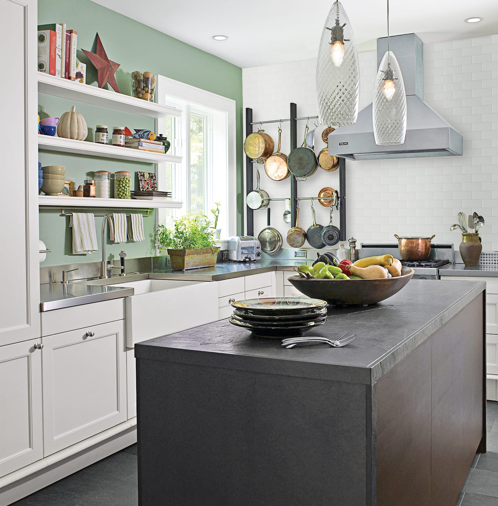
The remodeled kitchen removes a few uppers, adds deep drawers, creates a prep zone near the sink, and replaces the oversized island with a slimmer furniture-style island. The cabinets combine warm white uppers with natural wood lowers. The faucet is polished nickel, the hardware is aged brass, and the pendant lights include a black detail that ties back to the range. Under-cabinet lighting brightens the counters. A short open shelf holds daily dishes. The backsplash has texture, the range hood vents properly, and the pantry finally stops pretending to be a black hole.
The room breaks several old rules, but it feels calmer, more useful, and more personal. That is the whole point.
Experience Notes: What Real Kitchen Rule-Breaking Feels Like
Living through a kitchen before and after teaches one lesson very quickly: the “perfect” design on paper can become very imperfect when someone is trying to unload groceries, answer a text, stop the pasta from boiling over, and find the missing lid to a storage container all at the same time. Real kitchens are not magazine spreads. They are action scenes with snacks.
One of the most useful experiences is testing habits before making changes. For a week, pay attention to where people naturally drop bags, make coffee, chop vegetables, feed pets, charge devices, and stack mail. These little patterns reveal more than any generic design rule. If everyone enters through the side door and dumps keys on the counter, the after kitchen needs a landing zone. If two people cook together, the remodel needs wider paths or separate prep areas. If the coffee maker is the first appliance used every morning, it deserves a real station instead of a sad corner next to the toaster.
Another experience: lighting always matters more than expected. Many homeowners focus on cabinets and counters first, then realize the beautiful new surfaces look dull under weak lighting. Task lighting under cabinets can completely change how a kitchen works at night. A dimmer switch can make the room feel cozy after dinner. Pendants can add charm, but they should support the lighting plan, not carry the whole production like a tired lead actor.
Storage also becomes emotional. People often think they need more cabinets, but what they really need is smarter access. Deep drawers can make a kitchen feel larger because items are easier to see and reach. Pullout trash, tray dividers, drawer organizers, and pantry shelves at practical heights can reduce daily irritation. A kitchen that stores things logically feels peaceful even when dinner is running late.
The biggest surprise is how freeing it feels to break matching rules. Mixed metals or two-tone cabinets may sound risky at first, but when repeated thoughtfully, they make a kitchen feel richer and more personal. A little contrast can wake up the room. The key is restraint. Three finishes can look intentional; thirteen can look like the hardware aisle exploded.
Finally, a successful kitchen before and after is not measured only by how dramatic the photos look. It is measured by whether mornings feel easier, cooking feels smoother, guests gather comfortably, and cleaning does not require heroic levels of denial. A beautiful kitchen is wonderful. A beautiful kitchen that works hard without complaining is even better.
Conclusion: Break the Right Rules, Keep the Smart Ones
A great kitchen before and after is not about rebellion for rebellion’s sake. It is about knowing which rules protect function and which rules only protect boring design. Keep the rules that support safety, comfort, ventilation, clearances, and durability. Break the rules that force every kitchen to look the same.
Mix finishes. Rethink the triangle. Use color. Shrink the island. Add open shelves only where they make sense. Choose lighting that flatters both the countertops and the cook. Keep character. Hide clutter. Make room for real routines. The best after kitchen does not whisper, “I followed every rule.” It says, “I know exactly how this household livesand I look good doing it.”