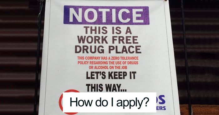
Bad text design is a special kind of comedy. It does not need a punchline, a stage, or even a willing audience. All it needs is one unfortunate font choice, a reckless line break, or a word split so badly that an innocent sign suddenly looks like it was written by a raccoon with a marketing degree.
Text design fails are everywhere: restaurant menus, store windows, wedding invitations, billboards, packaging, social media ads, school posters, restroom signs, and that one flyer taped to a telephone pole that somehow uses eight fonts, four gradients, and zero mercy. The funny part is that most of these designs were probably made with good intentions. Someone wanted to be bold. Someone wanted to be creative. Someone wanted the word “CLICK” to look exciting and accidentally created a public relations incident.
But beneath the laughter, there is a real design lesson. Great typography is not just about making words pretty. It is about readability, visual hierarchy, spacing, contrast, accessibility, and context. When those pieces fall apart, the message does not merely become ugly. It becomes confusing, misleading, hilarious, or completely unreadable. In other words, it becomes internet gold.
Why Text Design Fails Are So Funny
The best text design fails usually happen when the designer forgets one simple truth: people read quickly. We scan. We skim. We glance. We do not politely sit down with a confusing poster and say, “Let me honor the designer’s creative journey by decoding this like an ancient tablet.” If the eye reads the wrong word first, the joke writes itself.
Typography works like a traffic system. Size tells us where to look first. Spacing tells us which letters belong together. Contrast tells us what matters. Alignment gives the page structure. When those signals are broken, the reader takes a wrong turn and crashes directly into comedy.
That is why a poorly spaced slogan can look accidentally rude, a decorative font can turn a simple word into alphabet soup, and a motivational quote can become a hostage note if every word is in a different style. Bad text design is funny because it feels almost correct. It is close enough to recognize, but wrong enough to make your brain trip over its own shoelaces.
The 40 Most Common Text Design Fails That Are So Bad They’re Good
Here are forty classic text design fails that continue to appear in the wild, proving that letters may be small, but they are capable of causing enormous chaos.
1. The Kerning Catastrophe
Kerning is the space between letters. When it goes wrong, normal words suddenly become suspicious. A friendly shop sign can look like it is advertising something entirely different. One tiny gap can turn a brand message into a public apology.
2. The Line Break Disaster
Line breaks matter. Splitting a sentence in the wrong place can change the meaning completely. A wholesome phrase like “Kids Eat Free” becomes much less wholesome if the words are stacked with zero planning.
3. The Font Buffet
Some designs use one font for the headline, one for the subheadline, one for emphasis, one for decoration, and three more because apparently the designer wanted the poster to resemble a ransom note from a craft store.
4. The Invisible Text Trick
Light gray text on a white background may look elegant on a designer’s monitor, but to everyone else it says, “Good luck, detective.” Low contrast is not sophistication. It is hide-and-seek with information.
5. The All-Caps Scream
All caps can work for short labels or urgent warnings. But when an entire paragraph is capitalized, it feels like the sign is yelling at you while holding a clipboard.
6. The Script Font Situation
Decorative script fonts can be beautiful in small doses. Use them for everything, and suddenly your menu looks like it was handwritten by a Victorian ghost during turbulence.
7. The Too-Tiny Text Trap
If people need to zoom, squint, lean forward, and question their eyesight, the text is too small. Fine print should not be the main design strategy.
8. The Giant Word Problem
Oversized text can create drama, but when one random word is enormous for no reason, readers assume it is important. If the biggest word on your flyer is “and,” something has gone terribly wrong.
9. The Centered-Everything Poster
Center alignment has its place, but centering every heading, paragraph, bullet point, address, and phone number creates a wobbly visual tower. The eye has no stable starting point.
10. The Rainbow Typography Attack
Color can guide attention. Too many colors can make text look like it fell into a box of crayons and emerged with confidence it did not deserve.
11. The Background Betrayal
Text placed over a busy photo often disappears. If your message is sitting on top of trees, clouds, faces, and fireworks, do not be surprised when no one can read it.
12. The Wrong Mood Font
A funeral program in Comic Sans. A children’s birthday invite in a horror font. A luxury brand logo that looks like a garage sale sticker. Fonts have personalities, and some personalities should not be invited.
13. The Stretchy Letter Crime
Stretching type horizontally or vertically rarely improves it. It usually makes the letters look like they survived a cartoon anvil accident.
14. The Fake 3D Explosion
Drop shadows, bevels, glows, outlines, and gradients can quickly turn text into a haunted bowling alley sign. Effects should support readability, not challenge it to a duel.
15. The Missing Hierarchy Mess
When everything is bold, nothing is bold. Without hierarchy, readers do not know what to read first, second, or never.
16. The Overlapping Letters Incident
Overlapping text may look artistic in a mood board, but in real life it often looks like two words fighting in a parking lot.
17. The Bad Sign Placement Fail
Sometimes the text is fine, but the placement ruins everything. A pole, fold, door handle, or product curve can cover one letter and create a brand-new word no one approved.
18. The Confusing Read Order
If readers cannot tell whether to read left to right, top to bottom, clockwise, or emotionally, the layout has failed.
19. The Logo That Reads Wrong
Logos are especially vulnerable to spacing mistakes. A clever arrangement of letters can accidentally create a second word, and that second word is usually not flattering.
20. The Menu Typography Meltdown
Restaurant menus often suffer from tiny prices, decorative food names, crowded descriptions, and headings that look like side dishes. Hungry people should not need a treasure map.
21. The Poorly Wrapped T-Shirt
Text on clothing changes when the fabric moves. A phrase that looks fine flat can become wildly unfortunate once worn by a human body with shoulders, elbows, and opinions.
22. The Vertical Text Puzzle
Vertical text can be stylish, but it must be handled carefully. Otherwise, people tilt their heads like confused golden retrievers trying to read a tax form.
23. The Spacing That Creates New Words
Too little space between words can fuse them into nonsense. Too much space can separate words that belong together. Either way, the reader becomes an unwilling editor.
24. The Overdecorated Invitation
Weddings, birthdays, and baby showers often inspire extreme font enthusiasm. Unfortunately, romance can quickly become unreadable when every detail is wrapped in curls, swashes, and floral chaos.
25. The Sign That Accidentally Insults People
Bad punctuation, awkward breaks, or missing words can make public signs sound rude. “Please use bathroom customers only” is not the warm hospitality message anyone intended.
26. The Misleading Emphasis Fail
Emphasis tells people what matters. Highlighting the wrong word can turn a normal sentence into something suspicious, dramatic, or accidentally sarcastic.
27. The Mobile Cropping Disaster
Text that looks good on desktop can be sliced apart on mobile. If a headline becomes “Fresh Hot Ch,” users may not stay long enough to discover the chicken.
28. The Button Nobody Can Read
Buttons need clarity. A pale label on a pale button is not minimalist. It is a tiny rectangle of uncertainty.
29. The Overly Clever Poster
Sometimes designers arrange words into shapes, spirals, waves, or objects. It can look cool. It can also make the reader work harder than a crossword champion on espresso.
30. The Unfortunate Abbreviation
Shortening words can save space, but abbreviations need context. Otherwise, a simple label can look like a secret code or an accidental joke.
31. The Decorative Font in Body Copy
Expressive fonts belong in small, controlled moments. Using them for long paragraphs is like making people read a novel through a lace curtain.
32. The No-Spacing Poster
White space is not wasted space. It gives text breathing room. Without it, the design feels like every word is trying to board the same elevator.
33. The Bad Translation Layout
Translated text often expands or contracts. If the layout does not adapt, the result can be clipped words, broken spacing, or labels that look like they gave up halfway.
34. The Wrong Contrast for Outdoor Signs
Outdoor signs must survive sunlight, rain, shadows, distance, and moving traffic. Delicate pastel text may look charming indoors but vanish outside like a shy ghost.
35. The Clashing Brand Voice
A serious message in a playful font creates confusion. A playful message in a corporate font can feel like a tax notice wearing party glasses.
36. The Typo Plus Design Combo
A typo is bad. A typo enlarged to billboard size with neon effects is unforgettable. Proofreading is cheaper than becoming a meme.
37. The Text Over Face Fail
Placing text across a person’s face in an ad can create strange expressions, accidental mustaches, or words emerging from someone’s forehead. None of these are ideal.
38. The Misplaced Arrow or Label
Labels need to point to the correct thing. If the arrow points somewhere ambiguous, users may misunderstand the instruction, the product, or their entire life path.
39. The QR Code Crowd
When text, logos, icons, and QR codes are crammed together, nothing gets attention. A crowded design is basically a group project where every element speaks at once.
40. The “Almost Genius” Fail
The funniest text design fails are often creative ideas that nearly worked. They had energy. They had ambition. They simply forgot to ask one important question: “Can a normal person read this without laughing?”
What Bad Text Design Teaches Us
Text design fails are not just visual jokes. They are reminders that typography has a job. Before text can be stylish, it has to be readable. Before it can be clever, it has to be clear. Before it can impress anyone, it has to communicate the right message in the right order.
Good text design starts with hierarchy. The reader should instantly understand what the headline is, what the supporting details are, and what action to take next. Size, weight, spacing, and contrast all help create that path. When hierarchy disappears, the design becomes a crowd of words wearing the same outfit.
Readability also depends on context. A poster viewed from ten feet away needs larger, simpler type than a brochure held in someone’s hand. A mobile ad needs flexible text that does not get cropped. A package label needs to remain readable when wrapped around a bottle, box, bag, or tube. The best designers think beyond the screen and imagine the real-world moment when someone actually sees the message.
Accessibility is another major lesson. Text should have enough contrast against its background, use legible typefaces, and avoid relying only on color to communicate meaning. When text is readable for more people, it works better for everyone. That includes people with low vision, older readers, mobile users in bright sunlight, tired shoppers, distracted drivers, and anyone who has ever tried to read a menu in a restaurant with mood lighting that says, “Good luck.”
How to Avoid Becoming the Next Text Design Fail
Use Fewer Fonts
Two typefaces are usually enough: one for headings and one for body text. Sometimes one well-designed font family can do everything. If your design needs six fonts to feel interesting, the problem is probably not the fonts. It is the concept.
Check the Read Order
Before publishing, ask someone else to read the design quickly. Do they read the words in the correct order? Do they understand the message immediately? If they pause, laugh, or say, “Wait, is this supposed to say that?” revise immediately.
Respect Spacing
Kerning, tracking, line spacing, and margins are not tiny details. They are the invisible structure that keeps text from becoming chaos. Give letters enough room to be recognized and words enough room to stay together.
Test Contrast
Text should stand out clearly from its background. Avoid pale text on pale backgrounds, dark text on busy images, and color combinations that vibrate like they are arguing. If the text matters, make it readable.
Preview the Final Format
A design is not finished until it has been checked in its real environment. View the poster from a distance. Test the website on mobile. Print the label. Wear the shirt. Fold the brochure. Walk past the sign. Reality is the toughest design reviewer, and it does not care about your mood board.
Experiences Related to Text Design Fails
Anyone who has worked with design, marketing, printing, or social media has probably met a text design fail in person. It usually begins innocently. A small business owner wants a flyer for a weekend sale. A student wants a poster for an event. A restaurant wants a menu that feels “modern but fun.” Then someone opens a design tool, discovers the font menu, and the adventure begins.
One common experience is the “it looked fine on my screen” problem. A design may look clean on a bright laptop display, but once printed, the gray text becomes nearly invisible. The headline that seemed dramatic at full size becomes cramped on a phone. The elegant script that looked charming in a template becomes unreadable when used for a street sign. This is why professional designers test their work across formats. A design is not only what you see while creating it. It is what the audience sees in the real world.
Another familiar experience is the group feedback spiral. One person says, “Can we make the headline bigger?” Another says, “Can we add more color?” Someone else says, “Can we include the full address, phone number, website, Instagram handle, QR code, sponsor logo, parking instructions, and a motivational quote?” Suddenly, a clean design becomes a visual storage closet. Nobody meant to ruin it. Everyone simply wanted their piece included. Good design often requires the courage to say no, or at least, “Maybe the parking instructions do not need to be in glitter purple.”
There is also the pain of discovering a fail after publication. Maybe the banner has already been printed. Maybe the social post is live. Maybe the T-shirts have arrived, and the line break across the chest has created a phrase that nobody can unsee. These moments are embarrassing, but they are also educational. After one public typo or spacing disaster, people become much more respectful of proofreading, mockups, and second opinions.
The funniest part is that text design fails often bring people together. Strangers point, laugh, take photos, and share the mistake online. The design may have failed at its original job, but it succeeds as comedy. A bad sign can become more memorable than a perfect one. Of course, that is not a recommended branding strategy unless your business model is “accidental internet fame.”
From experience, the best prevention is simple: slow down before publishing. Read the design out loud. Look at it from far away. Flip it upside down to check balance. Ask someone who has never seen it before what they notice first. Zoom out. Print a draft. Test it on a phone. Check whether any letters accidentally merge into a new word. These small steps can save a design from becoming the next hilarious screenshot in a “so bad it’s good” collection.
Conclusion
Text design fails are funny because they reveal how powerful typography really is. A little spacing mistake can rewrite a message. A poor font choice can change the mood. A bad line break can turn a serious sign into a comedy act. But these mistakes also make design easier to understand. They show us why readability, hierarchy, contrast, alignment, and context matter.
The next time you see a sign that reads like a puzzle, a poster that screams in seven fonts, or a menu that requires the eyesight of an eagle, enjoy the laugh. Then remember the lesson: good text design is not about showing off every trick in the toolbox. It is about helping people understand the message quickly, comfortably, and correctly.
And if your design accidentally becomes funny? Congratulations. You may not have created perfect typography, but you did create content. The internet thanks you.
Note: This article is written as original, publish-ready content based on real typography, UX, readability, and accessibility principles, with no copied examples or unnecessary source-code artifacts.