Some white paints walk into a room wearing sneakers. White Tie No. 2002 Paint walks in wearing polished shoes, a linen pocket square, and the calm confidence of someone who knows exactly where the best chair is. This Farrow & Ball shade is not a cold, gallery-white wall color that makes your living room feel like a dentist’s waiting area. It is a soft, pale, creamy white with a gentle yellow base and just enough depth to keep it from looking flat.
For homeowners, decorators, designers, and anyone standing in front of a wall thinking, “Why are there 900 whites and why do they all look different?” White Tie No. 2002 is worth serious attention. It belongs to the world of warm whites and off-white paint colors: timeless, flexible, flattering, and a little more forgiving than bright white. It is especially loved for traditional interiors, cottage-style rooms, soft modern spaces, historic homes, and rooms that need warmth without turning yellow.
In this guide, we’ll explore what White Tie No. 2002 Paint really looks like, where it works best, how to pair it with trim, ceilings, wood tones, furniture, and lighting, and how to avoid the most common warm-white paint mistakes. Consider this your friendly, in-depth paint briefingwith fewer panic spirals in the sample aisle.
What Is White Tie No. 2002 Paint?
White Tie No. 2002 is a Farrow & Ball paint color described as a pale creamy white. Its name comes from the look of old, pre-brightened, starched cotton once used for formal white tie jackets. That reference matters because the color is not a harsh modern white. It has a vintage softness, like sunlight filtered through linen curtains.
The color sits in the yellow-based neutral family. That means it carries warm undertones, but it is not a buttery yellow. A tiny touch of black pigment gives it extra depth, helping the shade feel grounded rather than sugary. In practical terms, White Tie reads as a warm off-white that can make rooms feel gentle, layered, and quietly elegant.
It is the kind of paint color that works when you want your walls to feel finished but not loud. It creates a background that supports furniture, artwork, books, natural wood, brass hardware, woven rugs, and vintage pieces without fighting for attention. It is polite, but not boring. Think “well-mannered dinner guest,” not “plain toast.”
Why White Tie No. 2002 Is Popular
It Adds Warmth Without Overpowering a Room
The biggest strength of White Tie No. 2002 Paint is its warmth. Many homeowners choose white paint because they want brightness, but then end up with a color that feels sterile. Bright whites can look sharp, blue, or clinical, especially in spaces with strong daylight or cool artificial lighting. White Tie softens that effect.
Because of its creamy undertone, it can make a room feel more welcoming. It is especially helpful in spaces that have hard surfaces, such as stone floors, tile, marble, glass, metal, or minimal furniture. Instead of bouncing light back in a harsh way, White Tie gives light a softer glow.
It Works Beautifully in Traditional and Transitional Homes
White Tie has a natural relationship with classic interiors. It looks at home with paneling, crown molding, built-ins, fireplaces, antique mirrors, botanical prints, linen upholstery, and aged wood. However, it is not limited to old houses. In a newer home, it can prevent minimalist rooms from feeling too cold.
That makes it ideal for transitional design, where traditional details meet clean-lined furniture. Picture White Tie walls with a slipcovered sofa, oak coffee table, black picture frames, and a ceramic lamp. Nothing screams for attention, yet the room feels complete.
It Plays Nicely With Other Warm Neutrals
White Tie is often paired with other warm Farrow & Ball neutrals such as Matchstick, String, New White, and Wimborne White. These shades create a soft, layered palette instead of a high-contrast one. If you dislike abrupt trim lines or bright white ceilings, White Tie gives you options.
You can use it on walls with a slightly fresher white on trim, or use it across walls, ceilings, and woodwork for a color-drenched effect. In a low-contrast scheme, architectural details become subtle rather than shouty. Your baseboards will not look like they are trying to win a staring contest.
Undertones: Is White Tie Yellow, Cream, or Off-White?
White Tie No. 2002 is best described as a warm creamy white. It has yellow undertones, but the black pigment keeps it from becoming too sweet or lemony. This is the important distinction: a yellow-based white can feel warm and elegant, while a yellow paint can feel much more obvious.
In north-facing rooms, White Tie may look slightly deeper and creamier. In south-facing rooms, it can look brighter and warmer. In east-facing rooms, it may feel fresh in the morning and softer later in the day. In west-facing rooms, it can pick up a golden glow in the afternoon and evening.
That changing personality is normal. White paint is basically the mood ring of interior design. It reflects flooring, furniture, trees outside the window, nearby buildings, light bulbs, and even the color of your sofa. This is why testing White Tie in your actual room is essential before committing.
Best Rooms for White Tie No. 2002 Paint
Living Rooms
White Tie is excellent for living rooms because it creates a relaxed, comfortable backdrop. It pairs well with natural textures such as rattan, jute, wool, linen, leather, and oak. If your living room has a fireplace, built-in shelves, or vintage furniture, this color can make those features feel intentional and charming.
For a cozy living room, combine White Tie walls with warm wood floors, cream upholstery, brass accents, and muted artwork. For a more tailored look, add black lampshades, dark bronze hardware, or charcoal picture frames. The contrast gives the room structure without stealing the softness.
Kitchens
In kitchens, White Tie can work on walls, cabinetry, or breakfast nooks. It looks especially good with butcher block counters, honed marble, soapstone, unlacquered brass, aged copper, and natural stone. It is also a smart choice if you want a kitchen that feels bright but not icy.
If using White Tie on kitchen walls, consider a washable finish such as Modern Emulsion. Kitchens are heroic rooms where tomato sauce, steam, fingerprints, and mysterious splashes appear as if summoned by a tiny chaos wizard. A more durable finish helps keep the color looking fresh.
Bedrooms
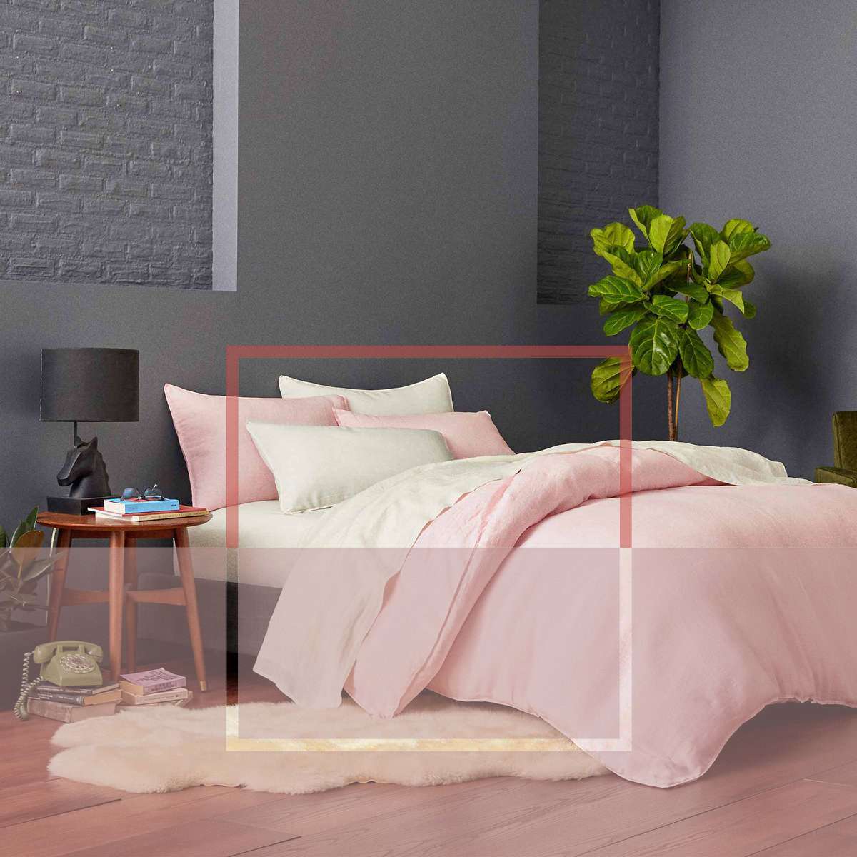
White Tie is a lovely bedroom paint color because it feels restful and soft. Unlike stark white, it does not create a high-energy glare. It works with upholstered headboards, wood nightstands, patterned quilts, warm lamps, and soft curtains.
For a calm bedroom, pair White Tie with oatmeal linen, warm taupe, dusty rose, muted olive, or soft blue-gray accents. The color gives you flexibility: you can keep the room neutral or layer in seasonal textiles without repainting every time your taste changes.
Bathrooms
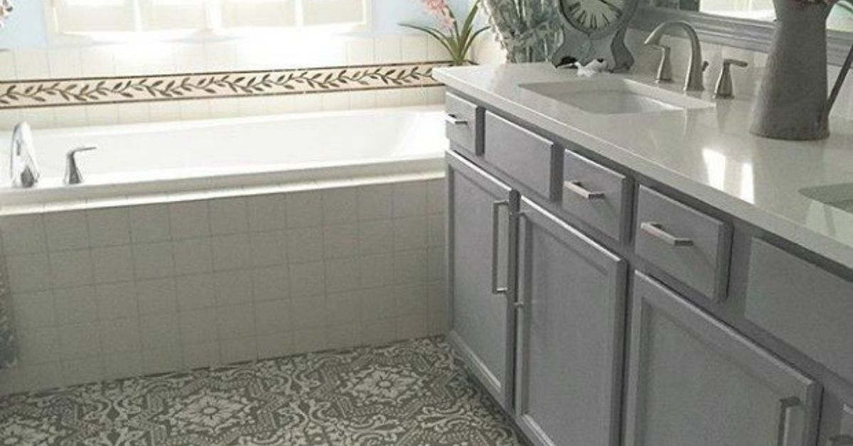
In bathrooms, White Tie can make white tile, stone, and chrome feel warmer. However, lighting matters here. Bathrooms often have limited natural light and strong artificial bulbs, so test the color next to tile, countertops, and mirrors. A warm white can look beautiful, but the wrong bulb can make it appear more yellow than expected.
For bathrooms, choose a moisture-friendly, washable finish. Pair White Tie with marble, warm brass, creamy tile, woven baskets, and wood vanities for a polished but welcoming look.
Hallways and Entryways
Hallways are tricky because they often lack natural light. White Tie can help them feel less cold, especially compared with sharp whites or cool grays. It gives narrow spaces a gentle lift while keeping the mood warm.
For entryways, White Tie works well with black doors, wood benches, vintage runners, framed art, and aged brass hooks. It creates a first impression that says, “Welcome, come in,” rather than, “Please remove your personality at the door.”
Best Trim and Ceiling Colors With White Tie
White Tie can be paired with Wimborne White for a slightly cleaner trim contrast. This combination keeps the scheme warm but gives woodwork a subtle lift. It is a good choice if you want traditional white trim without the harshness of bright builder white.
Another option is to use White Tie on both walls and trim in different finishes. For example, walls could be painted in a matte finish and trim in a more durable eggshell or satin-like finish. This approach creates a seamless, designer look. The room feels larger and calmer because the eye is not chopped up by strong contrast.
For ceilings, White Tie can be used if you want a cozy, enveloping effect. If the room has low ceilings or limited light, a lighter complementary white may help keep the space feeling open. The best choice depends on your flooring, window direction, and furniture palette.
What Colors Pair Well With White Tie No. 2002?
Soft Neutrals
White Tie pairs naturally with warm neutrals such as beige, oatmeal, sand, mushroom, taupe, and stone. These colors create a layered palette that feels calm and expensive. Not “private island expensive,” necessarily, but definitely “someone owns matching lamps” expensive.
Natural Wood Tones
Oak, pine, walnut, and antique wood all look beautiful with White Tie. The warm undertone of the paint complements wood grain rather than making it appear orange or muddy. If your home has original wood trim or vintage floors, White Tie can bridge old and new elements gracefully.
Muted Greens and Blues
Because White Tie is warm, it can balance muted greens and blues. Try it with sage, olive, gray-green, duck egg blue, dusty navy, or muted teal. The contrast feels classic rather than trendy. This is especially effective in bedrooms, studies, and sitting rooms.
Black, Bronze, and Brass
White Tie also looks excellent with dark accents. Matte black hardware, bronze sconces, and brass knobs add definition. This prevents a cream-toned room from becoming too soft or sleepy. Every room needs a little punctuation; otherwise, it becomes one long beige sentence.
Choosing the Right Finish
The finish you choose affects both durability and appearance. A matte finish makes White Tie look soft and velvety, while a higher-sheen finish can make the color appear slightly brighter or more reflective.
Dead Flat
Dead Flat is a very low-sheen option suitable for interior walls, ceilings, woodwork, and metal. It is useful when you want a seamless, ultra-matte look across multiple surfaces. This can be especially attractive in older homes with paneling, doors, or trim that you want to visually blend with the walls.
Estate Emulsion
Estate Emulsion gives a classic chalky matte look. It is beautiful in bedrooms, formal living rooms, dining rooms, and low-traffic spaces. If you love the soft Farrow & Ball look, this finish delivers that signature powdery effect.
Modern Emulsion
Modern Emulsion is more washable and durable, making it a smart choice for kitchens, bathrooms, hallways, family rooms, and homes with children or pets. It has a slightly higher sheen than ultra-flat finishes, but it still reads as matte to most people.
Eggshell and Gloss Options
For trim, doors, cabinetry, and furniture, consider appropriate wood and metal finishes. These finishes are designed for surfaces that get handled, bumped, opened, closed, and occasionally attacked by backpacks. Durability matters.
How to Test White Tie Before Painting
Testing is not optional with warm white paint. It is the difference between “dreamy cream” and “why does my hallway look like vanilla pudding?” Paint a large sample area or use a high-quality sample sheet. Place it on multiple walls and observe it in morning, afternoon, evening, and artificial light.
Look at the sample next to flooring, countertops, tile, upholstery, curtains, and trim. If you are painting cabinets, test the color vertically and horizontally because light hits those surfaces differently. Also check it under your actual light bulbs. Warm bulbs can emphasize the creaminess, while cool bulbs can make the undertone feel cleaner.
Do not judge White Tie from a tiny paint chip alone. A two-inch square cannot explain how a whole room will feel. That is like choosing a wedding cake after licking one sprinkle.
Common Mistakes to Avoid
Using Bright White Trim Without Testing
Bright white trim can make warm white walls look dingy by comparison. If you want contrast, choose a complementary soft white rather than a harsh blue-white. White Tie usually looks better with warm or balanced trim colors.
Ignoring Natural Light
Rooms with strong sunlight can intensify undertones. Since White Tie has a yellow base, very bright southern or western light may make it appear warmer. This can be beautiful, but it should be expected.
Choosing the Wrong Finish for the Room
A delicate matte finish may look stunning, but a busy hallway or kitchen needs more durability. Choose the finish based on how the room is actually used, not how peacefully it behaves in your imagination.
Assuming All Creamy Whites Are the Same
White Tie is not identical to every off-white or cream. Some warm whites lean peach, beige, gray, or green. White Tie has a distinct yellow-based warmth with subtle depth, so compare it with your materials before making the final decision.
Who Should Choose White Tie No. 2002?
Choose White Tie No. 2002 Paint if you want a warm white that feels traditional, soft, and refined. It is ideal for people who dislike stark white but still want brightness. It also suits homes with natural materials, vintage furniture, warm woods, classic architectural details, and layered neutral palettes.
You may want a different white if your home is ultra-modern with cool stone, blue-gray flooring, icy lighting, and chrome finishes. In those spaces, White Tie may feel too creamy unless balanced carefully. But if your goal is warmth, elegance, and gentle charm, White Tie deserves a place on your shortlist.
Experience Notes: Living With White Tie No. 2002 Paint
One of the best ways to understand White Tie No. 2002 Paint is to imagine the real experience of using it, not just the perfect photo version where nobody owns phone chargers, laundry baskets, or snacks. In daily life, White Tie behaves like a warm, flexible backdrop. It does not demand a complete personality change from your home. Instead, it quietly improves what is already there.
In a living room, the first impression is usually softness. The walls look finished, but they do not dominate the furniture. A beige sofa looks intentional, not accidental. Wood tones feel richer. Brass lamps look warmer. Black frames feel crisp but not severe. Even colorful books on shelves seem happier, as if they have finally found good lighting for their author photo.
In a bedroom, White Tie can feel especially comforting. During the morning, it may look clean and gently bright. By evening, with warm lamps turned on, it becomes creamier and more relaxed. This makes it a strong choice for people who want a bedroom that feels calm but not cold. White bedding still looks fresh against it, while linen, oatmeal, dusty pink, or sage accents add depth.
In a kitchen, the experience depends heavily on surfaces. With warm wood floors and brass hardware, White Tie can feel elegant and timeless. With cool gray counters or blue-white tile, it may reveal its yellow undertone more clearly. That does not mean it cannot work, but it does mean the sample test should happen near the actual backsplash, countertop, and cabinet finish. Paint has opinions, and it will share them under overhead lighting.
For older homes, White Tie often feels natural. It suits plaster walls, cottage beams, paneled doors, and slightly imperfect surfaces. A very stark white can make old walls look bumpy or tired, while White Tie is more forgiving. It softens shadows and gives character room to breathe. If your house has quirks, White Tie tends to say, “Charming,” not “Please call a contractor immediately.”
For small apartments, White Tie can be a smart whole-home color if the goal is warmth and continuity. Painting connected spaces in the same soft white can make the layout feel calmer. However, in rooms with very little natural light, test carefully. It may become creamier than expected, which can be cozy or too warm depending on your furniture and bulbs.
The most satisfying experience with White Tie usually comes from pairing it thoughtfully. It loves natural textures: woven shades, sisal rugs, linen curtains, oak tables, ceramic vases, stoneware bowls, and aged metal. It also benefits from contrast. A few dark accentsa black mirror, bronze sconce, deep green chair, or walnut cabinetkeep the room from floating away into a cloud of cream.
The biggest lesson is simple: White Tie No. 2002 Paint is not a “default white.” It is a design choice. It has warmth, history, and personality. Used well, it can make a home feel softer, more welcoming, and more collected. Used without testing, it may surprise you, because warm whites are tiny drama queens in elegant clothing. Give it the right lighting, finish, and companions, and White Tie can become the kind of color people notice without immediately knowing why the room feels so good.
Conclusion
White Tie No. 2002 Paint is a refined warm white for anyone who wants brightness without harshness. Its creamy yellow-based undertone, subtle depth, and classic character make it a beautiful choice for living rooms, bedrooms, kitchens, bathrooms, hallways, trim, and full-home palettes. It pairs especially well with warm neutrals, natural wood, brass, muted greens, soft blues, and traditional architectural details.
The key is to test it properly. White Tie changes with light, finish, and surrounding materials. In the right room, it delivers a gentle glow that feels elegant, comfortable, and timeless. It is not the loudest color in the fan deck, but that is exactly its strength. White Tie proves that a white paint can be quiet and still have plenty to say.