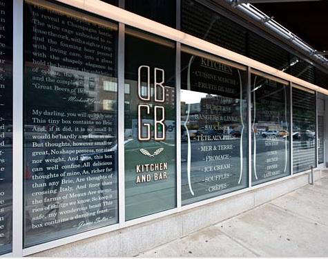
Some restaurant interiors whisper. Others clear their throat, adjust their linen napkin, and announce exactly who they are. DBGB Kitchen & Bar, Daniel Boulud’s once-buzzing Bowery brasserie-tavern in New York City, belonged firmly in the second camp. It mixed French culinary confidence with downtown grit, then softened the whole thing with bistro chairs, upholstered booths, open shelving, and a gleaming battalion of copper pots. The result was not just a dining room; it was a design clue board.
That is why “Design Sleuth: DBGB Thonet Bistro Chair & Copper Pots” remains such a useful case study for anyone who loves restaurant design, vintage kitchen decor, Thonet bistro chairs, copper cookware, or the fine art of making a room look collected instead of decorated by a panicked committee. DBGB showed how two humble elementsa bentwood chair and a wall of cookwarecould carry an entire design story.
Let’s investigate the scene, Sherlock-style, minus the magnifying glass and plus a very good appetite.
The DBGB Design Story: Bowery Grit Meets French Bistro Polish
DBGB Kitchen & Bar opened in 2009 at 299 Bowery, a location loaded with New York restaurant-supply history and cultural memory. The name nodded cheekily to CBGB, the legendary punk venue nearby, while the food concept fused French brasserie tradition with American tavern energy. Think sausages, burgers, beer, seafood, and enough Daniel Boulud finesse to remind diners that “casual” did not mean “careless.”
The dining room leaned into the Bowery’s utilitarian past. Instead of hiding storage, it celebrated it. Open shelves displayed wine, dry goods, glassware, cookware, and practical kitchen objects. This was not minimalism. It was organized abundance. The room suggested a restaurant-supply shop that had dressed up for dinner and remembered to wear good shoes.
The design worked because it had layers. Concrete floors and dark wood gave the space a sturdy industrial base. Upholstered booths added comfort. Semi-open kitchen views created culinary theater. Then came the decorative masterstroke: well-worn copper pots and pans, many connected to respected chefs, arranged like trophies of craft rather than shiny props.
Why the Thonet Bistro Chair Was the Perfect Clue
The Thonet bistro chair is one of those designs that seems so familiar we forget how radical it once was. Michael Thonet’s bentwood process helped change furniture history in the nineteenth century. The famous No. 14 chair, introduced in 1859, became known as the Vienna coffee house chair and later an international bistro icon. Its magic lies in economy: curved wood, light structure, graceful silhouette, and a confidence that does not need upholstery, chrome legs, or a motivational quote on the wall.
At DBGB, a Thonet-style bistro chair made perfect sense. It connected the restaurant to European café culture while staying practical for a busy dining room. A good restaurant chair must do more than look cute in a photograph. It has to be light enough for staff to move, sturdy enough for thousands of diners, compact enough for tight layouts, and timeless enough not to look dated by dessert.
The Bentwood Chair’s Secret Weapon
Bentwood furniture is loved because it feels both handmade and industrial. The curves are warm and human, but the construction is efficient. The classic Thonet chair is not bulky. It does not bully the table. It slides into a room with the quiet confidence of a regular who knows the bartender.
For home decorators, the lesson is simple: when you want a kitchen or dining room to feel bistro-inspired, start with seating that has history. A Thonet bistro chair, or a high-quality bentwood dining chair inspired by it, can add café charm without turning your home into a theme restaurant. Pair it with a marble-topped table, a dark wood farm table, or even a simple round pedestal table. The chair adapts like a polite guest.
Copper Pots: The Warm Glow That Made DBGB Memorable
If the Thonet chair supplied the bistro grammar, copper pots supplied the accent. Copper cookware has long been associated with serious kitchens, especially French kitchens, because it conducts heat quickly and evenly. For chefs, that responsiveness matters. Sauces, delicate proteins, and precise cooking techniques benefit from a pan that reacts quickly when heat changes.
But copper is not only functional. It is visual poetry with handles. In a restaurant interior, copper adds warmth, reflection, age, and culinary credibility. Stainless steel says “professional.” Copper says “professional, but possibly also capable of making a sauce that will change your personality.”
At DBGB, the copper pots were more than decoration. They told diners that the restaurant respected cooking as craft. Their patina mattered. Perfectly polished copper can be beautiful, but slightly worn copper feels lived-in. It suggests heat, use, repetition, and meals remembered. In design terms, patina is texture with a backstory.
Why Copper Works So Well in Interiors
Copper sits in the warm-metal family with brass and gold, but it has a more culinary, earthy quality. It pairs beautifully with dark wood, blackened steel, white tile, stone, leather, and aged mirrors. In DBGB’s case, copper softened the industrial shell. Without it, the room might have felt too gray, too hard, too warehouse-adjacent. With it, the space glowed.
For homeowners, copper can be used in several ways: hanging pots over a kitchen island, displaying a few vintage pans on a rail, adding copper molds to a wall, or using a single copper saucepan as a sculptural object on open shelving. The trick is restraint. One copper moment looks intentional. Fifty copper moments can start to resemble a cookware yard sale with excellent lighting.
Open Shelving: Storage as Storytelling
One of DBGB’s smartest design moves was using open shelving as atmosphere. In many homes, open shelves become a battlefield between aspiration and cereal boxes. In restaurants, however, open shelving can create rhythm, depth, and narrative. DBGB’s shelves worked because the objects belonged to the concept: cookware, wine, provisions, and restaurant-supply references.
The same idea applies at home. If you use open shelving, curate it around a theme. A bistro-style kitchen might include stacks of white plates, clear glassware, copper pans, wooden boards, linen napkins, and a few pantry jars. Avoid random clutter. Open shelving is not a storage solution for things that lost a custody battle with your cabinets.
How to Recreate the DBGB Look at Home
You do not need a New York restaurant budget or a chef’s copper collection to borrow the DBGB mood. Focus on materials, silhouettes, and contrast.
1. Choose Bistro Seating With Character
Start with bentwood chairs, cane-seat chairs, or simple café chairs in black, walnut, or natural beech. A Thonet bistro chair is the classic reference, but the broader idea is lightweight, curved, timeless seating. Avoid overly bulky dining chairs if your goal is European café ease.
2. Add Copper as a Focal Point
Instead of scattering copper everywhere, choose one strong display. Hang three to five copper pans on a wall rail. Place one large copper stockpot above cabinetry. Add a vintage copper mold collection to a breakfast nook. Let copper be the warm note that pulls the eye, not the entire orchestra.
3. Use Dark Wood and Practical Surfaces
DBGB’s appeal came partly from the mix of polish and utility. Dark wood, butcher-block accents, stone, concrete-look tile, or matte black metal can help create that restaurant-supply-meets-bistro feeling. The goal is handsome durability. If a surface looks afraid of olive oil, it probably does not belong in this story.
4. Curate Open Shelves Like a Menu
Think in groups: plates together, glassware together, dry goods together, cookware together. Use repetition to avoid visual chaos. A row of matching jars looks intentional; a lonely bag of flour beside a novelty mug looks like a cry for help.
5. Mix Metals Thoughtfully
Copper does not have to live alone. It pairs well with aged brass, matte black, iron, and warm nickel. Keep one metal dominant and use the others as accents. For example, matte black lighting, brass cabinet hardware, and copper cookware can coexist beautifully if the finishes are distributed evenly.
The Bigger Design Lesson: Authenticity Beats Decoration
What makes the DBGB Thonet bistro chair and copper pots combination so compelling is that both elements have a reason to exist. The chair belongs to café culture. The copper pots belong to cooking. Together, they create a believable restaurant world.
This is where many interiors go wrong. They borrow the look but not the logic. A fake farmhouse sign in a city apartment does not automatically create warmth. A random industrial pipe shelf does not automatically create character. Authenticity happens when the objects support the life of the space.
DBGB’s interior succeeded because it connected place, chef, menu, and material. The Bowery restaurant-supply reference made sense. The brasserie seating made sense. The copper cookware made sense. Nothing had to shout because everything belonged.
Thonet Chair Buying Tips for a Bistro-Inspired Room
If you are shopping for Thonet bistro chairs or bentwood dining chairs, look for proportion first. The chair should feel light but not flimsy. Curves should be smooth, joints should be tight, and the seat height should work with your table. Cane seats add texture and classic café style, while solid wood seats are easier to clean in busy households.
Vintage chairs can be wonderful, but inspect them carefully. Check for wobbling, cracks, loose screws, damaged cane, and uneven legs. A little wear is charming. A chair that threatens to fold like a nervous flamingo is less charming.
For modern homes, black bentwood chairs create a crisp bistro mood. Natural wood feels softer and more Scandinavian. Dark walnut or espresso finishes lean restaurant-like and pair especially well with copper, marble, and white tile.
Copper Pot Buying and Styling Tips
If you want copper cookware for actual cooking, pay attention to lining and thickness. Quality copper cookware is usually lined with stainless steel or tin so food does not react directly with copper. Thicker copper generally performs better, though it is heavier and more expensive. Many serious cooks look for pieces around 2 to 3 millimeters thick, especially for sauté pans and saucepans.
If your goal is mostly decorative, vintage copper can be a fantastic choice. You can find old molds, lids, small saucepans, and stockpots with beautiful patina. Just be honest with yourself: decorative copper does not need to be restaurant-grade. It needs to look good, hang safely, and not fall on anyone during brunch.
When styling copper, let some patina remain. A mirror shine can be glamorous, but aged copper has depth. Clean the interior properly if you cook with it, but do not feel pressured to polish the exterior every time it darkens. Patina is not dirt; it is copper developing a personality.
Why DBGB Still Matters as a Design Reference
Although the original DBGB Kitchen & Bar closed after its Bowery run, its interior remains a useful design reference because it captured a very specific idea: the modern bistro as a working pantry, social room, and culinary stage. It did not rely on one expensive statement piece. It relied on repetition, practical objects, and historical references.
That is good news for anyone designing a kitchen, café, breakfast nook, or restaurant. You do not always need more decor. Sometimes you need better clues. A chair with history. A pot with patina. A shelf that tells the truth about what the room is for.
Design Experience Notes: Living With the DBGB Mood
The first thing you notice when you bring a DBGB-inspired look into a real home is that it changes the way the room behaves. A bentwood chair does not feel ceremonial. It invites quick coffee, long conversation, homework at the table, late-night toast, and the kind of casual gathering where someone says, “I’ll only stay ten minutes,” then somehow is still there two hours later discussing olive oil.
In my experience, the best bistro-style rooms are not overly perfect. They need a little movement. A copper pan hanging slightly off-center, a stack of plates that gets used daily, a chair pulled away from the table, a linen towel draped where it actually belongsthese details make the room feel alive. The DBGB lesson is not to create a museum of restaurant design. It is to create a place where function looks good because it is allowed to be visible.
Copper is especially powerful in rooms that otherwise feel cold. A white kitchen with stainless appliances can look clean but flat. Add one rail of copper pans and suddenly the space has warmth, reflection, and a sense of cooking history. The same thing happens in a dining area with black bentwood chairs. The black adds graphic structure, while copper adds glow. Together they create contrast: crisp and warm, old and modern, practical and romantic.
The challenge is editing. Copper is addictive. You buy one little saucepan, then a mold, then a kettle, and before long your kitchen looks ready to challenge Versailles to a cookware duel. The solution is to choose a single display zone. Keep copper near the stove, above a sideboard, or on one open shelf. Give it breathing room. Beautiful materials need space to do their charming little dance.
Another practical lesson: comfort matters. Some bistro chairs are gorgeous but not ideal for three-hour dinners. If your dining table is where people linger, consider seat cushions, cane seats with slight give, or upholstered banquettes paired with bentwood side chairs. DBGB understood this balance well: hard-working café shapes mixed with booths and softer seating. That blend keeps a room from feeling either too stiff or too lounge-like.
Lighting also makes or breaks the look. Copper loves warm light. Under cool lighting, it can look harsh or orange in the wrong way. Under warm pendants, sconces, or candlelight, copper becomes rich and flattering. This is why restaurants use glow so strategically. Everyone looks better, the food looks better, and even the water glass starts acting important.
Finally, the DBGB look works best when it reflects real habits. If you cook often, display tools you actually use. If you mostly entertain, style shelves with glassware, wine, serving boards, and a few copper accents. If you love breakfast more than dinner, create a café corner with bentwood chairs, a small round table, and open shelving for mugs. The point is not copying DBGB exactly. The point is borrowing its design intelligence: let the room reveal what it loves.
Conclusion
“Design Sleuth: DBGB Thonet Bistro Chair & Copper Pots” is more than a pretty restaurant-design phrase. It is a blueprint for creating atmosphere with honest materials. The Thonet bistro chair brings history, lightness, and café charm. Copper pots bring warmth, craft, and culinary credibility. Open shelving turns storage into storytelling. Together, these elements prove that great design does not always need spectacle. Sometimes it just needs the right chair, the right glow, and a few objects that look like they have earned their place.
Whether you are designing a restaurant, refreshing a kitchen, or simply trying to make your dining nook feel less like a furniture catalog and more like a place where life happens, DBGB offers a valuable reminder: choose pieces with roots. Let function show. Welcome patina. And never underestimate the decorative power of a copper pot that looks like it knows how to make a sauce.