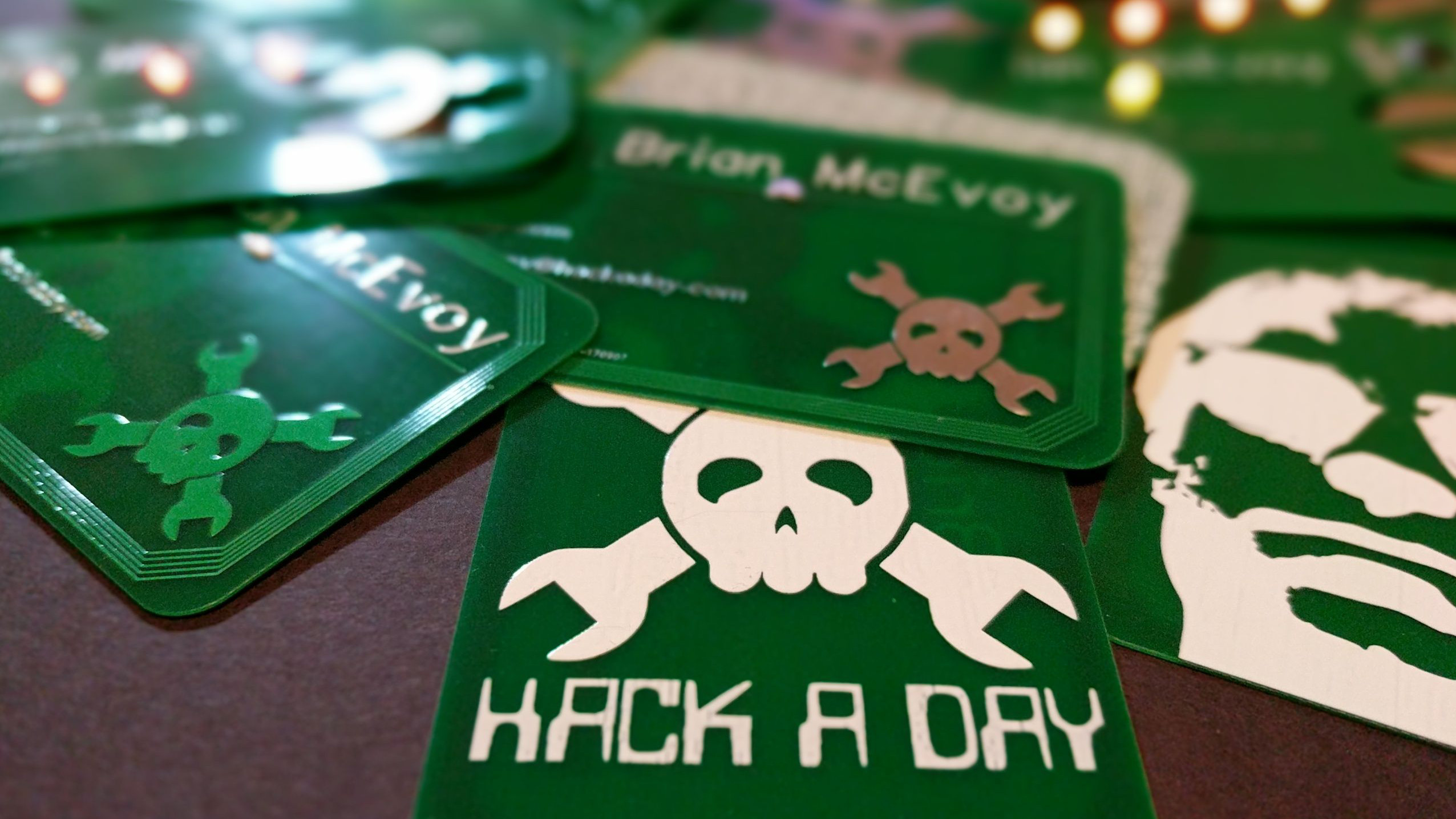
A business card is usually a small rectangle that waits patiently at the bottom of a pocket, hoping it will not be mistaken for a grocery receipt. A blinky business card has a different plan. It flashes, glows, you do?”
That tiny burst of light can turn an ordinary introduction into a memorable interaction. But the best blinky business cards are not built just to make people say “Whoa.” They combine thoughtful brand design, practical electronics, print craftsmanship, and a clear reason for someone to keep the card instead of feeding it to the nearest conference tote bag.
This is the art of making a light-up business card that feels clever rather than gimmicky, polished rather than homemade, and useful long after the LED has finished its tiny disco career.
Why Blinky Business Cards Still Work in a Digital World
We live in a world where networking happens through QR codes, LinkedIn requests, digital contact cards, calendar links, and messages that begin with “Great meeting you!” even when nobody is entirely sure where they met. Yet physical business cards still have a special advantage: they create a tangible moment.
A blinking business card adds a layer of surprise. It gives someone something to hold, inspect, show a friend, and remember later. That matters because memory is often attached to an experience, not a job title. A card that lights up when pressed can create a small story: “I met a lighting designer whose business card actually glowed,” or “That robotics company had a card with a tiny animated logo.”
The goal is not to turn every networking event into a miniature Las Vegas sign. The goal is to make your brand easier to recall. A creative business card should function like a handshake with excellent timing: confident, brief, and impossible to confuse with someone else’s.
The Difference Between Memorable and Merely Noisy
A blinking card is memorable when the light supports the story behind your business. A designer might use a soft glow to highlight a logo. A music producer could create a pulse effect that resembles a beat. A tech startup may use LEDs to suggest motion, connection, or innovation. A photographer might reveal a silhouette when the card is pressed.
A blinking card becomes noisy when the lighting has no relationship to the brand. If you are a tax accountant and your card flashes like a spaceship trying to escape a parking garage, people may remember the card, but they may not remember why they should trust you with their deductions.
The best creative business cards answer one simple question: What does this interaction say about the person or company behind it?
Start With the Story, Not the Circuit
Before choosing LEDs, batteries, copper tape, printed circuit boards, or fancy conductive ink, decide what your business card should communicate. The lighting effect is only the delivery method. The message comes first.
Choose One Core Brand Idea
Great business card design is often built around one strong idea. Your blinky effect should reinforce that idea instead of competing with it.
- Architect or interior designer: A warm line of light can suggest a window, floor plan, or illuminated skyline.
- Software developer: A short LED sequence can resemble loading data, compiling code, or sending a signal.
- DJ, musician, or audio engineer: A rhythmic pulse can hint at sound without forcing anyone to attend an accidental rave.
- Electrician or energy consultant: A glowing bolt or power symbol instantly connects the card to the service.
- Marketing agency: A reveal effect can reinforce the idea of attention, transformation, or making a brand stand out.
- Event producer: A card that lights when pressed can mimic the moment an event comes alive.
This approach keeps the card from becoming a random science-fair project wearing a blazer. The electronics should amplify the identity, not replace it.
Design the Moment of Discovery
Think about what happens when someone receives your card. Do they press a button? Bend a tab? Pull a small paper strip? Tap an NFC area? Scan a QR code after the light catches their attention?
The interaction should be obvious enough that people do not need an instruction manual, safety goggles, and a graduate degree in curiosity. A subtle label such as “Press to light up” or “Tap for the full story” can guide the recipient without making the card look like an appliance manual.
The Design Principles Behind a Great Light-Up Business Card
A blinky card has two jobs. First, it must be readable. Second, it must be memorable. Many designs succeed at one and accidentally abandon the other.
Keep the Essential Information Easy to Find
Your name, company, role, phone number, email address, website, and primary call to action should never become hidden behind the lighting effect. The human eye loves novelty, but it also appreciates being able to find an email address before lunch ends.
Use high contrast between text and background. Choose one or two readable typefaces. Give the layout breathing room. White space is not empty space; it is the part of the design that prevents your information from looking like it was packed for a long trip in a very small suitcase.
Keep key details away from trim edges, folds, buttons, batteries, and any circuit path that could complicate the layout. Your printer’s bleed and safe-area requirements should be treated as non-negotiable, especially when the card includes special finishes or custom die cuts. h3>Let the Light Create Hierarchy
LEDs are powerful attention magnets. Use them to guide the eye toward something important: your logo, an icon, a short phrase, or an image detail. Avoid lighting every available corner of the card. A card with eight glowing elements can feel less premium than one card with a single, beautifully placed point of light.
Consider the visual rhythm. A slow pulse can feel calm and refined. A quick flash can feel energetic. A sequence of lights can suggest movement. A hidden LED behind translucent paper can feel mysterious and elegant. The effect should match the brand personality, whether that personality is “minimalist creative studio” or “engineer who believes ordinary stationery has had it too easy.”
Use Color Like a Brand Asset
Light color has emotional weight. Warm white or amber can feel premium, nostalgic, or handcrafted. Blue often feels modern and technical. Green may support sustainability, finance, wellness, or energy themes. Red creates urgency and excitement, but it can become visually aggressive if it dominates the design.
Match the LED color to your established palette whenever possible. A business card should feel like part of the same family as your website, presentation deck, packaging, social profiles, and email signature. Consistency is what turns a cool object into a recognizable brand touchpoint.
Choosing the Right Type of Blinky Business Card
Not every light-up business card needs the same level of complexity. The right option depends on your budget, production quantity, target audience, and tolerance for tiny things that may occasionally decide they are on vacation.
Paper Circuit Cards
Paper circuit cards are usually the most approachable option. They can use paper or cardstock, conductive copper tape, a small LED, and a coin-cell battery. A press point or folded flap can complete the circuit and activate the light.
This style works well for limited runs, workshops, portfolio pieces, maker events, holiday promotions, and personal networking. It has visible craftsmanship, which can be a major advantage for artists, educators, engineers, and creative studios.
Paper circuits are especially useful for prototyping because they let you test the physical interaction before investing in professional fabrication. Small coin-cell-powered paper circuits are commonly used in beginner maker projects, where copper tape and LEDs create simple light-up designs. h3>Printed Circuit Board Business Cards
PCB business cards are the serious cousin of the paper circuit card. Instead of cardstock and tape, the card itself is made from a printed circuit board. It may include LEDs, buttons, sensors, programmable chips, or touch controls.
These cards can look incredibly polished, especially for software developers, electronics engineers, hardware startups, cybersecurity firms, and robotics companies. They also make excellent conversation starters at trade shows because they demonstrate technical skill before you even begin describing your services.
A PCB business card can be simple, such as a logo with a single flashing LED, or more elaborate, such as a programmable animation, mini game, or electronic badge. The danger is overbuilding. When a card requires five pages of instructions, a USB cable, and a support ticket, it has wandered a little too far from “business card.”
Light-Enhanced Print Cards
Some designs do not require exposed circuitry at all. You can pair premium printing techniques with a subtle lighting element, such as a hidden LED behind translucent stock, a layered paper construction, or a pull-tab reveal.
This approach works beautifully for luxury brands, event planners, boutique agencies, hospitality businesses, and high-end creative professionals. The card feels more like a tiny package or invitation than a standard piece of networking material.
Hybrid Cards With QR Codes or NFC
A blinking card can make someone curious. A QR code or NFC-enabled destination can turn that curiosity into action. The card can link to your portfolio, booking page, digital contact card, product demonstration, newsletter signup, or a landing page created specifically for people you meet in person.
Keep the destination focused. Do not send someone to a website homepage where they must hunt through nine menus, three popups, and a cookie banner the size of Nebraska. Give them one useful next step: save your contact, view your work, schedule a call, watch a short demo, or request a quote.
QR codes work best when they are large enough to scan, have strong contrast, and include a small instruction or call to action. A QR code on a business card can help recipients save contact information or reach a digital destination without manually typing a URL. ction>
Practical Electronics: Small Details That Matter
The fun of a light-up card depends on reliability. A card that works only when held at a 37-degree angle under a full moon is not a conversation starter. It is a tiny haunted object.
Plan for Power Early
The battery is often the thickest and least flexible part of the design. Decide where it will sit before finalizing the layout. A coin cell can work for prototypes and small LED effects, but it affects thickness, weight, packaging, and the amount of pressure required to activate the card.
Build your design around realistic battery life. A single short flash may be practical. A constantly glowing card handed out to hundreds of people may become expensive, bulky, and surprisingly hungry for power. The more LEDs, brightness, and animation you add, the more carefully you need to consider energy use.
Do Not Ignore Current Control
LEDs need appropriate current management. In simple circuits, a resistor is often used to limit current and help protect the LED. The exact component choice depends on the power source, LED forward voltage, and intended current, so test the circuit and verify the specifications before any production run. > For a custom board, work with an experienced electronics designer or fabricator. A good design should be safe, stable, and repeatable. It should not rely on optimism, electrical folklore, or the ancient networking tradition of “It worked on my desk yesterday.”
Make the Activation Method Durable
A press-button area, pull tab, touch point, or fold switch should survive normal handling. Test the card repeatedly. Place it in a wallet. Put it in a pocket. Let a few people use it without explaining what to do. If everyone immediately presses the wrong area, the design needs help.
Also consider the recipient’s experience after the battery is depleted. The card should still look good and still contain useful information. A dead LED should not turn your business card into evidence from a failed magic trick.
Print Production and Materials: Where Great Ideas Become Real Objects
A digital mockup can make almost anything look glamorous. Real life introduces paper thickness, adhesive, trim variation, battery placement, shipping stress, fingerprints, and the mysterious ability of black ink to reveal every smudge in the universe.
Select Materials That Support the Concept
Thick stock can make a premium card feel substantial, but it may not be suitable for every electronic build. Translucent vellum or frosted materials can create beautiful glow effects. Matte finishes can feel sophisticated, while spot gloss can highlight a logo or light pattern.
Consider whether the card will be carried in a wallet, handed out at an event, mailed in a protective sleeve, or displayed at a booth. The more delicate the structure, the more intentional your packaging should be.
Prototype Before Ordering in Bulk
Never move directly from a clever sketch to a giant production order. Build a prototype. Test the LED placement. Check whether the text remains readable in bright daylight and dim indoor lighting. Scan the QR code from several phones. Ask someone unfamiliar with the project to use the card.
Then test it again after it has spent a day in a bag, a pocket, or a box. The best blinky business card is not the one that photographs best on a clean studio table. It is the one that still works after a busy trade show, three coffee meetings, and one accidental encounter with a loose pen.
How to Hand Out a Blinky Business Card Without Making It Weird
A great card helps an introduction. It does not replace one. Do not silently hand someone a glowing rectangle and vanish into the crowd like an extremely polite magician.
Use the card as a natural extension of your conversation. For example:
- “I design interactive brand materials, so I made my card do a little of the talking.”
- “Press the logo. It is a tiny preview of the kind of event experiences we create.”
- “The card lights up, and the QR code takes you to a short demo of our product.”
- “I work in hardware design, so I thought my card should have at least one component that earns its keep.”
The explanation should be short and human. Let curiosity do the rest. The person receiving the card should feel invited into the experience, not recruited into a product demonstration they did not consent to during the appetizer course.
Common Blinky Business Card Mistakes to Avoid
Making the Card Too Thick
A business card should still be reasonably easy to carry. If it needs its own carrying case, it may be closer to a product sample than a networking card.
Prioritizing the Effect Over the Information
Your contact details are not optional decoration. Make sure the recipient can quickly identify who you are, what you do, and how to reach you.
Using a Weak Call to Action
“Visit our website” is fine, but “See the 30-second product demo” is more specific. “Book a design consultation” is better than “Learn more.” Give the recipient a reason to scan, tap, or follow up.
Skipping Real-World Testing
A card may look perfect on screen while the button is hard to press, the light is too dim, the battery shifts, or the QR code fails after trimming. Testing is not a boring final chore. It is part of the design process.
Forgetting the Brand Voice
A blinking business card should still sound and look like your business. Use the same tone, colors, imagery, and level of polish your audience expects from you elsewhere.
Experience-Based Field Notes: What Blinky Business Cards Teach You About Networking
The most interesting lesson from blinky business cards is that people rarely remember a card because of its dimensions. They remember it because it gave them a reason to pause. In a busy networking room, most introductions happen quickly: names are exchanged, industries are named, cards are traded, and everyone quietly tries to remember where the coffee table is. A card with a small interactive moment interrupts that routine in a useful way.
Imagine a freelance lighting designer meeting an event planner. Instead of handing over a standard black card with a tiny logo, the designer offers a card with a soft amber glow hidden behind a stage-shaped cutout. The planner presses a marked spot, the “stage” lights up, and the designer says, “That is basically what I do for blank rooms.” The interaction lasts five seconds, but it creates a visual explanation that is easier to remember than a paragraph of credentials.
Another useful experience comes from technical networking events. Engineers, developers, and hardware founders often receive stacks of nearly identical cards. A simple PCB card with a clean circuit-trace pattern and one carefully programmed LED can make the recipient stop and inspect it. The conversation changes from “What does your company do?” to “How did you fit that onto a card?” That question opens the door to explaining your expertise, design choices, and products in a more natural way.
Creative professionals often discover that the card works best when it is not overly precious. A small run of handmade paper-circuit cards can feel more personal than a mass-produced premium card. The visible copper tape, a short handwritten note, or a slightly imperfect fold can become part of the charm. For an illustrator, teacher, artist, or maker, that handmade quality says, “I care about the object itself,” which is often exactly the message the audience needs to hear.
There is also a practical lesson: the most successful cards do not depend entirely on the electronics. After the LED goes dark, the card should still function as a business card. It should still contain a clear name, contact information, a recognizable brand, and a useful digital path through a QR code or website. The blinking effect gets attention, but the design must earn the follow-up.
Finally, blinky business cards teach a broader branding lesson. People respond to thoughtful details. They notice when an object has been designed with care, when an interaction makes sense, and when a company demonstrates its personality instead of simply describing it. A tiny light can become a tiny proof point. It says that you are willing to think beyond the obvious, solve a small problem creatively, and make an ordinary moment feel a little more alive.
That is the real art of blinky business cards. The light is not the product. The light is the invitation.
Final Thoughts
A blinky business card is not for every brand, every budget, or every networking situation. But when the concept fits, it can become an unusually effective piece of personal branding. It combines print design, storytelling, technology, and human curiosity in one tiny object.
Start with a clear message. Keep the contact information readable. Make the light effect relevant. Prototype before producing. Add a useful digital destination. Then hand it out with confidence, not choreography.
The best business cards do more than share your details. They give people a reason to remember you. And in a world full of forgettable rectangles, a little light can go a long way.