Indigo is not the shy blue that sits politely in the corner and waits to be noticed. It is the blue that walks into a room wearing velvet loafers, orders something mysterious at the bar, and somehow makes everyone else look more interesting. In the hands of Eve Ashcraft, one of America’s most respected architectural color consultants, indigo becomes more than a dramatic paint choice. It becomes a tool for mood, proportion, light, and emotional atmosphere.
Ashcraft is known for treating color as architecture, not decoration sprinkled on at the end like parsley on a dinner plate. A painter by training and a longtime color strategist for interiors, brands, finishes, and public spaces, she has helped shape influential paint palettes, including work connected to Martha Stewart Living’s early paint collections. Her book, The Right Color, made the intimidating world of paint selection feel more human, less like decoding a secret government document in the fluorescent aisle of a hardware store.
So what makes Eve Ashcraft’s indigo palette worth studying? The short answer: restraint, contrast, and a fearless respect for darkness. The longer, more useful answer is that indigo works best when it is allowed to be deep, layered, and slightly unpredictable. It can make a room feel intimate, graphic, historic, modern, serene, and a little bit mischievousall before you have chosen the throw pillows.
Why Indigo Has Such Staying Power in Interior Design
Indigo sits between blue and violet, which gives it an unusual dual personality. Blue brings calm, clarity, and familiarity. Violet adds mystery, depth, and a touch of theatricality. Together, they create a color that feels grounded but never dull. Unlike bright cobalt or baby blue, indigo has weight. It behaves almost like a dark neutral, especially when paired with whites, blacks, woods, linens, leather, marble, and aged metals.
Historically, indigo was a prized dye, sometimes called “blue gold,” and its cultural story runs through textiles, trade, craft, art, and fashion. That history matters in interiors because indigo still feels connected to handwork. Think denim softened by years of wear, Japanese shibori cloth, block-printed textiles, old library walls, painted doors, and deep blue ceramics. It has memory. A room painted indigo rarely feels brand-new in a sterile way; it feels collected.
This is one reason Ashcraft’s approach feels so relevant today. Modern homes often suffer from sameness: white walls, pale oak, beige sofa, tasteful bowl, existential crisis. Indigo breaks that pattern without screaming. It gives a room a point of view.
The Core Lesson from Eve Ashcraft’s Indigo Palette
The most important lesson is not “paint everything blue and hope for compliments.” The lesson is that dark color needs a composition. Ashcraft’s indigo thinking often depends on relationships: dark walls against white marble, black trim against blue depth, red upholstery against a moody background, and pale reflective surfaces that keep the room from becoming a cave where houseplants go to reconsider their life choices.
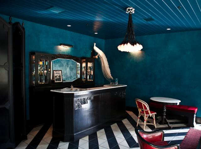
In a memorable indigo room analysis, Ashcraft praised the way deep blue walls and ceiling could create a lounge-like intimacy. Extending the color over the ceiling matters because it removes the hard stop between wall and overhead plane. Instead of a room wearing an indigo jacket with a white hat, the space becomes fully enveloped. The effect is cozy, glamorous, and architectural.
But she also recognized the need for relief. White surfaces bounce light. Black trim sharpens the edges. A high-contrast floor adds movement. A red accent wakes the whole palette up. That is the difference between a room that is “dark” and a room that is designed.
How to Build an Indigo Palette That Works
1. Start with the Mood, Not the Paint Chip
Before choosing a shade, decide what the room should do. Should it feel like a quiet study, a cinematic dining room, a chic guest bedroom, a polished entry, or a powder room with main-character energy? Indigo can support all of these, but the finish, lighting, trim, and companion colors will change.
For calm spaces, reduce contrast. Paint walls, trim, and ceiling in close tones or use a muted indigo with soft off-white textiles. For drama, increase contrast with crisp white, black, brass, red, or graphic pattern. For warmth, bring in cognac leather, walnut, rattan, aged brass, tobacco brown, camel, or ochre.
2. Choose an Indigo Family
Not all indigos are created equal. Some lean navy. Some lean violet. Some have green or gray undertones. This matters because undertones are the tiny gremlins that appear after you have painted the whole room and suddenly realize your “classic blue” is flirting with purple.
A denim indigo feels casual and livable. A blackened indigo feels formal and architectural. A violet indigo feels artistic and moody. A green-tinged deep blue can look sophisticated in rooms with natural wood and stone. Paint brands such as Benjamin Moore, Sherwin-Williams, Farrow & Ball, Pratt & Lambert, Valspar, and Fine Paints of Europe have offered deep blues that can support an Ashcraft-inspired palette, though every color must be sampled in the actual room.
3. Let Light Make the Final Decision
Color only exists because of light. That sounds poetic, but it is also the practical reason your paint sample looks rich at noon and like a navy sock at 8 p.m. Indigo changes dramatically depending on exposure. South-facing rooms can make it appear brighter and more saturated. North-facing rooms may cool it down, making violet, gray, or black undertones more obvious. Artificial lighting can warm it, flatten it, or make it deliciously moody.
Test large samples on multiple walls and view them morning, afternoon, evening, and under lamps. Do not judge indigo from a two-inch chip unless you enjoy gambling with gallons of paint.
Best Rooms for an Indigo Palette
Bedrooms
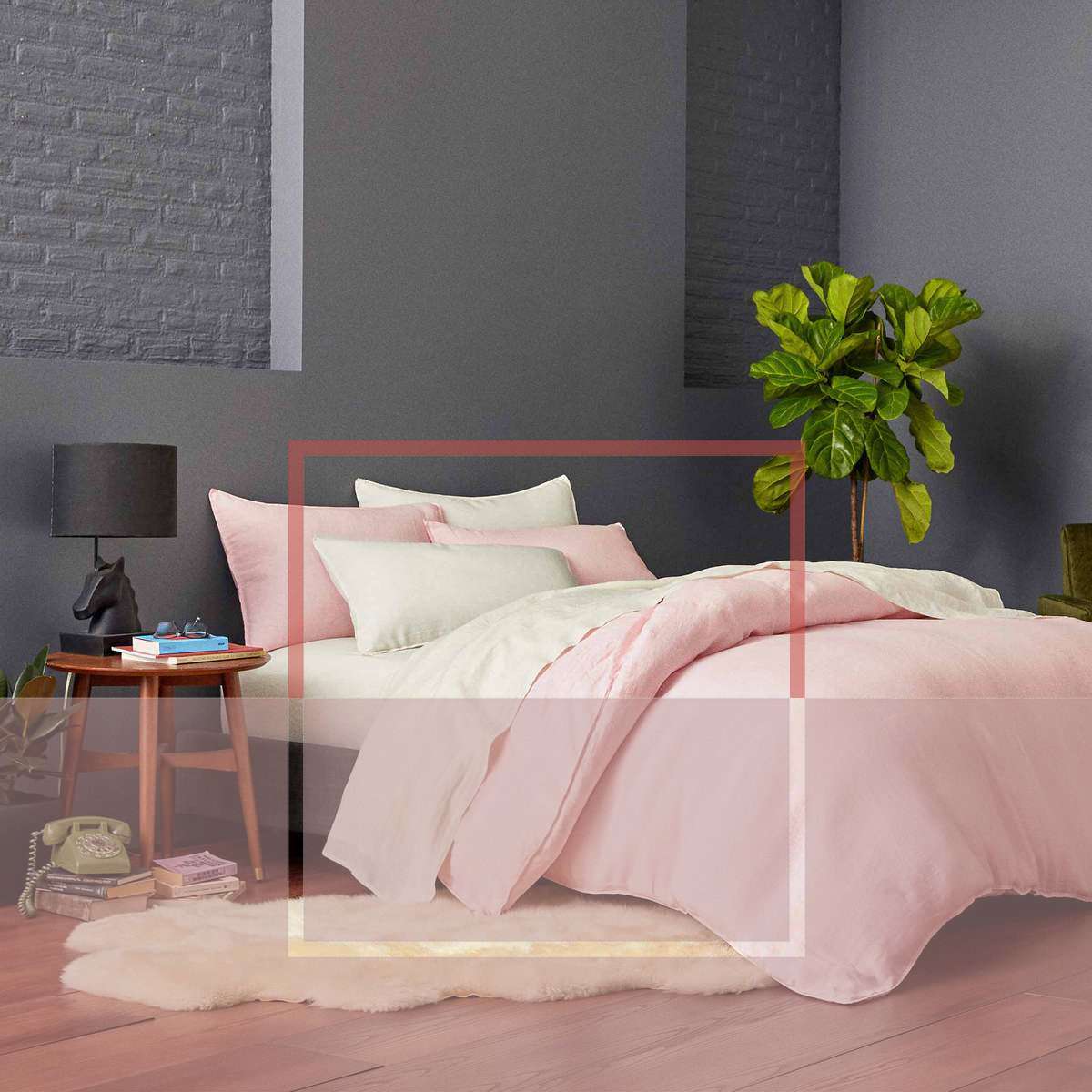
Indigo is a natural fit for bedrooms because it creates enclosure. In a bedroom, that can be a luxury. Pair indigo walls with ivory bedding, washed linen, walnut nightstands, and soft brass lamps. For a more modern look, add black metal, charcoal wool, and abstract art. If the room is small, do not automatically avoid dark color. A deep shade can blur boundaries and make a compact room feel intentional instead of apologetic.
Dining Rooms
A dining room can handle more drama than a living room because it is used for atmosphere. Indigo walls with candlelight, dark wood, white plates, and a red or rust accent can feel deeply elegant. Add a mirror or pale artwork to keep the space lively. This is where Ashcraft’s love of mood makes perfect sense: dining rooms are not supposed to feel like spreadsheets.
Powder Rooms
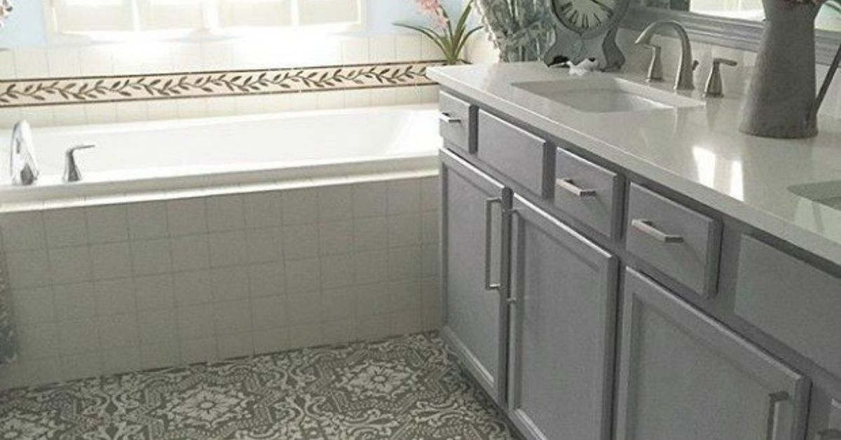
If you are nervous about indigo, start with a powder room. It is small, contained, and naturally suited to surprise. Try indigo walls with a black vanity, marble sink, brass fixtures, or a patterned floor. Guests will come out saying, “I love your bathroom,” which is one of adulthood’s weirdly satisfying achievements.
Libraries and Studies
Indigo belongs in rooms with books. The color adds concentration and depth without the heaviness of brown or black. Use it on built-ins, walls, or both. Pair with leather, framed art, warm lamps, and a slightly messy stack of books that says “intellectual” rather than “I lost the receipt.”
Kitchens and Cabinetry
Indigo cabinets can be beautiful when balanced with lighter counters and warm hardware. Use deep blue on lower cabinets or an island if you want drama without committing every wall. Pair with white tile, soapstone, butcher block, unlacquered brass, or aged bronze. Avoid overly cold whites if the indigo already leans cool; a slightly warm white often feels more welcoming.
Colors That Pair Beautifully with Indigo
Indigo and White
This is the classic pairing. White brings clarity, reflects light, and keeps indigo fresh. The trick is choosing the right white. A stark white creates crisp contrast, while a warm white softens the mood. For older homes, creamy whites often feel more natural than icy gallery whites.
Indigo and Black
Black trim, black doors, or black furniture can make indigo feel more modern. This pairing works because black gives structure. It outlines the room like eyelinersubtle when done well, alarming when overdone.
Indigo and Red
Ashcraft’s indigo logic often embraces the power of a red accent. Red energizes blue because the contrast is emotional as much as visual. A lipstick-red chair, a crimson lampshade, a burgundy pillow, or a small piece of art can keep an indigo room from becoming too quiet.
Indigo and Natural Materials
Wood, linen, leather, jute, clay, plaster, and stone make indigo feel rooted. Without texture, deep blue can become flat. With texture, it becomes layered. A linen sofa against indigo walls, a walnut table under a blue ceiling, or a woven shade beside a dark blue cabinet can make the palette feel relaxed and expensive without shouting about it.
Indigo and Brass
Warm metal is one of indigo’s best friends. Brass, bronze, and aged gold bring warmth and reflection. Chrome can work in modern spaces, but brass usually gives indigo more glow.
Common Mistakes to Avoid with Indigo
Using Too Many Competing Blues
Layering blues can be gorgeous, but they need to speak the same language. A green-blue, violet-blue, and gray-blue in one room may start arguing. Choose one dominant indigo, then add supporting blues carefully through textiles, art, or ceramics.
Ignoring the Ceiling
A white ceiling above dark indigo walls can look crisp, but it can also chop the room visually. If intimacy is the goal, consider painting the ceiling the same color or a softer related tone. This is especially effective in dining rooms, bedrooms, and lounges.
Forgetting Reflection
Dark rooms need light movement. Marble, mirrors, glass, pale art, metallic accents, glossy trim, or light upholstery can all help. Without reflection, indigo can swallow detail.
Choosing the Wrong Finish
Matte finishes can make indigo look velvety and rich, but they may show scuffs in high-traffic areas. Satin or eggshell can add durability and subtle light reflection. High gloss is glamorous on trim, doors, and furniture, but on imperfect walls it may reveal every bump, patch, and mysterious dent from 2009.
A Practical Indigo Palette Formula
Here is a simple Ashcraft-inspired formula for building a balanced indigo room:
- Dominant color: deep indigo on walls, cabinetry, or built-ins.
- Anchor color: black, charcoal, or very dark blue on trim, frames, doors, or furniture.
- Light reflector: warm white, marble, ivory linen, pale stone, or cream paint.
- Warm material: walnut, oak, rattan, leather, brass, bronze, or terracotta.
- Energy accent: red, coral, ochre, tobacco, or saffron in one or two controlled moments.
- Texture layer: grasscloth, linen, velvet, plaster, ceramic, wool, or woven fiber.
This formula works because it gives indigo both depth and company. The room gets mood, but it also gets oxygen.
How to Use Indigo Without Repainting Everything
If painting walls feels too permanent, introduce indigo through textiles and objects. Try indigo pillows on a neutral sofa, a dark blue lampshade, a patterned rug, denim-toned linen bedding, blue-black ceramic lamps, or a single painted cabinet. Indigo also performs beautifully in art, especially abstract work, botanical prints, and photography with deep shadow.
For renters, a removable wallpaper with indigo pattern can transform a wall without risking a security deposit. Even a collection of indigo books, vases, or framed fabric can create a small color story.
Experience Notes: Living with an Indigo Palette
The most surprising thing about living with indigo is that it becomes less intimidating after the first week. At first, a deep blue wall may feel like a major declaration. You may walk past it and think, “Well, that happened.” But as furniture returns, lamps switch on, art finds its place, and daily life resumes, indigo starts behaving like a confident neutral. It supports everything around it.
In real homes, indigo is especially good at making ordinary objects look considered. A simple white bowl looks sculptural. A wooden chair looks warmer. A brass lamp suddenly has a reason to exist beyond “it was on sale.” Even books and plants gain presence against a deep blue background. This is why indigo is useful for people who want a more designed home without replacing every object they own.
The experience also teaches patience. Indigo needs evening light, not just daylight. Many paint colors are judged at noon, but indigo often reveals its best self after sunset. Under warm lamps, it becomes softer, more enveloping, and more complex. A room that looked bold in the morning may feel like a private club by night. Add music and a decent chair, and suddenly you are the sort of person who says things like “the atmosphere is working.”
Another lived-in advantage is flexibility. Indigo works across styles. In a coastal house, it can feel nautical without turning the room into a souvenir shop. In a city apartment, it feels polished and compact. In a farmhouse, it pairs beautifully with old wood and white walls. In a modern home, it gives depth to clean lines. It is one of the rare saturated colors that can move between traditional and contemporary settings without needing a personality transplant.
The key experience-based warning is this: do not under-light an indigo room. One ceiling fixture will not do. Use layers: table lamps, sconces, picture lights, floor lamps, and candlelight when appropriate. Indigo rewards lighting the way a good suit rewards tailoring. The color is already handsome; the lighting makes it charismatic.
Finally, indigo encourages better editing. Because the color has strength, clutter becomes more visible. That does not mean the room must be minimalist. Ashcraft’s own color philosophy leaves room for richness, collections, and personality. But indigo asks for intention. Keep what contributes to the mood. Remove what looks accidental. A deep blue room does not have to be perfect, but it does want you to stop pretending that the random plastic storage bin is “temporary.”
Conclusion
Eve Ashcraft’s indigo palette is not simply about choosing a beautiful blue. It is about understanding how color shapes architecture, mood, light, and behavior. Indigo can make a room feel intimate, elegant, historic, modern, artistic, or quietly dramatic. The secret is balance: pair darkness with reflection, coolness with warmth, depth with texture, and seriousness with one lively accent that keeps the room awake.
For homeowners, designers, and color-curious decorators, indigo is a reminder that bold color does not have to be loud. Sometimes the most powerful color in the house is the one that lowers its voice and makes everyone lean in.
Note: This article is based on real design information, public background on Eve Ashcraft’s color work, and widely accepted interior color principles. It is written as original editorial content for web publication.