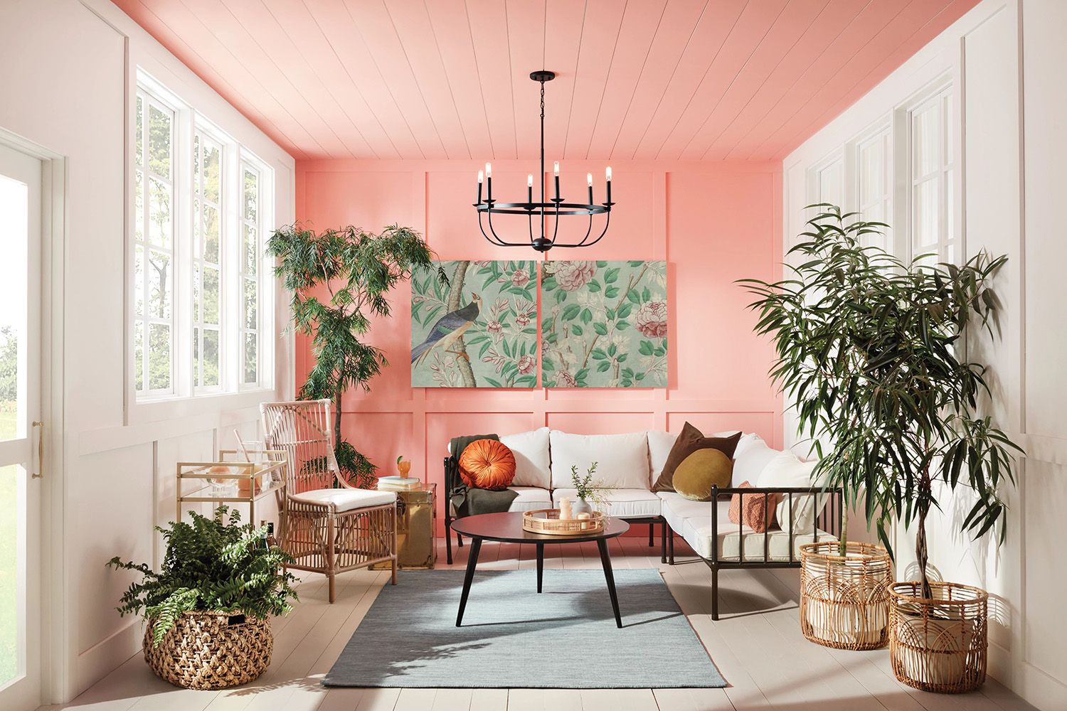
Barbiecore has a reputation problem. Say the word out loud and half the room imagines a glitter cannon, a flamingo wearing lip gloss, and a sofa so pink it could probably file taxes as a strawberry milkshake. But that’s only one version of the look. At its best, Barbiecore home decor is not about drowning your house in cotton-candy color until your guests need protective eyewear. It is about mood, personality, playful glamour, and the confidence to decorate like beige never personally inspired you.
That is exactly why this trend still has legs, heels, and probably a fabulous acrylic side table. Barbiecore borrows from nostalgia, maximalism, midcentury curves, glossy finishes, cheeky accessories, and a strong sense of self-expression. Yes, pink is part of the story. No, it does not have to be the whole book. In fact, if you don’t like pink, you may be the perfect person to do Barbiecore well, because you are more likely to interpret it thoughtfully instead of turning your home into a life-size toy aisle.
The smartest version of Barbiecore is less “plastic fantastic overload” and more “bold, witty, and unexpectedly chic.” It invites you to decorate with joy, take style risks, and make your rooms feel a little more cinematic. Think curves, shine, graphic pattern, energetic color, and a touch of glamour that never apologizes for having fun. That can look like coral velvet, a lacquered plum sideboard, a wavy mirror, a checkerboard rug, a bubble lamp, or an entryway that feels like it knows how to make an entrance.
What Barbiecore Actually Means in a Home
Barbiecore is often reduced to hot pink, but the aesthetic is really about attitude. It leans into whimsy, high contrast, optimism, and a slightly larger-than-life point of view. It is nostalgic without looking dusty, glamorous without demanding a mansion, and playful without requiring you to hang feather boas from the ceiling fan. The design language is expressive: rounded silhouettes, statement lighting, mirrored or glossy surfaces, retro references, and colors that feel alive.
That is why Barbiecore overlaps so naturally with other trends people already love. It can borrow the confidence of maximalism, the feel-good color of dopamine decor, the curves of contemporary furniture, the polish of Hollywood Regency, and the nostalgic soul of vintage finds. You can mix it with midcentury modern, Palm Beach, retro ’70s flair, or even a clean minimalist backdrop. The common thread is simple: the room should look intentional, spirited, and just a little bit fabulous.
In other words, Barbiecore is not one exact palette. It is a decorating mindset. It says your home can be expressive. It says fun and taste are not enemies. It says your lamp can have a wavy base and your room can still look grown up. Revolutionary, I know.
Why Barbiecore Still Works Even When Pink Is Not Your Thing
Plenty of homeowners love the energy of Barbiecore and still feel no urge to paint a wall peony blush. Fair enough. Pink fatigue is real. The good news is that the boldest lessons from the trend have almost nothing to do with one specific shade. They come from the way Barbiecore uses shape, finish, and fearless styling.
1. Shape Does a Lot of the Heavy Lifting
Rounded sofas, scalloped edges, wavy mirrors, mushroom lamps, bubble chandeliers, and curved headboards all deliver Barbiecore energy without relying on color. These pieces soften a room and make it feel playful right away. A curvy cream bouclé chair, for example, can hint at the aesthetic without screaming it from a convertible.
2. Shine Creates Instant Glamour
Glossy lacquer, acrylic, lucite, mirrored finishes, chrome, and polished brass give Barbiecore its signature sparkle. If you dislike pink, lean into sheen instead. A chrome bar cart, a lacquered side table in cherry red, or a smoky acrylic console can make the room feel lively and glamorous without one bubblegum note in sight.
3. Pattern Adds the Wink
Graphic black-and-white stripes, checkerboard floors, chevron, playful florals, and exaggerated geometrics all fit the mood beautifully. Pattern is what keeps Barbiecore from becoming just “a room with one bright chair.” It adds movement and personality. The trick is to choose one lead pattern and support it with quieter repeats or smaller-scale prints so the room feels styled rather than scrambled.
The Best Barbiecore Color Palettes for People Who Don’t Want Pink
If pink feels too obvious, too sugary, or too close to a pediatric dentist’s waiting room, try one of these Barbiecore-friendly alternatives instead.
Cherry Red and Lipstick Coral
This is Barbiecore for people who like confidence more than sweetness. Red lacquer, coral pillows, or a persimmon accent chair bring the same high-energy glamour as hot pink, but with a slightly sharper edge. These tones look especially strong with cream walls, brass accents, and dark wood.
Teal, Aqua, and Retro Blue
Think Malibu Barbie with better architecture. Turquoise, tropical teal, and retro sky blue bring vacation-house optimism to the trend. These shades work beautifully in kitchens, bathrooms, and breakfast nooks, especially when paired with white, chrome, and sunny yellow.
Lavender, Plum, and Moody Berry
If you like drama, go deeper. Lavender feels playful, while plum and berry tones give Barbiecore a more sophisticated, evening-wear mood. A plum velvet bench, berry drapes, or mauve lacquered trim can feel glamorous, whimsical, and adult all at once.
Jade, Chartreuse, and Wasabi
For the brave souls who believe a room should have a pulse, green can deliver the same electric spirit as pink. Jade adds freshness. Chartreuse wakes up sleepy corners. Wasabi-toned accents feel weird in the best possible way. These shades are fantastic for side chairs, lamps, or art in otherwise neutral spaces.
Black, White, and Metallics
This is the stealth-wealth version of Barbiecore. High-contrast black and white, especially in stripes or chevron, nods to Barbie’s iconic roots while chrome, mirrored surfaces, and polished brass add the glam. It is crisp, graphic, and far more timeless than people expect.
How to Use Barbiecore in Every Room of the House
Living Room
Start with one hero piece: a sculptural sofa, a curved accent chair, or a bold area rug. Then build around it with gleaming finishes and playful forms. A cream room with a cherry lacquer coffee table, a smoky mirror, a striped rug, and a bubble lamp can feel Barbiecore without looking theme-y. Add velvet or satin textiles for a slightly dressed-up mood.
If your living room already has neutral bones, that is excellent news. Wood floors, stone, white walls, and natural textures help bold pieces look polished rather than chaotic. Think of neutrals as the stage crew. They do not need the spotlight, but the show falls apart without them.
Bedroom
The bedroom is one of the easiest places to try the trend because it benefits from softness and drama. An upholstered curved headboard, glossy nightstands, flirty pleated lampshades, or dramatic art can shift the mood immediately. If you do want a whisper of pink, use it in bedding or trim rather than on every wall. If not, try lilac, coral, or even burgundy with brass and cream.
For a more cocooning approach, use a color-drenched palette in one hue family. That could be soft lavender on walls, trim, and textiles, or peachy terracotta used across paint, linens, and an accent bench. The result feels immersive and bold without becoming visually frantic.
Kitchen and Dining Area
Barbiecore in a kitchen is all about charm and shine. Colorful stools, retro-inspired appliances, glossy tile, playful hardware, and unexpected lighting can transform a practical space into one with actual personality. If bright cabinetry feels like too much commitment, paint the island instead. Or add a vibrant pendant, a striped runner, and colorful glassware that makes even Tuesday leftovers feel somewhat glamorous.
In the dining area, try upholstered chairs in a juicy color, a scalloped tablecloth, or a statement chandelier that looks like it has opinions. Barbiecore dining should feel a little celebratory, even when you are eating takeout over the sink five minutes later.
Bathroom and Entryway
Small spaces are where bold design risks often pay off fastest. A powder room can absolutely handle wallpaper, glossy paint, a funky mirror, and a color that would feel overwhelming in a larger room. Entryways also love a touch of drama. A painted ceiling, checkerboard runner, curvy bench, or pop-art print can set the tone before guests even get fully inside.
How to Keep Barbiecore Chic Instead of Childish
The line between stylish and silly is not actually pink. It is balance. A Barbiecore room looks sophisticated when bold choices are grounded by restraint somewhere else.
First, mix playful elements with elevated materials. Velvet, marble, brass, wood, linen, and quality ceramics add maturity. A wavy mirror above a solid wood console looks stylish. The same mirror next to six novelty signs and a glitter bean bag starts to look like the room has a sugar rush.
Second, repeat your choices. If you bring in one curve, repeat curves elsewhere. If you use chrome, let it appear in two or three places. If coral is your accent color, echo it in art, textiles, and accessories. Repetition creates rhythm, and rhythm is what makes bold rooms feel designed.
Third, give the eye a place to rest. Even very colorful interiors need quiet moments. That might be a neutral rug, white trim, natural wood, or stone surfaces. Without contrast, the room stops feeling exciting and starts feeling noisy.
Finally, avoid buying an entire “trend starter pack” in one afternoon. The best Barbiecore spaces look collected. Vintage finds, thrifted oddities, framed art, and pieces with personality always feel more interesting than a room filled with matching novelty decor that arrived in one large cardboard box.
Budget-Friendly Ways to Try the Trend
You do not need a Dreamhouse budget to get the look. In fact, Barbiecore often works best when it feels a little inventive. Paint a side table. Reupholster a thrifted bench. Swap out a basic mirror for a wavy one. Add a bold lamp, peel-and-stick wallpaper inside a bookcase, or a graphic runner in the hallway. A room can shift dramatically with just a few playful moves.
Art is another easy entry point. Pop art prints, fashion photography, retro ads, abstract florals, or cheeky framed pieces can inject Barbiecore energy without forcing a full-room makeover. Even better, art lets you play with pink, coral, lavender, red, or metallics in a way that feels flexible. If your taste changes later, you can swap the frame instead of repainting the whole house while muttering about your life choices.
A Simple Barbiecore Starter Plan for Pink Skeptics
If you are curious but cautious, begin here:
Pick one bold color that is not pink. Coral, jade, cherry red, teal, plum, and chartreuse all work.
Add one curvy shape. A rounded chair, scalloped lamp, or wavy mirror changes the mood fast.
Bring in one glossy or metallic finish. Chrome, lacquer, mirrored glass, or brass adds glamour.
Use one graphic pattern. Stripes, checks, or chevron create that playful edge.
Ground it with one calm material. Wood, stone, linen, or cream upholstery prevents chaos.
That combination alone can make a room feel bold, stylish, and unmistakably Barbiecore-adjacent without a single hot pink wall in sight.
Real-Life Experiences: What Barbiecore Home Decor Feels Like When You Live With It
One of the most interesting things about Barbiecore is that people often expect it to feel visually loud but emotionally shallow. In real life, the opposite can happen. When a room is filled with playful color, curved shapes, glossy surfaces, and pieces chosen simply because they delight you, the space can feel surprisingly personal. It stops reading as a trend and starts reading as confidence.
That experience often begins in small ways. You walk into a room with a sculptural lamp, a striped rug, and a lacquered side table in a bold color, and the space feels awake. It has a pulse. It does not look like every social media living room with oatmeal walls and a sad bowl of decorative spheres trying their best. Instead, it feels like someone lives there on purpose.
Another common experience with this style is that it changes how people interact in the room. Guests notice things. They comment on the mirror. They laugh at the cheeky art. They ask where the chair came from. Barbiecore encourages conversation because it is expressive. It gives people visual moments to respond to, and that can make a home feel warmer and more memorable. A room with personality invites people in differently than a room that is technically beautiful but emotionally anonymous.
There is also a mood benefit. Spaces with bold, upbeat styling often feel energizing in the morning and festive in the evening. A vanity with a curved mirror and glowing lamp can make getting ready feel more enjoyable. A dining nook with glossy color and playful textiles can make weeknight dinners feel less like a task and more like a tiny event. No, a colorful sideboard will not solve all of life’s problems. But it can make daily routines feel less flat, and that is not nothing.
For people who do not like pink, the experience becomes even more interesting because they are usually editing the trend through their own taste instead of copying it literally. That tends to produce better rooms. Maybe the emotional lift comes from persimmon instead of fuchsia. Maybe the glam moment is a chrome floor lamp rather than a blush sofa. Maybe the nostalgia shows up through a curvy vintage chair, a retro phone, or black-and-white pattern that feels playful without feeling sugary. The room still delivers the same spirit: optimism, glamour, humor, and unapologetic individuality.
Living with Barbiecore also teaches a useful decorating lesson: seriousness is overrated. Not every object in a home has to whisper. Some pieces can flirt. Some can sparkle. Some can be a little dramatic. When those elements are balanced well, the room does not feel juvenile. It feels alive. And for many people, that is the real appeal of Barbiecore. It gives them permission to stop decorating defensively and start decorating emotionally.
So if you love bold homes but dislike pink, do not assume this trend is off limits. The best version of Barbiecore was never about obeying one color anyway. It is about designing a home that makes you smile when you open the door, even if the smile comes from jade velvet, a cherry-red lamp, a striped runner, or a ridiculous little mushroom sculpture you bought because it made you laugh. That, honestly, is the dream house energy people are chasing.
Conclusion
Barbiecore home decor is not a strict formula and it definitely is not a loyalty test for pink. It is a permission slip to decorate more boldly, more playfully, and more personally. Whether you lean into coral, teal, plum, jade, black-and-white graphics, or just one glossy statement piece, the heart of the look stays the same: joy, glamour, character, and rooms that do not apologize for being fun. If your home has good bones, a little confidence, and one or two fabulous choices, you are already closer to Barbiecore than you think.