Historic interiors have a reputation for being grand, dignified, and occasionally a little too fond of tassels. Yet the best historic decorating ideas are not museum pieces. They are practical lessons in pigment, proportion, pattern, and atmosphereand Little Greene has built an entire design philosophy around bringing those lessons into contemporary homes.
The independent British paint and wallpaper company draws on approximately 300 years of decorative history, researching colors and patterns from heritage buildings, archived documents, artwork, textiles, and surviving wallpaper fragments. Those references are then carefully adjusted for modern rooms, modern lighting, and modern lifestyles. The result is a collection that feels historically informed without requiring a four-poster bed, ancestral portrait, or suspiciously drafty castle.
From deep greens and nuanced neutrals to exuberant botanical wallpaper, Little Greene paints and wallpapers offer a persuasive answer to a common decorating question: How can a home feel timeless without looking old-fashioned?
A Paint Company With Color in Its History
The story associated with Little Greene reaches back to the Little Greene Dye Works, which was operating near Manchester, England, by 1773. The original works supplied pigments and dyes to local industries during a period when the region was becoming an important center for textile and manufacturing activity.
The modern company is family-run and manufactures its paints in the United Kingdom. Its identity combines two qualities that do not always share the same paint tin: respect for traditional decorative materials and a willingness to develop practical finishes for contemporary households.
That balance is important. Historic color is not simply “old-looking color.” It reflects the pigments, materials, architecture, social habits, and available light of a particular period. A Georgian green, Victorian gray, or midcentury blue carries subtle undertones that distinguish it from a generic color mixed only to follow a passing trend.
History as a Starting Point, Not a Costume
Little Greene’s goal is not to make every room resemble a period drama. Historical research serves as a starting point from which colors can be reformulated, refined, and presented for present-day interiors.
A shade discovered in an old property may be cleaner, brighter, or more energetic than people expect. Historical palettes were not composed entirely of brown walls and gloomy corridors. Depending on status, location, and period, interiors could include vivid blues, mineral greens, warm pinks, strong yellows, and deeply pigmented reds.
This explains why Little Greene colors often feel complex rather than merely muted. Their undertones shift as daylight changes, giving walls more visual depth than a flat, one-note color. In the morning, a gray-green might appear fresh and botanical. By evening, it may become warmer, softer, and almost architectural.
The National Trust Partnership
One of the most significant influences on Little Greene’s collections is its collaboration with the National Trust, the conservation organization that cares for historic houses, gardens, collections, and landscapes throughout England, Wales, and Northern Ireland.
Little Greene specialists have studied surviving decoration in National Trust properties, examining wallpaper, painted surfaces, clothing, furniture, artwork, and other historic objects. This research has helped the company recreate colors and adapt patterns while also contributing paint to selected restoration projects.
The relationship is more than a clever branding exercise involving tea, stately homes, and beautifully arranged paint cans. Sales from associated paint and wallpaper collections support conservation work, connecting modern decorating projects with the preservation of historic places.
From Fragile Fragment to Usable Wallpaper
An archival wallpaper fragment may be faded, damaged, incomplete, or unsuitable for a modern room in its original scale. Reviving it requires more than pressing “print” and hoping for the best.
Designers may reconstruct missing sections, simplify overly dense details, adjust the pattern repeat, revise the scale, and develop new colorways. The goal is to preserve the character of the original while making the finished wallpaper visually comfortable in a 21st-century dining room, hallway, bedroom, or powder room.
Collections developed from historic material have included designs connected with Arts and Crafts figures, storybook illustration, hand-painted Chinese wallpaper, garden artifacts, historic textiles, and patterns found in houses cared for by the National Trust. The source material may be centuries old, but the finished designs are intended to live alongside modern sofas, streamlined lighting, concrete counters, and televisions large enough to frighten a Georgian footman.
Understanding Little Greene Paint Collections
Little Greene’s paint palette is organized to help homeowners combine heritage character with contemporary color planning. Two of its best-known groupings are Colours of England and Colour Scales.
Colours of England
The Colours of England collection gathers historically significant and widely useful shades inspired by several centuries of British decoration. The palette includes neutrals, pinks, yellows, blues, greens, reds, and darker architectural colors.
Although the collection has historic roots, many shades are surprisingly adaptable. French Grey, for example, has long been popular because it offers the restraint of a neutral without the chilly impersonality of a basic gray. Eau-de-Nil evokes the green-inflected colors associated with the 1930s, while darker greens can give cabinetry, paneling, and trim a confident architectural presence.
The strength of these colors is their ability to support both traditional and modern furnishings. A heritage green can look stately beside antique oak, then suddenly look crisp and graphic beside a steel lamp and pale linen sofa.
Colour Scales
The Colour Scales system organizes related shades into tonal families. A central color is supported by lighter and darker variations created with similar pigmentation. This makes tonal decorating easier because the colors share an underlying relationship.
For example, a homeowner might use the palest version on the ceiling, a midtone on the walls, and the deepest shade on doors or built-in cabinetry. The room gains variation and definition without turning into a color-card traffic jam.
This approach is especially useful for color drenching, in which walls, trim, doors, and sometimes ceilings are painted in one color family. Tonal variation prevents the scheme from appearing flat while retaining the immersive, restful quality that makes color drenching so appealing.
Paint Finishes for Real Homes
A historically influenced color is only as useful as the finish carrying it. Little Greene offers traditional-looking surfaces as well as washable, water-based options designed for active households.
Absolute Matt Emulsion
Absolute Matt Emulsion produces a very flat, chalky appearance that emphasizes rich pigmentation. It is particularly effective on living room walls, adult bedrooms, ceilings, and areas where a soft, low-sheen finish is the priority.
Flat paint can make deep colors appear velvety and expansive. It also reduces glare, which is useful in rooms with abundant windows or artificial lighting. The tradeoff is that highly matte finishes are generally best chosen according to the amount of wear the surface will receive.
Intelligent Matt Emulsion
Intelligent Matt Emulsion is designed for greater durability and washability while retaining a matte appearance. It can be a practical choice for kitchens, hallways, children’s rooms, and other spaces where walls may encounter fingerprints, splashes, pets, or the mysterious marks that appear whenever guests bring small children.
Eggshell, Satin, and Gloss
Eggshell and satin finishes are useful for woodwork, trim, cabinets, furniture, and radiators, depending on the specific product and surface preparation. Gloss introduces stronger light reflection and can make a dark color feel especially dramatic on a front door, bookcase, or architectural detail.
Using the same color in different sheens is an elegant contemporary strategy. Matte walls paired with satin trim create subtle contrast without introducing another hue. The room remains calm, but its moldings and doors become more defined as light moves across them.
Wallpaper That Tells a Story Without Shouting
Little Greene’s wallpaper collections span multiple periods, from early decorative traditions to Victorian ornament and 20th-century graphic design. Historic patterns are researched, redrawn, recolored, and sometimes rescaled so they can function in contemporary spaces.
Botanical and Arts and Crafts Patterns
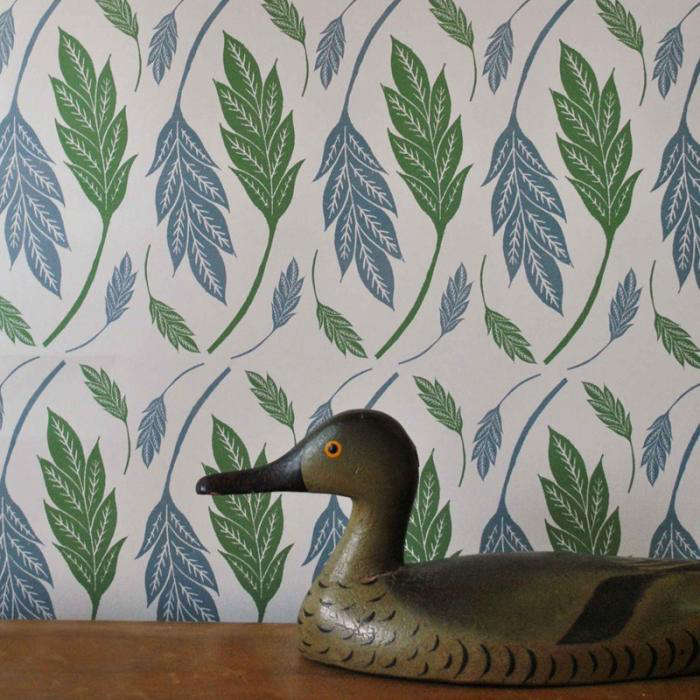
Botanical wallpaper is one of the easiest ways to introduce heritage style because plants do not become obsolete. Leaves, flowers, birds, and winding stems can connect a room to the natural world while softening modern architecture.
Arts and Crafts-influenced patterns work particularly well with simple furniture. Their flowing lines provide movement, while solid-color upholstery and clean-lined cabinetry keep the room from feeling overly themed.
Geometric and Midcentury Designs
Not every archival pattern is floral. Little Greene’s 20th-century wallpaper collections include patterns informed by postwar illustration, hand-drawn scenes, geometric structures, and designs rediscovered in gallery or private archives.
Patterns such as stylized landscapes, freehand trellises, and expressive plant forms can feel remarkably current. A wallpaper originating in the 1950s or 1960s may pair naturally with contemporary furniture because both share an interest in simplified shapes and energetic composition.
Architectural Illusion
Some historic designs mimic paneling, carved detail, or other architectural surfaces. In a modern apartment without elaborate millwork, this kind of wallpaper can add visual structure without a major carpentry project.
A panel-effect design used on all four walls creates a tailored envelope. Used on one wall, it can become a quiet backdrop for a desk, bed, or dining table. Either approach is considerably easier than persuading a contractor to recreate an 18th-century drawing room before lunch.
Why Historic Colors Work in Contemporary Interiors
Modern rooms often contain large areas of plain surface: broad walls, slab-front cabinets, simple doors, minimal trim, and open floor plans. These features create an ideal canvas for nuanced paint colors and expressive wallpaper.
Complex Color Adds Depth to Simple Architecture
A plain rectangular room can feel richer when coated in a color with layered undertones. Deep olive, earthy pink, warm brown, mineral blue, or smoky red gives the walls personality even when architectural ornament is limited.
This is why historically derived colors can work so well in newly built homes. The paint supplies some of the visual complexity that older architecture would otherwise provide through plasterwork, aged wood, or decorative molding.
Old and New Create Useful Tension
Contemporary furniture looks more interesting against a historically influenced background. A sculptural white chair becomes sharper against a deep green wall. A minimalist oak table feels warmer beneath a detailed floral paper. Matte-black hardware looks less severe when surrounded by a soft, plaster-like neutral.
The contrast prevents both sides from becoming predictable. The heritage element avoids nostalgia, while the modern element avoids sterility.
Warm Neutrals Feel More Livable
For years, cool gray dominated modern decorating. Historically influenced palettes offer alternatives based on stone, clay, parchment, ochre, umber, faded rose, and soft green.
These colors still function as neutrals, but they interact more sympathetically with wood, woven textiles, brass, leather, and warm artificial light. Brown-based shades, including dessert-inspired tones such as caramel, honey, and chocolate, can create a cocooning interior without making the room feel like a 1970s basement recreation center.
Room-by-Room Decorating Ideas
Living Room
Use a midtone historic neutral on the walls, then introduce a darker related color on the fireplace, built-ins, or doors. Add one patterned chair or a wallpapered alcove to prevent the scheme from feeling overly cautious.
For a more dramatic room, paint walls and trim in the same deep green or blue. Pale linen, light oak, and reflective metal accents will keep the space balanced.
Kitchen
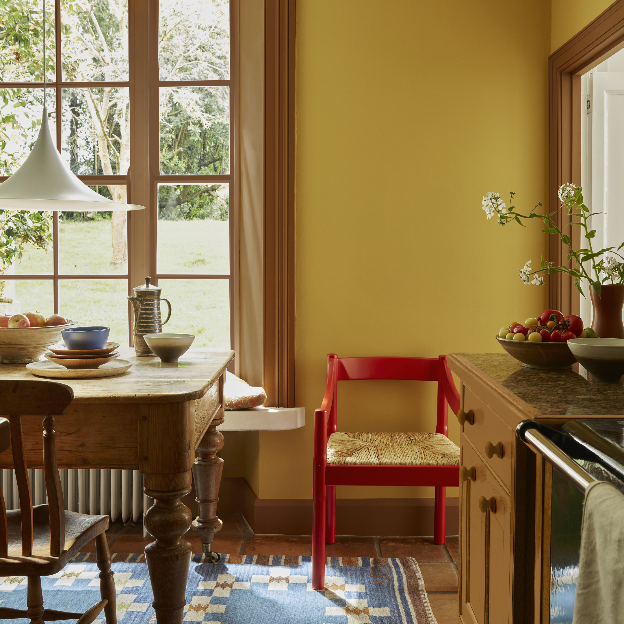
Historic greens, warm grays, and earthy browns are natural choices for cabinetry. Pair painted cabinets with walls in a lighter tonal variation, or use botanical wallpaper above paneling in a breakfast nook.
Durable, washable finishes are particularly important in kitchens. Choose the finish according to the surface, expected cleaning, and exposure to moisture rather than choosing solely by appearance.
Bedroom
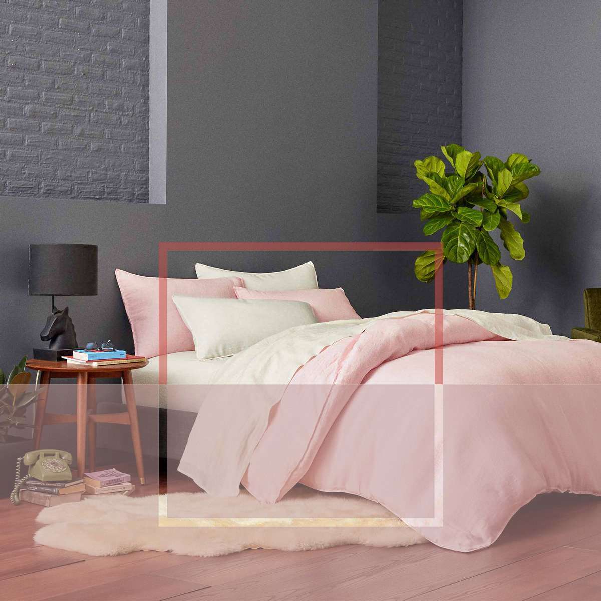
Bedrooms welcome softness. A small-scale floral paper can cover all four walls without becoming overwhelming when its background color is restrained. Continue one of the wallpaper colors onto the trim for a cohesive look.
Alternatively, use a muted pink, gray-green, or warm neutral from floor to ceiling. Darker paint behind the bed creates intimacy, while lighter bedding provides enough contrast to keep the room fresh.
Bathroom or Powder Room
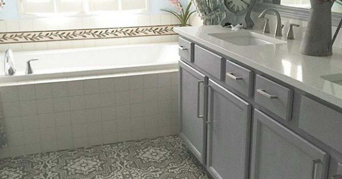
A powder room is an excellent place for a confident archival pattern. Because the space is small and visited briefly, a design that seems daring on a sample can feel delightful once installed.
Coordinate the vanity or woodwork with one of the pattern’s less obvious accent colors. Matching only the background shade is safe; selecting a tiny secondary color is where the fun begins.
Hallway
Hallways benefit from durable finishes and stronger colors. A dark lower wall can disguise everyday scuffs, while a lighter upper section preserves brightness. Wallpaper above painted paneling creates character and reduces the amount of pattern exposed to bumps and bags.
How to Combine Little Greene Paint and Wallpaper
The simplest method is to let the wallpaper build the palette. Identify its background color, dominant motif color, and smallest accent color. Use those three roles to guide the rest of the room.
The background might become the ceiling color. The dominant motif color can appear on walls or cabinets. The tiny accent color may be repeated on a door, lamp, picture frame, or piece of furniture.
Avoid matching everything too precisely. A successful interior needs conversation, not uniform. Materials such as natural wood, aged brass, stone, linen, wool, and leather introduce tonal variation that prevents the room from looking like it was assembled entirely from one sample card.
Test Before Committing
Paint colors change dramatically with orientation, daylight, bulbs, surrounding materials, and time of day. Test a generous painted sample and move it around the room. Examine it in morning light, afternoon light, and after sunset.
Wallpaper should also be viewed vertically and at full scale whenever possible. A pattern that looks busy on a small sample may become calm when repeated across a wall. Conversely, a tiny motif may become surprisingly energetic once multiplied several hundred times.
Common Mistakes to Avoid
Treating Historic Color as Automatically Dark
Heritage palettes include pale, bright, and playful colors as well as dramatic ones. Do not reject a collection simply because your room is small. A saturated color can blur boundaries and make a compact space feel intentional rather than cramped.
Defaulting to White Trim
Bright white trim can create a harsh outline around nuanced wall colors. Consider a related neutral, a darker version of the wall color, or the same shade in a different sheen.
Ignoring Surface Preparation
Premium paint cannot negotiate peace with grease, dust, loose previous coatings, or poorly repaired plaster. Clean, fill, sand, and prime as recommended for the surface. Good preparation is not glamorous, but neither is watching expensive paint detach from the wall like a dramatic stage curtain.
Using Too Many Historical References
A room does not need patterned wallpaper, ornate curtains, antique furniture, decorative trim, a Persian rug, and six brass candlesticks merely because the paint color dates from the Victorian era. Choose one or two heritage elements and let contemporary pieces create breathing space.
A Hands-On Experience With Heritage Color and Modern Style
Working with historically influenced paint is different from choosing a basic neutral under the fluorescent lights of a hardware store. The process is slower, more observant, and ultimately more rewarding. The first surprise usually arrives when the sample is placed on the wall. A color that appeared gray on a card may reveal green, lavender, brown, or blue undertones once it meets the room’s natural light.
In one contemporary living room scenario, imagine testing a warm gray-green beside a flat, builder-grade gray. At noon, the two may seem fairly similar. By late afternoon, the builder gray can become cold and slightly lifeless, while the historically influenced shade develops warmth beside oak flooring and cream upholstery. Nothing dramatic has been added, yet the room suddenly looks considered.
The second lesson is that trim color matters more than expected. Painting every baseboard and door bright white often feels like the safe decision. However, when a deep green wall is paired with trim in the same color but a satin finish, the architecture becomes quieter and more sophisticated. Light catches the trim just enough to outline it. The wall feels deeper, and the door stops interrupting the composition.
Wallpaper creates a different kind of experience. Holding a small historical pattern in your hand can be misleading because the details appear dense and precious. Once several drops are installed, the eye stops inspecting every leaf and begins reading the pattern as atmosphere. A complicated botanical design may feel calmer across a full wall than it did on a letter-size sample.
The installation process also rewards patience. Walls need to be smooth, measurements must be accurate, and the first drop must be straight. That first strip is the wallpaper equivalent of laying the foundation of a house. Begin crooked, and every subsequent strip will enthusiastically continue the mistake.
One especially effective approach is to wallpaper a bedroom and then select paint from a secondary tone in the pattern. Suppose the paper has a warm neutral ground, green foliage, dusty pink flowers, and tiny dark accents. Instead of choosing the obvious neutral for the woodwork, use the green or dusty pink. The result feels collected and intentional, while the darker detail can be repeated through lamp bases or picture frames.
Living with the finished room reveals another advantage of complex color: it does not look identical all day. Morning light may make the paint feel fresh and clear. Afternoon sun brings out warmth. Lamplight deepens the shade at night. The room changes without being redecorated, which is convenient because most people prefer not to repaint between breakfast and dinner.
There is also a practical emotional benefit. Historically grounded colors tend to feel less disposable than trend-driven shades. Because they have already survived decadesor centuriesof decorative change, they inspire more confidence. A homeowner may be more willing to paint an entire room in a rich brown, green, or red when the color carries a sense of precedent.
The most successful experience comes from allowing the history to remain subtle. Visitors do not need a lecture about the precise era of the wallpaper or the archival origin of the paint. They simply notice that the room feels warm, layered, and distinctive. That is the real achievement: history contributes depth, while contemporary styling keeps the space relaxed and useful.
After the final coat dries and the furniture returns, the room should still feel like a home rather than an exhibition. A laptop can sit on the antique desk. Sneakers can remain near the paneled wall. The television does not have to be concealed behind a tapestry. Little Greene’s historically influenced colors and wallpapers work best when they support ordinary lifewith all its books, pets, coffee cups, phone chargers, and occasional fingerprints.
Conclusion: A More Colorful Relationship With the Past
Little Greene demonstrates that heritage design does not have to be formal, nostalgic, or fragile. Through archival research, thoughtful recoloring, sophisticated pigmentation, and practical modern finishes, the company translates centuries of decorative history into materials suitable for contemporary homes.
Its paints add complexity to simple architecture, while its wallpapers introduce story, movement, and pattern. Used together, they can make a new apartment feel established, refresh a traditional house without erasing its character, or give an ordinary room the confidence to stop apologizing for its beige walls.
The key is balance. Choose a historically influenced color with undertones that respond to the room’s light. Pair archival pattern with clean furniture. Match paint finishes to real-life demands. Test everything before committing, and remember that white trim is a choicenot a constitutional requirement.
History provides the inspiration, but the final room should belong to the people living in it now.