If the phrase ’90s paint colors makes you picture sponge-painted walls, faux Tuscan kitchens, and enough teal-and-mauve drama to power a daytime talk show, take a deep breath. The colors are back, but the chaos does not have to come with them.
Across current design trends, the shades that once defined the decade are showing up again in smarter, calmer, and much better-dressed ways. Warm beige is replacing chilly gray. Buttery yellow feels sunny instead of syrupy. Burgundy is being treated like a sophisticated neutral. Greens are moving from “country kitchen” territory into rich, cocooning, designer-approved territory. In other words, the palette survived. The bad styling choices did not.
The big difference now is context. In the ’90s, these colors often appeared with heavy window treatments, shiny faux finishes, orange oak, bulky furniture, and matching-everything syndrome. Today, they are being paired with cleaner silhouettes, layered textures, warm whites, natural stone, unlacquered brass, matte finishes, and a lot more breathing room. Same color family, completely different vibe.
So yes, your childhood living room may have been onto something. It just needed better lighting and fewer decorative geese.
Why ’90s Paint Colors Feel Right Again
Color trends rarely return exactly as they were. They come back edited. That is exactly what is happening now. After years of bright white walls, cool gray everything, and homes that sometimes looked like they were auditioning to be a dentist’s office, people want rooms that feel warmer, softer, and more personal.
That shift makes the revived ’90s palette especially appealing. Many of the decade’s best colors were comforting, earthy, and easy to live with. Think sandy beige, dusty greens, rosy mauves, clay-like reds, and mellow yellows. These shades have enough personality to make a room memorable, but they are still grounded enough to feel livable day after day.
Another reason these hues are resonating now is that homeowners are less interested in one-note minimalism. Rooms today are expected to feel layered, collected, and human. A warmer palette helps create that effect immediately. Even a simple coat of paint can make a room feel less generic and more like it belongs to an actual person with books, opinions, and a favorite mug.
The ’90s Paint Colors Making the Strongest Comeback
1. Warm Beige and Taupe
Beige was once the punchline. Now it is the comeback kid. But today’s beige is not the flat, sleepy tan that made old apartments look permanently tired. The fresh version leans warmer, creamier, and more nuanced, often with a sandy, mushroom, or clay-like undertone.
This kind of beige works because it softens a room without draining it of character. It plays beautifully with wood furniture, woven textures, linen upholstery, plaster-like finishes, and darker accent colors. It is especially useful in living rooms, hallways, and bedrooms where you want warmth without obvious color.
How to make it feel fresh: Pair warm beige with crisp trim, black accents, light oak, travertine, or deep olive. Skip yellowy builder beige and look for a shade with subtle depth. Matte or eggshell finishes help it feel modern rather than rental-grade.
2. Butter Yellow
Yellow in the ’90s had a tendency to shout. The updated version knows how to use its indoor voice. Instead of intense sunflower or faux-Tuscan gold, the new butter yellow feels creamy, gentle, and surprisingly elegant.
This shade works because it adds light and optimism without the starkness of white. It can make north-facing rooms feel warmer and gives kitchens, breakfast nooks, mudrooms, and guest bedrooms a welcoming glow. It also looks wonderful in morning light, which is more than most of us can say before coffee.
How to make it feel fresh: Use it with warm whites, walnut, brushed brass, soft blue accents, or aubergine for contrast. Butter yellow also shines when used in smaller doses, such as cabinetry, a pantry, or a ceiling. If you are nervous, start with a powder room. Powder rooms are the bangs of home design: easy to try, not that serious, and fun when they work.
3. Mauve, Dusty Rose, and Plum-Tinted Neutrals
Mauve may be the color most associated with dated ’90s interiors, but it is quietly winning back respect. The reason is simple: modern versions are muddier, grayer, and far more sophisticated than the sweet pink-purple shades many people remember.
Today’s mauves and plum-browns feel romantic, earthy, and a little moody. They bridge the gap between neutral and statement color, which makes them ideal for anyone who wants something more interesting than beige but less intense than a jewel tone.
How to make it feel fresh: Keep the palette restrained. Pair mauve with creamy white, cocoa brown, olive, or stone. It looks especially polished on bedroom walls, dining rooms, and even cabinetry when the finish is velvety and the styling is clean. Avoid pairing it with shiny brass, dusty blue florals, and anything that looks like it came from a formal living room nobody was allowed to sit in.
4. Burgundy, Oxblood, and Maroon
Rich red tones are back, and this time they are less “Victorian drama club” and more “designer hotel bar.” Burgundy, oxblood, and wine shades bring warmth, depth, and a sense of confidence that lighter colors simply cannot fake.
These hues work especially well now because interiors are leaning moodier and more enveloping. In the right room, burgundy can act almost like a dark neutral, especially when surrounded by wood, leather, plaster, or creamy upholstery.
How to make it feel fresh: Use burgundy in a color-drenched room, on millwork, in a dining room, or on lower cabinets. Balance it with soft lighting, natural materials, and lighter textiles. The mistake to avoid is scattering red everywhere without commitment. Burgundy looks best when it feels intentional, not accidental.
5. Hunter Green and Deep Olive
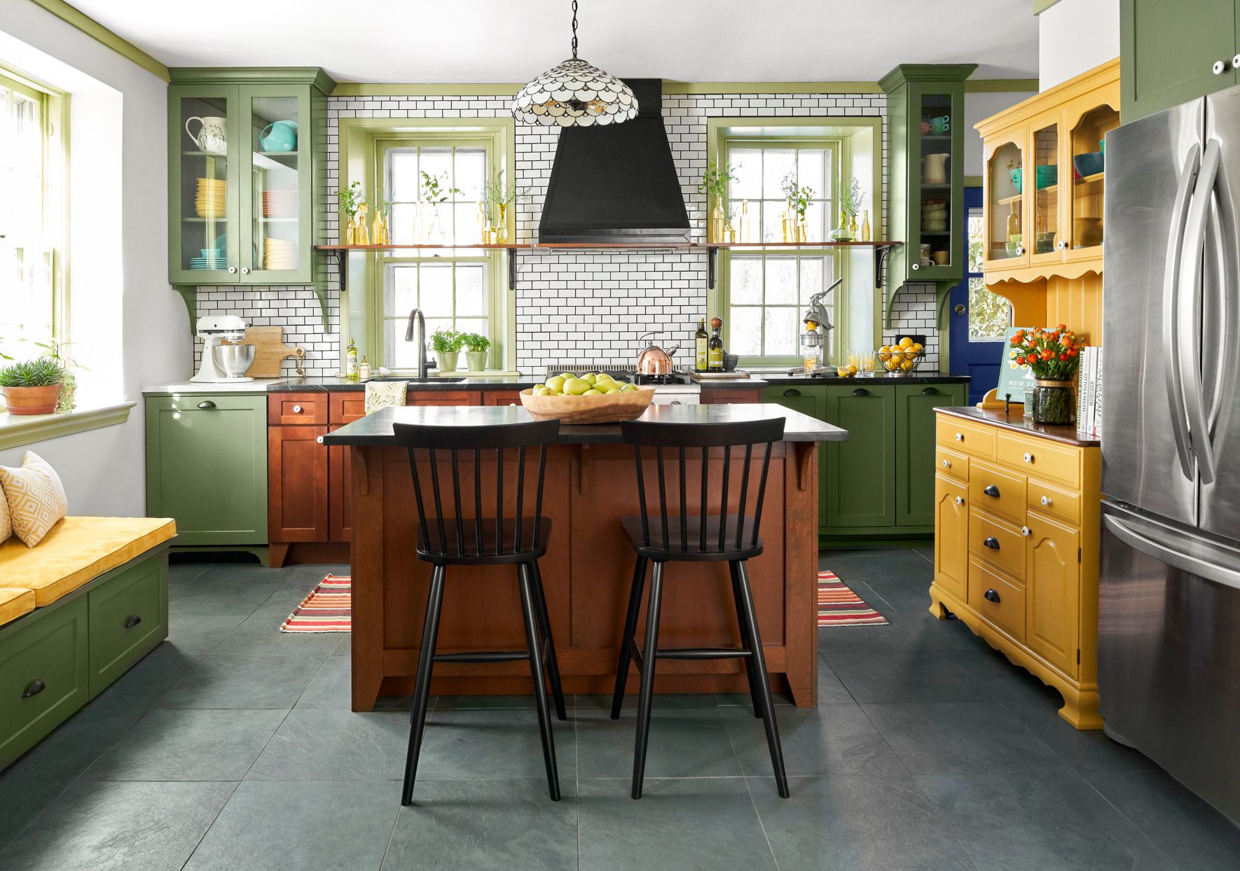
Green has range. The ’90s loved sage and hunter, and today both are back with better styling. Hunter green feels dramatic, grounded, and tailored. Olive feels earthier and slightly more relaxed. Both create a sense of coziness that works beautifully in libraries, bathrooms, kitchens, and entryways.
These deeper greens are especially popular because they connect interiors to nature without feeling too literal. They also flatter wood tones, vintage furniture, marble, aged brass, and handmade ceramics, which just so happen to be everywhere right now.
How to make it feel fresh: Skip country-themed accessories and instead lean into contrast. Pair deep green with off-white walls, warm wood, blackened steel, unlacquered brass, or tobacco-colored leather. You can also use it on trim and doors for a bold but controlled look.
6. Sage Green
If hunter green is the dramatic sibling, sage is the easygoing one who somehow always has better skin. Sage has become one of the most versatile paint colors because it acts like a neutral while still giving a room personality.
It works in nearly every style: cottage, traditional, modern organic, farmhouse, and even minimalist spaces that want a little warmth. In kitchens and bedrooms especially, sage creates a calm atmosphere without falling into blandness.
How to make it feel fresh: Use sage with natural oak, warm white, handmade tile, creamy stone, and subtle black accents. The cleaner and simpler the room, the more elevated sage will look. The goal is soft and architectural, not faux herb-garden themed.
7. Terracotta and Clay
Terracotta is not always the first color people associate with the ’90s, but it absolutely belongs in the nostalgia conversation. The decade loved warm, earthy reds and clay-inspired tones, often in Mediterranean and Southwestern-inspired spaces.
What makes terracotta feel current is that it now appears in cleaner, more sculptural rooms. It warms up modern interiors, gives white spaces a pulse, and looks fantastic with plaster, limewash, boucle, and darker wood tones.
How to make it feel fresh: Think tonal, not theme. Pair clay tones with camel, rust, ivory, olive, and charcoal. Use terracotta in dining rooms, reading nooks, powder rooms, or as an accent wall behind open shelving. Avoid turning the room into a themed restaurant with too many rustic accessories.
How to Keep Nostalgic Colors From Looking Dated
The biggest trick is not choosing the color. It is controlling everything around the color. A beautiful shade can still look stuck in the past if the finish, lighting, furnishings, or styling are doing it no favors.
Choose better undertones
The modern versions of nostalgic colors tend to be softer, muddier, and more complex. Look for beige with clay or mushroom undertones, yellow with creaminess, burgundy with brown depth, and green with gray or olive softness.
Use fewer competing elements
’90s rooms often piled on color, pattern, finish, and furniture shape all at once. Today, restraint is what makes these hues feel elevated. Let the paint have a starring role, then support it with fewer, stronger choices.
Update the finish
Flat, matte, eggshell, and limewash-style finishes can make familiar colors feel architectural and intentional. Skip glossy faux finishes, sponging, rag rolling, and heavy texture tricks unless irony is truly your design plan.
Pair with modern materials
Natural linen, light-to-medium wood, stone, plaster, boucle, matte metal, and handmade ceramics all help nostalgic colors feel current. This is where the magic happens: old-school color, new-school texture.
Consider color drenching
Painting walls, trim, and even ceilings in the same family can make a revived color feel enveloping and chic instead of random. This works especially well with burgundy, sage, olive, taupe, and mauve.
Best Rooms to Try These Colors
- Living room: Warm beige, olive, or plum-brown for a cozy, collected feel.
- Kitchen: Sage or butter yellow on cabinetry, or burgundy on an island for personality.
- Bedroom: Mauve, sage, or clay for softness and comfort.
- Dining room: Burgundy, terracotta, or hunter green for instant atmosphere.
- Bathroom or powder room: The perfect place to test a bolder nostalgic tone without repainting your entire life.
- Entryway: Deep green or warm taupe makes a memorable first impression.
The Biggest Mistakes to Avoid
Not every revival deserves full custody of your walls. A few choices still make these colors feel dated fast.
- Using a nostalgic color with orange-toned wood that clashes instead of complements.
- Pairing mauve, teal, and country floral prints all in one room. That is not a comeback. That is a time machine.
- Choosing a paint color under store lighting and never testing it at home.
- Ignoring sheen, which can make even a beautiful color look cheap.
- Over-accessorizing the room until the paint loses all sophistication.
- Forgetting that undertones matter more than the name on the paint chip.
Living With the Comeback: Real-World Experiences With Revived ’90s Colors
One of the most interesting things about these revived ’90s paint colors is how different they feel once people actually live with them. On a paint chip, beige can look boring, burgundy can look risky, and sage can seem too safe. But on real walls, with changing light and daily use, these colors often reveal why they have staying power.
Warm beige, for example, tends to surprise people most. Many expect it to feel plain, but in lived spaces it often reads as calm, flattering, and far more adaptable than stark white. In the morning, it can look creamy and bright. In the evening, it becomes softer and more cocooning. Rooms painted in a good beige often feel finished faster because the color naturally supports wood, art, upholstery, and texture without demanding constant decorating decisions.
Butter yellow creates a different kind of experience. It changes the mood of a room almost immediately. In kitchens and breakfast spaces, people often describe it as cheerful without being childish. It reflects light in a way that makes a room feel awake. The key is subtlety: the softer the yellow, the longer it tends to stay lovable. A pale buttery shade can feel comforting for years, while a louder yellow may wear out its welcome after the honeymoon period.
Mauve and plum-tinted neutrals are usually the biggest emotional gamble, but they can also be the most rewarding. In bedrooms especially, these colors often feel surprisingly restful. They bring warmth without the heaviness of brown and softness without the sweetness of pink. People who try these shades often discover that the room feels more intimate and designed, even when the furniture stays exactly the same. That is the sneaky power of color: it can make a space feel newly intentional without requiring a truckload of shopping bags.
Burgundy and oxblood tend to create the strongest first impression. They are not shy colors, but they do not have to be loud. When used in dining rooms, libraries, or powder rooms, they often create a sense of depth and occasion. People frequently notice that guests react to these spaces more emotionally. They may not identify the undertones or discuss saturation levels like tiny interior designers, but they do say things like, “This room feels expensive,” or, “This is so cozy.” That reaction matters.
Greens are perhaps the easiest nostalgic shades to live with because they feel grounded from day one. Deep hunter and olive greens can make a room feel sheltered and rich, while sage tends to feel fresh, quiet, and flexible. In kitchens and bedrooms, sage often becomes the color people get tired of the least. It works with changing decor, different seasons, and a wide range of materials, which makes it a smart long-term choice for anyone who wants color without daily drama.
Terracotta and clay bring a more sensory experience. These shades often make spaces feel warmer, especially in rooms with limited natural light. They look good with skin tones, candlelight, and wood, which is one reason they tend to make dining rooms and reading corners feel inviting. People often worry terracotta will feel too themed, but when it is balanced with simple furniture and edited styling, it usually reads as earthy and artistic instead.
The bigger lesson from all these experiences is that successful color is less about chasing nostalgia and more about translating it. The best revived ’90s paint colors work not because they remind us of the past, but because they answer what homes need right now: warmth, softness, personality, and comfort. The past may have introduced the palette, but the present finally knows how to style it.
Final Take
The return of ’90s paint colors does not mean we are all one step away from sponge painting a powder room and calling it a day. It means homeowners are rediscovering the part of that decade’s palette that always worked: warmth, approachability, and character.
Beige feels richer. Yellow feels creamier. Burgundy feels moodier. Green feels more architectural. Mauve feels grown up. Terracotta feels sculptural. The secret is not to recreate a ’90s room exactly as it was. The secret is to borrow the best colors, remove the visual clutter, and give them the cleaner, quieter setting they always deserved.
If you do that, these comeback colors will not feel dated at all. They will feel like they have finally matured. Frankly, same.