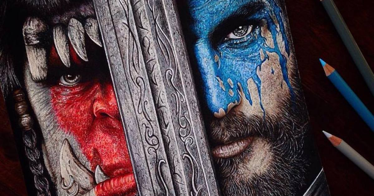
Some people spend 20 hours training for a marathon. I spent 20 hours drawing shoulder armor the size of a compact car. That, in a sentence, is the magical nonsense of creating a World of Warcraft drawing. If you have ever tried to make WoW fan art that actually feels like Azeroth, you already know the trap: it starts with, “I’ll just sketch a cool character tonight,” and ends with you zoomed in at 300% muttering about glowing runes, cloak folds, and whether that axe looks heroic or merely emotionally unavailable.
World of Warcraft has one of the most recognizable visual identities in gaming. It is bold without being sloppy, exaggerated without being chaotic, and colorful without turning into a bag of spilled jellybeans. That balance is exactly why making World of Warcraft artwork is so challenging. The game makes stylization look easy. It is not easy. It is a beautifully organized ambush.
This article breaks down why a single World of Warcraft drawing can take more than 20 hours, what makes the game’s style so hard to imitate well, and what the full digital illustration process looks like from first sketch to final glow effect. Along the way, I’ll share the creative wins, the dumb mistakes, and the very real moment when I realized I had spent 40 minutes painting one shoulder pad like it was a Renaissance commission.
Why a World of Warcraft Drawing Eats So Much Time
At a glance, WoW’s visual style feels approachable. The silhouettes are clear, the colors are readable, and the shapes are larger than life. But that simplicity is doing a lot of heavy lifting. Great fantasy character art in the Warcraft style depends on strong design decisions early on. If the pose is weak, the whole piece looks flat. If the color palette is muddy, the character stops feeling like they belong in Azeroth. If the gear details are generic, the drawing loses that unmistakable Blizzard flavor.
That is why the time disappears so quickly. You are not only drawing a character. You are building a miniature visual story. Is this a battle-worn orc warrior fresh out of a raid? A blood elf mage standing in smug, arcane confidence? A night elf hunter who looks like she has personally judged your transmog choices? Every choice affects the final image.
In my case, the drawing took over 20 hours because I was not chasing basic accuracy. I was chasing atmosphere. I wanted the piece to feel like a splash of Azeroth captured in one frame: dramatic lighting, oversized armor, rich color contrast, and enough tiny design cues to suggest a real backstory. That goal is noble. It is also the creative equivalent of deciding to bake a wedding cake because you were hungry for a cookie.
Step One: The Character Concept Does Most of the Work
Before the sketch even begins, you need a concept that can carry the image. The strongest WoW drawing ideas usually start with a clear emotional hook. Maybe it is vengeance. Maybe it is honor. Maybe it is “I just solo-farmed this mount for six months and now I am legally allowed to look this dramatic.” Whatever the theme is, it helps shape pose, costume, lighting, and background.
For a World of Warcraft piece, that concept phase matters more than people think. Warcraft characters do not rely on realism alone. Their appeal comes from readable shapes, iconic accessories, and visual attitude. A good design tells you who the character is before they say a word. You should be able to glance at the drawing and think, “That person definitely owns at least three dangerous artifacts and terrible sleep habits.”
Step Two: Reference Hunting Is Not Cheating
Let us clear this up for the record: using reference is not cheating. It is called being smart and avoiding anatomy crimes. For this kind of gaming art process, references are essential. I collected screenshots, armor inspiration, weapon designs, color schemes, and environmental ideas to lock in the mood. The goal was not to copy a single in-game image. The goal was to understand the visual language well enough to create something original that still felt unmistakably Warcraft.
That is where the first several hours went. I tested compositions, swapped poses, changed hand placement, adjusted the weapon angle, and redrew the face more times than I would like to admit. Nothing burns time like a drawing that is almost right. “Almost right” is the Bermuda Triangle of illustration.
What Makes the Warcraft Style So Hard to Nail
The secret sauce of World of Warcraft fan art is not realism. It is controlled exaggeration. Warcraft characters are heroic, but not stiff. Their armor is ornate, but not unreadable. Their environments are vibrant, but not random. The style depends on silhouette clarity, color confidence, and storytelling through design.
That sounds manageable until you sit down to draw it.
One of the trickiest parts is proportion. WoW loves big forms: broad pauldrons, dramatic weapons, powerful hands, heavy boots, sweeping horns, and cloaks that behave like they have their own personal wind machine. Push the proportions too little, and the drawing feels generic. Push them too much, and suddenly your noble paladin looks like he lost a fight with a wardrobe department.
Then there is color. Warcraft visuals often rely on strong contrast and deliberate palettes. Fel greens, icy blues, holy golds, void purples, and earthy reds are not just decorative. They communicate class fantasy, faction identity, and mood. A successful Azeroth artwork piece needs that same discipline. Too many colors and the image gets noisy. Too few and it loses energy.
Materials are another time sink. In WoW-inspired art, metal should feel weighty, cloth should feel layered, and magical elements should glow with purpose. This is where many pieces either level up or collapse in front of your eyes like a raid group after one poorly explained mechanic. The trick is to simplify textures while preserving impact. You do not need to render every scratch on a breastplate, but you do need enough edge highlights and shadow shapes to sell the illusion.
Line, Shape, and Readability Matter More Than Tiny Details
A lot of beginners assume detailed art means good art. Warcraft-style illustration disagrees. Good detail supports the bigger forms instead of replacing them. That means the silhouette has to read first. The pose has to feel strong from a distance. The line work has to guide the eye. Tiny decorative details only matter once the large design is already doing its job.
This was one of the biggest lessons from my own process. I kept wanting to add more filigree, more buckles, more gems, more visual fireworks. But every time I zoomed out, the drawing looked weaker. The fix was not adding more detail. The fix was making the major shapes clearer. It turns out the shoulder armor did not need seventeen extra spikes. Shocking, I know.
My 20-Hour Drawing Process, Broken Down
Hours 1 to 4: Sketching and Composition
The early stage was all about gesture, silhouette, and composition. I tested multiple poses before choosing one that felt appropriately heroic without becoming painfully stiff. In fantasy art, “epic” and “posed like a department store mannequin” can be separated by one bad shoulder angle. I wanted energy, not accidental retail display.
During this phase, I also blocked in the weapon, cape flow, and basic background shapes. Nothing was polished yet. I just needed a structure strong enough to support the rest of the piece. This stage is usually fast in theory and chaotic in practice. Every decision here saves or wastes hours later.
Hours 5 to 9: Anatomy, Armor, and Clean Line Work
Once the composition felt solid, I refined the anatomy and cleaned up the line art. This is where the drawing started to look like a real piece instead of a caffeinated argument between circles and rectangles. I adjusted the hands, face, and torso proportions, then built out the armor shapes so they felt powerful and readable.
This stage took forever because Warcraft gear is gloriously dramatic. Belts are not just belts. They are statements. Shoulder pieces are not accessories. They are their own zip code. Every element has to feel stylized, intentional, and functional within the fantasy. You are constantly balancing spectacle with clarity.
Hours 10 to 14: Base Colors and Rendering
Flat colors came next, followed by lighting and material definition. This is where the character finally began to feel alive. Skin tones, fabric surfaces, weapon reflections, and glowing magical effects all started interacting with each other. The piece went from “interesting sketch” to “okay, now we are getting somewhere.”
Coloring a World of Warcraft drawing is one of the most satisfying parts of the process, but it is also where you can ruin everything with confidence. If the shadows are too gray, the piece loses its fantasy energy. If the highlights are too sharp, the surfaces look plastic. If the glow effects are overdone, the image turns into a flashlight convention. I had to keep pulling back, checking values, and making sure the focal point stayed on the face and weapon.
Hours 15 to 20: Background, Effects, and Painfully Necessary Polish
The final hours were all about atmosphere. I developed the background just enough to support the character without stealing attention. Then came the fun stuff: rim light, magic effects, atmospheric haze, color balance, edge cleanup, and tiny corrections nobody notices until they are missing.
This is also the stage where I asked myself dangerous questions like, “Would another layer of glow improve this?” The answer is sometimes yes. The answer is also sometimes “put the stylus down and back away slowly.” Finishing art is often less about adding things and more about knowing when to stop before your epic fantasy illustration becomes a disco accident.
The Biggest Challenges I Did Not Expect
The face was harder than the armor. That surprised me. In a stylized piece, the face has to match the world. Too realistic, and it clashes with the exaggerated gear. Too simplified, and it loses emotion. I spent an absurd amount of time adjusting the eyes, nose, and mouth so the expression felt intense without looking like the character had just remembered they left the auction house without listing their loot.
Another challenge was visual hierarchy. In a detailed WoW fan art illustration, everything wants attention. The weapon wants attention. The shoulder pads want attention. The magical glow wants attention. The background wants attention. Even the cloak starts acting like it deserves billing. If you let them all win, the piece becomes noisy. You have to decide what matters most and force the rest to support it.
That is where polish becomes less about effort and more about restraint. The final drawing looked better not because I kept adding detail forever, but because I learned where to soften edges, reduce contrast, and let some areas breathe.
Why the Final Piece Felt Worth Every Minute
There is something deeply satisfying about finishing a drawing rooted in a world as visually rich as Azeroth. A great World of Warcraft artwork piece does more than show technical skill. It captures memory. It taps into late-night dungeon runs, favorite classes, iconic zones, and the kind of fantasy drama WoW has been serving for years with complete confidence.
That is why people keep making Warcraft fan art. It is not just about nostalgia, although nostalgia absolutely shows up wearing a cape and carrying a glowing sword. It is also about interpretation. Every artist filters Azeroth through their own style, their own mood, and their own obsession with tiny details no sane person would notice. That is part of the fun.
So yes, this World of Warcraft drawing took me over 20 hours to complete. And honestly, that makes sense. The Warcraft aesthetic is a strange and wonderful mix of clarity, spectacle, and storytelling. To make a piece that feels true to that spirit, you need time. You need patience. You need references. And ideally, you need the emotional strength to repaint a glowing shoulder rune six times without dramatically questioning your life choices.
Extra Experience: What Those 20+ Hours Actually Felt Like
If I had to describe the full experience of making this piece, I would say it felt like going on a miniature raid with my own attention span as the final boss. The first hour was pure excitement. I had the big idea, the rough composition, and that dangerous kind of optimism artists get right before the drawing starts asking difficult questions. Everything seemed possible. The character looked powerful. The mood felt dramatic. I was convinced I would wrap it up quickly. That confidence lasted for about fifteen minutes.
By hour three, reality had arrived wearing steel boots. The pose was decent, but the anatomy was fighting me. The weapon looked cool from one angle and completely ridiculous from another. The face kept drifting away from the Warcraft style and into a more generic fantasy look. That is the point where drawing stops being romantic and starts becoming a negotiation. You bargain with the piece. You move one shoulder. You tilt the chin. You redraw the hand. You tell yourself this is all part of the process, which is true, but also suspiciously convenient.
Somewhere in the middle, around the coloring phase, the illustration became fun again. The second the palette locked in, the piece finally started speaking the right language. The armor felt heavier. The skin tones looked alive. The magical glow created a focal point instead of visual chaos. That stage is the reward for surviving the messy middle. It is also the part that tricks artists into starting another massive project the next day, which is how we continue the ancient cycle of poor time estimation.
The final stretch was weirdly emotional. Once I got into edge cleanup, light effects, and tiny finishing touches, the drawing stopped feeling like a work-in-progress and started feeling like a place. That is the best part of making fantasy character art. At some point, the character is not just lines and color anymore. They feel like they belong somewhere. They have history. They have weight. They look like they could step straight into Azeroth and immediately start a side quest with suspiciously high emotional stakes.
And when I finally finished, I had that mix of exhaustion and satisfaction that only comes from a piece you truly wrestled into existence. Was it over 20 hours? Absolutely. Would I do it again? Also absolutely. I would probably complain the whole time, drink too much coffee, zoom in far too much, and lose an evening to painting decorative metal trim. But I would still do it, because that is the joy of making WoW fan art. It is demanding, ridiculous, and unbelievably rewarding when everything clicks.
Conclusion
A World of Warcraft drawing can easily take more than 20 hours because the style asks for more than technical skill. It asks for strong silhouettes, smart color decisions, believable materials, and a sense of story packed into one image. The best Warcraft-inspired art does not just show a character. It shows a world. That is why the process is slow, why the details matter, and why finishing the piece feels so satisfying. In the end, the time investment is not the problem. It is the proof that you cared enough to make the drawing feel worthy of Azeroth.